Nested Nav
Licensed under the MIT license
Works with Bootstrap 2.3 - 3+ or any markup that meets minimal, customizable requirements.
Download
All nestednav JS and CSS files are in the src folder. You can also download them from our demo page, but please do not link directly to them.
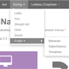
Demo
For a working example, check out our demo page and be sure to resize your browser or use a mobile device!
Overview
NestedNav has very few requirements and completely customizable class names, selectors, IDs, and attributes.
- Hierarchy matters and having selectors, but not elements*, particular classes, etc
- * All labels and links must use the
<a>tag, the only [element] requirement outside hierarchy.
Requirements
The basic requirments are:
| # | Option | Requirement | Default Example |
|---|---|---|---|
| 1 | n/a | A container for the entire navigation with that you invoke nestednav with | $('#main-nav').nestednav(); |
| 2 | mainNavSelector | A uniquely identifiable selector for menu items container | '.navbar-inner ul.nav' |
| 3 | mainNavChildrenSelector | A selector for children of #2 (top level menu items) | 'li' |
| 4 | dropdownClass | A class for when a top level menu item is a dropdown menu item | 'dropdown' |
| 5 | dropdownSelector | A selector for children of dropdown menu items (sub nav container) | 'ul' |
| 6 | dropdownSubMenuClass | A class for when a sub level menu item is a dropdown menu item | 'dropdown-submenu' |
| 7 | menuButtonSelector | A uniquely identifiable selector for the mobile menu toggle button | '.btn.btn-navbar' |
| 8 | caretIconHtml | HTML to make a caret icon or icon of choosing to denote dropdowns | '<i class="icon-caret-down"></i>' |
| 9 | nestedBoxIconHtml | HTML to make a remove icon or icon of choosing to denote CLOSE generated menu boxes | '<i class="icon-remove"></i>' |
| 10 | n/a | All links or dropdown labels MUST use an <a> tag, which is the only requirement, other than hierarchy. | '<a href="your link">Link</a>' |
Basic Structure for Nested Nav
Purely what is needed from Nested Nav, hierarchically speaking. (We're leaving out any unused Bootstrap markup.)
<div id="main-nav"> <ul class="navbar-inner nav"> <li><a href="#">Google</a></li> <li><a href="#">Yahoo</a></li> <li class="dropdown"> <a href="#">Fruit</a> <ul class="dropdown-menu"> <li><a href="#">Watermelon</a></li> <li><a href="#">Oranges</a></li> <li class="dropdown-submenu"> <a>Better Fruit</a> <ul class="dropdown-menu"> <li><a href="#">Strawberries</a></li> <li><a href="#">Bananas</a></li> </ul> </li> </ul> </li> </ul> </div> Invoked with $( '#main-nav' ).nestednav();
Bootstrap 3.+ *
* removed dropdown-submenu, check this stackoverflow solution for re-implementation and adjust nestednav options accordingly
<div id="main-nav"> <ul class="nav navbar-nav"> <li><a href="#">Google</a></li> <li><a href="#">Yahoo</a></li> <li class="dropdown"> <a aria-expanded="false" role="button" data-toggle="hover" class="dropdown-toggle" href="#">Fruit</a> <ul class="dropdown-menu"> <li><a href="#">Watermelon</a></li> <li><a href="#">Oranges</a></li> <li class="dropdown-submenu"> <a aria-expanded="false" role="button" data-toggle="dropdown" class="dropdown-toggle">Better Fruit</a> <ul class="dropdown-menu"> <li><a href="#">Strawberries</a></li> <li><a href="#">Bananas</a></li> </ul> </li> </ul> </li> </ul> </div> Invoked with:
$( '#main-nav' ).nestednav( { menuButtonSelector: '.navbar-toggle', mainNavSelector: '.nav.navbar-nav', caretIconHtml: '<span class="glyphicon glyphicon-chevron-down" aria-hidden="true"></span>', nestedBoxIconHtml: '<span class="glyphicon glyphicon-remove" aria-hidden="true"></span>', } ); Bootstrap 2.+
Review Example 1, add Bootstrap mark up such as data-toggle and class="dropdown" to <a> tag elements.
All Options
There is a complete list of all options available options on our demo page.
To Do
- Better Deliverable CSS - If you change nested-* class names in nestednav() options, be sure to update your css files!
- Add Drawer Open/Close events
- Add Swiping motion for Drawer


