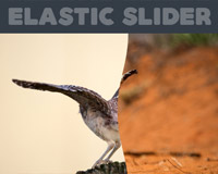
Elastic Slider
An experimental slider using SVG clip-path feature and animations powered by Snap.svg.
Usage
First you need to include the elastic-slider styles and scripts, along with external Snap.svg library. Then you can create a basic HTML markup and initialize the slider.
<!-- CSS: The inline piece is needed to work properly --> <link rel="stylesheet" href="elastic-slider.css"> <style> .clipped-left { -webkit-clip-path: url(#clipped-left); clip-path: url(#clipped-left); } .clipped-right { -webkit-clip-path: url(#clipped-right); clip-path: url(#clipped-right); } </style> <!-- JS --> <script src="snap.svg.js"></script> <script src="elastic-slider.js"></script> <!-- Basic HTML structure: A div with class 'elastic-slider' and three children at least --> <div class="elastic-slider"> <div id="image1"></div> <div id="image2"></div> <div id="image3"></div> </div> <!-- Simple 'elastic-slider' initialization --> <script> new ElasticSlider('.elastic-slider'); </script>Install with NPM
npm install elastic-slider Customization
The ElasticSlider constructor asks for 2 parameters:
el: DOM element or string selector.options(optional): Slider options in object notation.
All possible options
| Name | Type | Default | Description |
|---|---|---|---|
maxStretch | integer | 100 | Max distance (px) for stretching effect. |
bezierLen | integer | 80 | Parameter that allows to customize the curve in the stretching effect. A setting of 0 results in straight lines, and higher values result in steeper curves. |
Change dimensions
Default width and height values are 600px and 400px respectively. You can change these values easily in CSS, like:
.elastic-slider{ width: 400px; height: 300px; }


