S-Pagination
A JavaScript library for creating pagination. The main goal of this library is simple usage, so for initialization is required only specify page size, number of items and place for S-Pagination rendering (other parameters are optional). Page selected by user can be obtained by setting up callback or by redirection to specified URL. The library using Bootstrap components for pagination and jQuery UI library for slider. This library also contains definition files (.d.ts) for TypeScript.
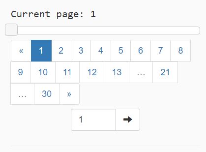
Demo
Usage
The simplest usage is following:
var pagination = new Pagination({ container: document.getElementById("pagination-1") as HTMLDivElement, pageClickCallback: function(pageNumber) {} }); pagination.make(itemsCount, itemsOnPage);The constructor initialize component with options but not render anything. The component is rendered after make() method call. This method can be called repeatedly for the component is rerendering.
Configuration
The library is configured by object passed in the constructor:
- container - The place in the DOM, where to render this component. The parameter type is HTMLDivElement or JQuery. This parameter is required.
- pageClickCallback - The callback function which is called when user change page by this component. The callback function contains one parameter with page number. Page numbers are equal to labels (first page has number 1).
- pageClickUrl - The URL to which is browser redirected after user change page by this component. If type of specified parameter is string, substring "{{page}}" is replaced by appropriate page number. If type of specified parameter is function, page number is passed as parameter and return type is string.
- callPageClickCallbackOnInit - If true, pageClickCallback is called immediately after component render (after make method call). Defaults to false.
- maxVisibleElements - The number of visible buttons in pagination panel (including arrows on the edges and shorting dots). Default value is 13.
- showSlider - If true, show slider for fast navigation between pages. Defaults to false.
- showInput - If true, show text input box for direct navigation to specified page. Defaults to false.
- inputTitle - The content of tooltip displayed on text input box.
- enhancedMode - If false, standard mode is used (show arrows on the edges, border page numbers, shorting dots and page numbers around current page). If true, standard mode is enhanced, so page number between border number and middle area is also displayed. Defaults to false.
Methods
- constructor(options) - The constructor accepts exactly one object parameter containing configuration.
- make(itemsCount, itemsOnPage, defaultPageNumber) - Render the component for specified items count and page size. DefaultPageNumber parameter is optional and sets active page.
- goToPage(pageNumber) - Force "Go to page" action. Component is rerendered to specified page and actions (pageClickCallback, pageClickUrl) are invoked.
- getPageCount() - Returns current page count.
- getCurrentPage() - Returns current page number.
Changes
Added support for Bootstrap v4.x


