graphly
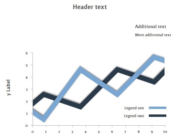
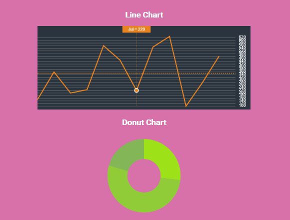
Graphly is an easy to use and lightweight jQuery plugin which allows you to transform your data into clean and customisable graphs. See below an example of a graph created using Graphly.

Supported browsers include:
- Chrome
- Firefox
- Internet Explorer 9+
- Opera
- Safari
Examples
To see some examples of Graphly in use, visit the demo page at http://www.getgraphly.com/demo/
How Do I Use Graphly?
The first step is to include the jQuery and Graphly libraries inside the head tags of your HTML document and ensure the HTML 5 doctype is being used, as in this template:
<!DOCTYPE html> <html> <head> <script src="jquery.min.js"></script> <script src="graphly.min.js"></script> </head> <body> </body> </html>After you have included the jQuery and Graphly libraries, you must place a canvas element where you wish the graph to appear, and set the width and height accordingly. For example, an 800x300 graph would require the following markup:
<canvas id="canvas" width="800" height="300"></canvas>The final step to creating a graph is to construct your data and pass it through to the Graphly plugin. The structure of this data differs based on what type of graph you want to use. If you want to create a bar chart, in its simplest form, the data consists of a single group of data and labels, such as this:
var data = { xLabel: 'Characters', yLabel: 'Awesomeness', groups: [ { label: 'People', values: [ { label: 'Jack Bauer', value: 100 }, { label: 'Jack Shephard', value: 13 }, { label: 'Nancy Botwin', value: 50 }, { label: 'Walter White', value: 77 } ] } ] };For more information on constructing your data see the Constructing Data for Bar Charts and Constructing Data for Line Graphs sections.
Once the data is constructed, simply call the Graphly plugin:
$('#canvas').graphly({ 'data' : data });See below for a complete example of how to use Graphly to create a bar chart:
<!DOCTYPE html> <html> <head> <script src="jquery.min.js"></script> <script src="graphly.min.js"></script> </head> <body> <canvas id="canvas" width="800" height="300"></canvas> <script> $(function() { var data = { xLabel: 'Characters', yLabel: 'Awesomeness', groups: [ { label: 'People', values: [ { label: 'Jack Bauer', value: 100 }, { label: 'Jack Shephard', value: 13 }, { label: 'Nancy Botwin', value: 50 }, { label: 'Walter White', value: 77 } ] } ] }; $('#canvas').graphly({ 'data' : data }); }); </script> </body> </html>In addition to the data setting that is passed in the above example, the following optional settings can be specified:
- customTheme - a custom theme definition to use instead of a built-in theme
- height - the initial height of the canvas to draw on
- paddingTop - the padding applied to the top of the canvas in pixels
- paddingLeft - the padding applied to the left of the canvas in pixels
- paddingBottom - the padding applied to the bottom of the canvas in pixels
- paddingRight - the padding applied to the right of the canvas in pixels
- removeBorders - a boolean value indicating whether or not to remove borders from bars
- showLabels - a boolean value indicating whether or not to show the axis labels
- showLegend - a boolean value indicating whether or not to show the legend
- theme - the name of the built-in theme to use
- width - the initial width of the canvas to draw on
Constructing Data for Bar Charts
Currently Graphly is capable of generating graphs which consist of one or more groups of data. An example of a data set that contains one group of data can be found below. Within the root object are three objects, xLabel, yLabel and groups. The label objects contain the axis labels that will be displayed on the graph, and the groups object contains an array of objects which represent groups of entities and data values.
{ xLabel: 'Characters', yLabel: 'Awesomeness', groups: [ { label: 'People', values: [ { label: 'Jack Bauer', value: 100 }, { label: 'Jack Shephard', value: 13 }, { label: 'Nancy Botwin', value: 50 }, { label: 'Walter White', value: 77 } ] } ] }The label property in the group object is the label / name associated with the entire group (see below example for a better example of this), and the labels in the values array are those that are associated with each individual bar in the graph.
In the above example, we have no repeating entities and will have four unique bars in the graph. However, if we have a graph that needs to show figures for a repeating group of entities under different circumstances, such as in the example below, which shows how a group of Graphics Processing Units perform under different circumstances, we can simply specify multiple groups in the groups array:
{ xLabel: 'GPU / Settings', yLabel: 'FPS', groups: [ { label: 'Tessellation Disabled', values: [ { label: 'nVidia GeForce GTX 680 2 GB SLi', value: 296 }, { label: 'nVidia GeForce GTX 690 4 GB', value: 285 }, { label: 'AMD Radeon HD 7970 3 GB CrossFire', value: 267 }, { label: 'Nvidia GeForce GTX 590 3 GB', value: 248 }, { label: 'AMD Radeon HD 6990 4 GB', value: 231 }, { label: 'nVidia GeForce GTX 680 2 GB', value: 207 }, { label: 'nVidia GeForce GTX 580 1.5 GB', value: 193 }, { label: 'AMD Radeon HD 7970 3 GB', value: 148 }, { label: 'AMD Radeon HD 7950 3 GB', value: 104 } ] }, { label: 'Tessellation Enabled', values: [ { label: 'nVidia GeForce GTX 680 2 GB SLi', value: 245 }, { label: 'nVidia GeForce GTX 690 4 GB', value: 240 }, { label: 'AMD Radeon HD 7970 3 GB CrossFire', value: 223 }, { label: 'Nvidia GeForce GTX 590 3 GB', value: 198 }, { label: 'AMD Radeon HD 6990 4 GB', value: 171 }, { label: 'nVidia GeForce GTX 680 2 GB', value: 142 }, { label: 'nVidia GeForce GTX 580 1.5 GB', value: 141 }, { label: 'AMD Radeon HD 7970 3 GB', value: 123 }, { label: 'AMD Radeon HD 7950 3 GB', value: 87 } ] } ] }In addition to the above examples, we can customise how the data will be represented further by specifying colours that will be associated with each entity, as can be seen in this example:
{ xLabel: 'Characters', yLabel: 'Awesomeness', groups: [ { label: 'People', values: [ { label: 'Jack Bauer', value: 100, color: '#636F57' }, { label: 'Jack Shephard', value: 13, color: '#78AB46' }, { label: 'Nancy Botwin', value: 50, color: '#66CD00' }, { label: 'Walter White', value: 77, color: '#7FFF00' } ] } ] }If no colour is specified the default colour selection will be used for that particular entity.
Constructing Data for Line Graphs
The data structure passed to Graphly when creating line graphs differs quite a bit from that of bar charts. We have the xLabel and yLabel properties as we do in the other structure, however we have two arrays at the top level; those being the points and groups arrays.
The points array contains an array of strings which are used to identify what the points represent along the X-axis. In the example below we use each month as we are illustrating stock prices over the space of a year.
The groups array contains an array of objects which store a label (used in the legend to identify what the line represents; in our case the company names) and an array of numeric values (which we use to store the stock prices). The values in the values array need to be in the same order of the points array to match together properly. For example, as Feb is at position 2 in the points array, our value for Feb needs to also appear at position 2 in the values array of each group.
Below is an example of how a line graph's data structure may look:
xLabel: 'Month', yLabel: 'Closing Price', points: [ 'Jan', 'Feb', 'Mar', 'Apr', 'May', 'Jun', 'Jul', 'Aug', 'Sep', 'Oct', 'Nov', 'Dec' ], groups: [ { label: 'Apple', values: [ 456.48, 542.44, 599.55, 583.98, 577.73, 584.00, 610.76, 665.24, 667.10, 595.32, 585.28, 532.17 ] }, { label: 'Google', values: [ 580.11, 618.25, 641.24, 604.85, 580.86, 580.07, 632.97, 685.09, 754.50, 680.30, 698.37, 707.38 ] }, { label: 'Microsoft', values: [ 29.53, 31.74, 32.26, 32.02, 29.19, 30.59, 29.47, 30.82, 29.76, 28.54, 26.62, 26.71 ] }, { label: 'Netflix', values: [ 120.20, 110.73, 115.04, 80.14, 63.44, 68.49, 56.85, 59.72, 54.44, 79.24, 81.71, 92.59 ] }, ] };When passing this data to Graphly, it is important to use the type property to indicate we want to use a line graph. For example:
$('#line-graph').graphly({ 'data': line_graph_data, 'type': 'line', 'width': 900, 'height': 400 });Authors and Contributors
Graphly is developed by rastating, and can be found on the following networks:
- GitHub: https://github.com/rastating
- Last.fm: http://www.last.fm/user/rastating
- Twitter: https://twitter.com/iamrastating
- Xbox LIVE: https://live.xbox.com/en-GB/Profile?gamertag=rastatingg