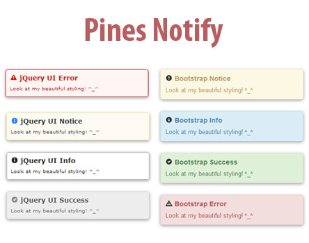
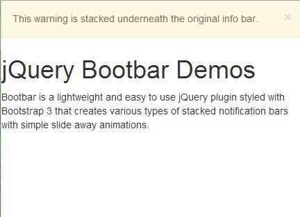
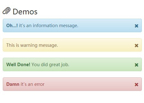
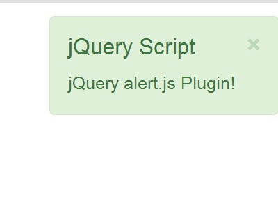
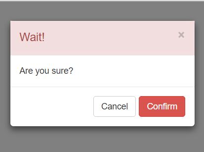
PNotify is a vanilla JavaScript notification and confirmation/prompt library. PNotify can provide desktop notifications based on the Web Notifications spec with fall back to an in-browser notice.
Demos
- http://sciactive.com/pnotify/ for the latest release
- https://sciactive.github.io/pnotify/ for what's in development
Table of Contents
- Getting Started
- Installation
- Styles
- Creating Notices
- Options
- Module Options
- Static Methods and Properties
- Instance Methods and Properties
- Stacks
- Features
- Licensing and Additional Info
Getting Started
You can get PNotify using NPM. (You can also use jsDelivr or UNPKG.)
npm install --save pnotify # If you plan to use Material style: npm install --save material-design-icons # If you plan to use the Animate module: npm install --save animate.css # If you plan to use the NonBlock module: npm install --save nonblockjsInside the pnotify module directory:
srcSvelte components and uncompressed Bright Theme CSS.lib/esuncompressed ECMAScript modules.lib/umduncompressed UMD modules.lib/iifeuncompressed IIFE scripts.distcompressed Bright Theme CSS.dist/escompressed ECMAScript modules.dist/umdcompressed UMD modules.dist/iifecompressed IIFE scripts.
Migrating from PNotify 3
Installation
In addition to the JS, be sure to include a PNotify style.
Svelte
PNotify in Svelte. Import the Svelte files from src:
import PNotify from 'pnotify/src/PNotify.html'; import PNotifyButtons from 'pnotify/src/PNotifyButtons.html'; PNotify.alert('Notice me, senpai!');React
PNotify in React. Import the ES modules from dist:
import PNotify from 'pnotify/dist/es/PNotify'; import PNotifyButtons from 'pnotify/dist/es/PNotifyButtons'; PNotify.alert('Notice me, senpai!');Angular
PNotify in Angular. Import the ES modules from dist and initiate the modules:
import PNotify from 'pnotify/dist/es/PNotify'; import PNotifyButtons from 'pnotify/dist/es/PNotifyButtons'; //... export class WhateverComponent { constructor() { PNotifyButtons; // Initiate the module. Important! PNotify.alert('Notice me, senpai!'); } }For IE support, see this issue.
Angular (Injectable)
PNotify in Angular as an injectable service:
// pnotify.service.ts import { Injectable } from '@angular/core'; import PNotify from 'pnotify/dist/es/PNotify'; import PNotifyButtons from 'pnotify/dist/es/PNotifyButtons'; @Injectable() export class PNotifyService { getPNotify() { PNotifyButtons; // Initiate the module. Important! return PNotify; } } // whatever.module.ts //... import { PNotifyService } from './pnotify.service'; @NgModule({ declarations: [...], imports: [...], providers: [PNotifyService], bootstrap: [...] }) export class WhateverModule {} // whatever.component.ts import { PNotifyService } from './pnotify.service'; //... export class WhateverComponent { pnotify = undefined; constructor(pnotifyService: PNotifyService) { this.pnotify = pnotifyService.getPNotify(); this.pnotify.alert('Notice me, senpai!'); } }AngularJS
PNotify in AngularJS. Import the UMD modules from dist:
var angular = require('angular'); var PNotify = require('pnotify/dist/umd/PNotify'); var PNotifyButtons = require('pnotify/dist/umd/PNotifyButtons'); angular.module('WhateverModule', []) .value('PNotify', PNotify) .controller('WhateverController', ['PNotify', function(PNotify) { PNotify.alert('Notice me, senpai!'); }]);Vanilla JS (ES5)
PNotify in vanilla ECMAScript 5. Include the IIFE scripts from dist:
<script type="text/javascript" src="node_modules/pnotify/dist/iife/PNotify.js"></script> <script type="text/javascript" src="node_modules/pnotify/dist/iife/PNotifyButtons.js"></script> <script type="text/javascript"> PNotify.alert('Notice me, senpai!'); </script>Vanilla JS (ES6)
PNotify in vanilla ECMAScript 6+. Include the ES modules from dist:
import PNotify from 'node_modules/pnotify/dist/es/PNotify.js'; import PNotifyButtons from 'node_modules/pnotify/dist/es/PNotifyButtons.js'; PNotify.alert('Notice me, senpai!');Styles
Bright Theme
The default, standalone theme, Bright Theme. Include the CSS file in your page:
<link href="node_modules/pnotify/dist/PNotifyBrightTheme.css" rel="stylesheet" type="text/css" />Material
The Material Style module. Requires material-design-icons. Include the module in your JS, and set it as the default:
import PNotifyStyleMaterial from 'pnotify/dist/es/PNotifyStyleMaterial.js'; // or var PNotifyStyleMaterial = require('pnotify/dist/umd/PNotifyStyleMaterial.js'); // Set default styling. PNotify.defaults.styling = 'material'; // This icon setting requires the Material Icons font. (See below.) PNotify.defaults.icons = 'material';Material Icons
To use the Material Style icons, include the Material Design Icons Font in your page.
# The official Google package: npm install --save material-design-icons # OR, An unofficial package that only includes the font: npm install --save material-design-icon-fonts<link rel="stylesheet" href="node_modules/material-design-icons/iconfont/material-icons.css" />Alternatively, you can use the Google Fonts CDN:
<link rel="stylesheet" href="https://fonts.googleapis.com/css?family=Material+Icons" />Bootstrap
To set Bootstrap as the default style, include the appropriate line(s) from below after you import PNotify:
PNotify.defaults.styling = 'bootstrap3'; // Bootstrap version 3 PNotify.defaults.icons = 'bootstrap3'; // glyphicons // or PNotify.defaults.styling = 'bootstrap4'; // Bootstrap version 4Font Awesome (Icons)
To set Font Awesome as the default icons, include the appropriate line from below after you import PNotify:
PNotify.defaults.icons = 'fontawesome4'; // Font Awesome 4 // or PNotify.defaults.icons = 'fontawesome5'; // Font Awesome 5Creating Notices
To make a notice, use the factory functions:
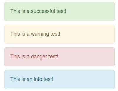
// Manually set the type. PNotify.alert({ text: "I'm an alert.", type: 'notice' }); // Automatically set the type. PNotify.notice({ text: "I'm a notice." }); PNotify.info({ text: "I'm an info message." }); PNotify.success({ text: "I'm a success message." }); PNotify.error({ text: "I'm an error message." });Options
PNotify options and default values.
PNotify.defaults = {
title: false
The notice's title.titleTrusted: false
Whether to trust the title or escape its contents. (Not allow HTML.)text: false
The notice's text.textTrusted: false
Whether to trust the text or escape its contents. (Not allow HTML.)styling: 'brighttheme'
What styling classes to use. (Can be 'brighttheme', 'bootstrap3', 'bootstrap4', or a styling object. See the source in PNotifyStyleMaterial.html for the properties in a style object.)icons: 'brighttheme'
What icons classes to use (Can be 'brighttheme', 'bootstrap3', 'fontawesome4', 'fontawesome5', or an icon object. See the source in PNotifyStyleMaterial.html for the properties in an icon object.)addClass: ''
Additional classes to be added to the notice. (For custom styling.)cornerClass: ''
Class to be added to the notice for corner styling.autoDisplay: true
Display the notice when it is created. Turn this off to add notifications to the history without displaying them.width: '360px'
Width of the notice.minHeight: '16px'
Minimum height of the notice. It will expand to fit content.type: 'notice'
Type of the notice. 'notice', 'info', 'success', or 'error'.icon: true
Set icon to true to use the default icon for the selected style/type, false for no icon, or a string for your own icon class.animation: 'fade'
The animation to use when displaying and hiding the notice. 'none' and 'fade' are supported through CSS. Others are supported through the Animate module and Animate.css.animateSpeed: 'normal'
Speed at which the notice animates in and out. 'slow', 'normal', or 'fast'. Respectively, 400ms, 250ms, 100ms.shadow: true
Display a drop shadow.hide: true
After a delay, close the notice.delay: 8000
Delay in milliseconds before the notice is closed.mouseReset: true
Reset the hide timer if the mouse moves over the notice.remove: true
Remove the notice's elements from the DOM after it is closed.destroy: true
Whether to remove the notice from the global array when it is closed.stack: PNotify.defaultStack
The stack on which the notices will be placed. Also controls the direction the notices stack.modules: {}
This is where options for modules should be defined.
}
PNotify.defaultStack = { dir1: 'down', dir2: 'left', firstpos1: 25, firstpos2: 25, spacing1: 36, spacing2: 36, push: 'bottom', context: document.body }Changing Defaults
PNotify.defaults.width = '400px';Changing a default for modules can be done in a couple ways.
// This will change the default for every notice, and is the recommended way. PNotify.modules.History.defaults.maxInStack = 10; // This will change the default only for notices that don't have a `modules` option. PNotify.defaults.modules = { History: { maxInStack: 10 } };Module Options
Desktop Module
Desktop: {
desktop: false
Display the notification as a desktop notification.fallback: true
If desktop notifications are not supported or allowed, fall back to a regular notice.icon: null
The URL of the icon to display. If false, no icon will show. If null, a default icon will show.tag: null
Using a tag lets you update an existing notice, or keep from duplicating notices between tabs. If you leave tag null, one will be generated, facilitating theupdatefunction.title: null
Optionally display a different title for the desktop.text: null
Optionally display different text for the desktop.options: {}
Any additional options to be passed to the Notification constructor.
}
Buttons Module
Buttons: {
closer: true
Provide a button for the user to manually close the notice.closerHover: true
Only show the closer button on hover.sticker: true
Provide a button for the user to manually stick the notice.stickerHover: true
Only show the sticker button on hover.labels: {close: 'Close', stick: 'Stick', unstick: 'Unstick'}
Lets you change the displayed text, facilitating internationalization.classes: {closer: null, pinUp: null, pinDown: null}
The classes to use for button icons. Leave them null to use the classes from the styling you're using.
}
ℹ️ In v4, it's no longer possible to show closer/sticker buttons when the notice is nonblocking.
NonBlock Module
Requires NonBlock.js 1.0.8 or higher.
It is also deprecated and unnecessary in v4. All it does is add the 'nonblock' class to your notice. You can do the same yourself with addClass: 'nonblock'.
NonBlock: {
nonblock: false
Use NonBlock.js to create a non-blocking notice. It lets the user click elements underneath it.
}
Mobile Module
Mobile: {
swipeDismiss: true
Let the user swipe the notice away.styling: true
Styles the notice to look good on mobile.
}
Animate Module
Requires Animate.css.
Animate: {
animate: false
Use animate.css to animate the notice.inClass: ''
The class to use to animate the notice in.outClass: ''
The class to use to animate the notice out.
}
The Animate module also creates a method, attention, on notices which accepts an attention grabber class and an animation completed callback.
Confirm Module
Confirm: {
confirm: false
Make a confirmation box.focus: null
For confirmation boxes, true means the first button or the button with promptTrigger will be focused, and null means focus will change only for modal notices. For prompts, true or null means focus the prompt. When false, focus will not change.prompt: false
Make a prompt.promptClass: ''
Classes to add to the input element of the prompt.promptValue: ''
The value of the prompt. (Note that this is two-way bound to the input.)promptMultiLine: false
Whether the prompt should accept multiple lines of text.align: 'right'
Where to align the buttons. (right, center, left, justify)
buttons: [ { text: 'Ok', textTrusted: false, addClass: '', primary: true, // Whether to trigger this button when the user hits enter in a single line // prompt. Also, focus the button if it is a modal prompt. promptTrigger: true, click: (notice, value) => { notice.close(); notice.fire('pnotify.confirm', {notice, value}); } }, { text: 'Cancel', textTrusted: false, addClass: '', click: (notice) => { notice.close(); notice.fire('pnotify.cancel', {notice}); } } ]- The buttons to display, and their callbacks. If a button has promptTrigger set to true, it will be triggered when the user hits enter in a prompt (unless they hold shift).
}
Because the default buttons fire notice events on confirmation and cancellation, you can listen for them like this:
const notice = PNotify.alert({ title: 'Confirmation Needed', text: 'Are you sure?', hide: false, modules: { Confirm: { confirm: true } } }); notice.on('pnotify.confirm', () => { // User confirmed, continue here... }); notice.on('pnotify.cancel', () => { // User canceled, continue here... });History Module
History: {
history: true
Place the notice in the history.maxInStack: Infinity
Maximum number of notices to have open in its stack.
}
The History module also has two methods:
PNotify.modules.History.showLast(stack)
Reopen the last closed notice from a stack that was placed in the history. If no stack is provided, it will use the default stack.PNotify.modules.History.showAll(stack)
Reopen all notices from a stack that were placed in the history. If no stack is provided, it will also use the default stack. If stack istrue, it will reopen all notices from every stack.
ℹ️ In v4, the History module can no longer make a dropdown for you. But hey, it's smaller now.
Callbacks Module
The callback options all expect the value to be a callback function. If the function returns false on the beforeOpen or beforeClose callback, that event will be canceled.
Callbacks: {
beforeInit
Called before the notice has been initialized. Given one argument, the options object.afterInit
Called after the notice has been initialized. Given one argument, the notice object.beforeOpen
Called before the notice opens. Given one argument, the notice object.afterOpen
Called after the notice opens. Given one argument, the notice object.beforeClose
Called before the notice closes. Given one argument, the notice object.afterClose
Called after the notice closes. Given one argument, the notice object.
}
Static Methods and Properties
PNotify.alert(options)
Create a notice.PNotify.notice(options)
Create a notice with 'notice' type.PNotify.info(options)
Create a notice with 'info' type.PNotify.success(options)
Create a notice with 'success' type.PNotify.error(options)
Create a notice with 'error' type.PNotify.closeAll()
Close all notices.PNotify.removeAll()
Alias for closeAll(). (Deprecated)PNotify.closeStack(stack)
Close all the notices in a stack.PNotify.removeStack(stack)
Alias for closeStack(stack). (Deprecated)PNotify.positionAll()
Reposition all notices.PNotify.VERSION
PNotify version number.PNotify.defaults
Defaults for options.PNotify.defaultStack
The default stack object.PNotify.notices
An array of all active notices.PNotify.modules
This object holds all the PNotify modules.PNotify.styling
Styling objects.
Instance Methods and Properties
notice.open()
Open the notice.notice.close()
Close the notice.notice.remove()
Alias for close(). (Deprecated)notice.update(options)
Update the notice with new options.notice.addModuleClass(...classNames)
This is for modules to add classes to the notice.notice.removeModuleClass(...classNames)
This is for modules to remove classes from the notice.notice.hasModuleClass(...classNames)
This is for modules to test classes on the notice.notice.refs.elem
The notice's DOM element.notice.refs.container
The notice container DOM element.notice.refs.titleContainer
The title container DOM element.notice.refs.textContainer
The text container DOM element.notice.refs.iconContainer
The icon container DOM element.
From the Svelte Component API
notice.get(option)
Get the value of an option.notice.set(options)
You probably want to useupdate(options)instead. It has some special PNotify secret sauce to make sure your notice doesn't break.notice.observe(key, callback[, options])
Observe an option. See the Svelte docs for more info.notice.destroy()
Removes the component from the DOM and any observers/event listeners. You probably want to useclose()instead. It will animate the notice out and you can open it again. Once you destroy it, you can't open it again.
Events
notice.on(eventName, callback)
Assign a callback to an event. Callback receives aneventargument.notice.fire(eventName, event)
Fire an event.
Stacks
A stack is an object used to determine where to position notices.
Stack properties:
dir1
The primary stacking direction. Can be'up','down','right', or'left'.firstpos1
Number of pixels from the edge of the context, relative todir1, the first notice will appear. If undefined, the current position of the notice, whatever that is, will be used.spacing1
Number of pixels between notices alongdir1. If undefined,25will be used.dir2
The secondary stacking direction. Should be a perpendicular direction todir1. The notices will continue in this direction when they reach the edge of the viewport alongdir1.firstpos2
Number of pixels from the edge of the context, relative todir2, the first notice will appear. If undefined, the current position of the notice, whatever that is, will be used.spacing2
Number of pixels between notices alongdir2. If undefined,25will be used.push
Where, in the stack, to push new notices. Can be'top'or'bottom'.modal
Whether to create a modal overlay when this stack's notices are open.overlayClose
Whether clicking on the modal overlay should close the stack's notices.context
The DOM element this stack's notices should appear in. If undefined,document.bodywill be used.
Stack behavior:
- If there is no
dir1property, the notice will be centered in the context. - If there is a
dir1and nodir2, the notices will be centered along the axis ofdir1. - The
firstpos*values are relative to an edge determined by the correspondingdir*value.dirX === 'up'meansfirstposXis relative to the bottom edge.dirX === 'down'meansfirstposXis relative to the top edge.dirX === 'left'meansfirstposXis relative to the right edge.dirX === 'right'meansfirstposXis relative to the left edge.
- Stacks are independent of each other, so a stack doesn't know and doesn't care if it overlaps (and blocks) another stack.
- Stack objects are used and manipulated by PNotify, and therefore, should be a variable when passed.
⚠️ Calling something likePNotify.alert({text: 'notice', stack: {dir1: 'down', firstpos1: 25}});may not do what you want. It will create a notice, but that notice will be in its own stack and will overlap other notices.
Example Stack
Here is an example stack with comments to explain. You can play with it here.
const stackBottomModal = { dir1: 'up', // With a dir1 of 'up', the stacks will start appearing at the bottom. // Without a `dir2`, this stack will be horizontally centered, since the `dir1` axis is vertical. firstpos1: 25, // The notices will appear 25 pixels from the bottom of the context. // Without a `spacing1`, this stack's notices will be placed 25 pixels apart. push: 'top', // Each new notice will appear at the bottom of the screen, which is where the 'top' of the stack is. Other notices will be pushed up. modal: true, // When a notice appears in this stack, a modal overlay will be created. overlayClose: true, // When the user clicks on the overlay, all notices in this stack will be closed. context: document.getElementById('page-container') // The notices will be placed in the 'page-container' element. };If you just want to position a single notice programmatically, and don't want to add any other notices into the stack, you can use something like this:
PNotify.alert({ text: "Notice that's positioned in its own stack.", stack: { dir1: 'down', dir2: 'right', // Position from the top left corner. firstpos1: 90, firstpos2: 90 // 90px from the top, 90px from the left. } });Features
- Rich graphical features and effects.
- Material, Bootstrap 3/4, Font Awesome 4/5, or the stand-alone theme, Bright Theme.
- Mobile styling and swipe support.
- Timed hiding.
- Slick animations with Animate.css.
- Attention getters with Animate.css.
- Highly customizable UI.
- Sticky notices.
- Optional close and stick buttons.
- Non-blocking notices for less intrusive use.
- Notification types: notice, info, success, and error.
- Stacks allow notices to position together or independently.
- Control stack direction and push to top or bottom.
- Modal notices.
- Confirm dialogs, alert buttons, and prompts.
- RTL language support.
- Feature rich API.
- Desktop notifications based on the Web Notifications standard.
- Dynamically update existing notices.
- Put forms and other HTML in notices.
- By default, escapes text to prevent XSS attack.
- Callbacks for lifespan events.
- Notice history for reshowing old notices.
- Universally compatible.
- Works with any frontend library (React, Angular, Svelte, Vue, Ember, etc.).
- Works well with bundlers (Webpack, Rollup, etc.).
- No dependencies for most features.
Licensing and Additional Info
Copyright 2009-2019 Hunter Perrin Copyright 2015 Google, Inc.
Licensed under the Apache License, Version 2.0 (the "License"); you may not use this file except in compliance with the License. You may obtain a copy of the License at
http://www.apache.org/licenses/LICENSE-2.0 Unless required by applicable law or agreed to in writing, software distributed under the License is distributed on an "AS IS" BASIS, WITHOUT WARRANTIES OR CONDITIONS OF ANY KIND, either express or implied. See the License for the specific language governing permissions and limitations under the License.
See http://sciactive.com/pnotify/ for more information, and demos.
