Animate Transition
Library for transition animations between blocks (pages) in the application.
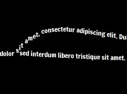
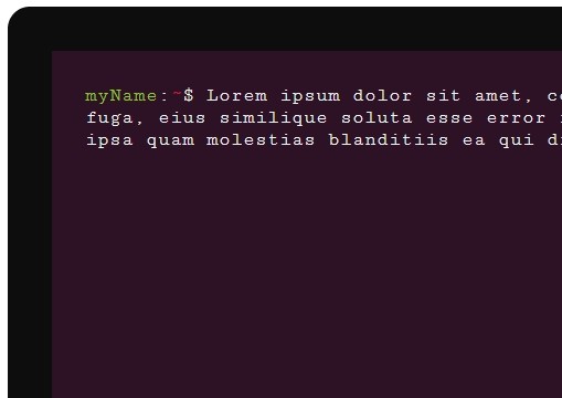
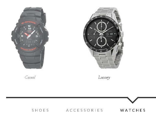
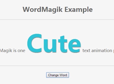
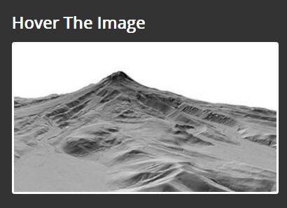
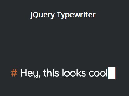
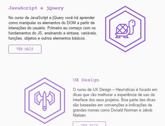
See live examples:
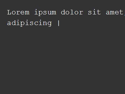
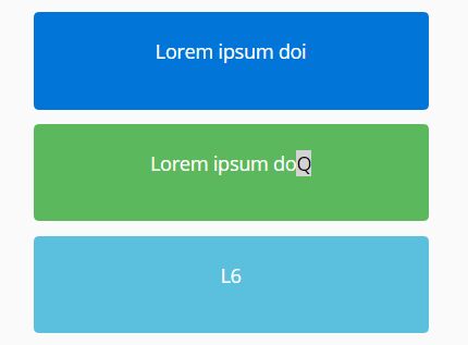
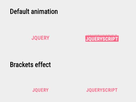
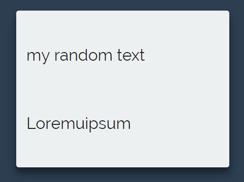
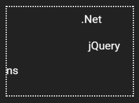
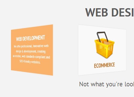
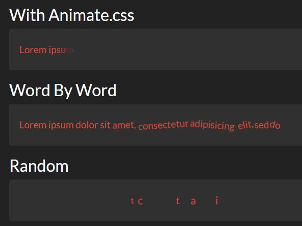
Animate Transition allows you to easily make transition between any two (or more, it all depends on you ) HTML elements. It can be used in different variety of situations, whatever you want to enhance appearance of your web site or navigate between pages in hybrid mobile application.
Animate Transition provides great performance due to using hardware accelerated CSS transitions. You can choose from 12 preset animation types for blocks, 8 animation types for popups or create your own CSS animation.
Animate Transition has no dependencies and supports all modern browsers, including Firefox 31+, Chrome 31+, Safari 7+, Opera 27+, IE 10+, iOS Safari 6.0+, Android Browser 2.3+
###Advantages
- Unlike other libraries,
Animate Transitionlet you not just animate one element, but made a transition between two in a way you like. It also has declarative style and provides callbacks to make sure that your code will be executed in right animation phase. - In order to prevent interaction with the UI during the transition the whole viewport is covered by the overlay.
- You can create & use your own custom transition animation.
Is it better than the pure-CSS approach?
Actually it is the pure-CSS approach in itself - but there is a helper for convenience, which has callbacks in all browsers; animation presets are optimized and work properly; and you write your pure-CSS animation and use it with the helper.
When there are more then two dozen types of browsers on Android only (let alone adding desktops, iOS, and Windows Phone), very often it becomes a real pain without a helper and optimized CSS.
###Usage
Just include animateTransition.min.js and transitions.css
<link rel="stylesheet" href="transitions.css"/>
<script src="animateTransition.min.js"></script>
Want to know how it works? See formatted development version with comments.
###Dependence Nope $)
###Methods
blocksTransition
blocksTransition(options) Takes the object options as the parameter. The object has the following properties:
-
container - container where the animation will take place. If the property is not defined, by default will be used document.body
-
blockIn - block, to which the transition is carried out. If it is not defined, by blockOut the block with the selected animation will disappear from the screen.
-
blockOut - block, from which the transition is carried out. If it is not defined, by blockIn the block with the selected animation will appear. At least one parameter ( blockIn or blockOut ) must be specified. container, blockIn, blockOut can be both css selectors or already existing DOM Elements.
-
animation - animation name. Currently the following blocks animations are supported by default:
slide-inslide-outfade-infade-outcover-incover-outcover-double-incover-double-outrevolution-inrevolution-outbounce-inbounce-out
As for showing popups you can choose from 8 animations:
popup-scale-inpopup-drop-inpopup-revolution-inpopup-fade-incover-incover-left-incover-right-inbounce-in
To hide popup just replace
-inby-outpopup-scale-outpopup-drop-outpopup-revolution-outpopup-fade-outcover-outcover-left-outcover-right-outbounce-out
To create custom animation with animation_name, you need to describe following css classes - .transition-animation_name for container animation, .animation_name-transition-view-to-show for blockIn and .animation_name-transition-view-to-hide for blockOut animation.
beforeTransition(blockIn, blockOut, container)- function that will be performed before the transition; if it is set to false, the animation will not be performed.onTransitionStart(blockIn, blockOut, container, e)- function that will be performed at the start of the transition, where е is the event object.onTransitionEnd(blockIn, blockOut, container, e)- function that will be performed at the end of the transition, where е is the event object.
Properties animation, beforeTransition, onTransitionStart and onTransitionEnd are optional.
Examples
To navigate between two blocks:
AnimateTransition({ container: '.container', blockIn: '.newElement', blockOut: '.oldElement', animation: 'slide-in' });To show popup:
AnimateTransition({ container: '.container', blockIn: '.popup', animation: 'popup-scale-in' });To hide popup:
AnimateTransition({ container: '.container', blockOut: '.popup', animation: 'popup-scale-out' });##License
The MIT License (MIT)
Copyright (c) 2015 Mobidev
Permission is hereby granted, free of charge, to any person obtaining a copy of this software and associated documentation files (the "Software"), to deal in the Software without restriction, including without limitation the rights to use, copy, modify, merge, publish, distribute, sublicense, and/or sell copies of the Software, and to permit persons to whom the Software is furnished to do so, subject to the following conditions:
The above copyright notice and this permission notice shall be included in all copies or substantial portions of the Software.
THE SOFTWARE IS PROVIDED "AS IS", WITHOUT WARRANTY OF ANY KIND, EXPRESS OR IMPLIED, INCLUDING BUT NOT LIMITED TO THE WARRANTIES OF MERCHANTABILITY, FITNESS FOR A PARTICULAR PURPOSE AND NONINFRINGEMENT. IN NO EVENT SHALL THE AUTHORS OR COPYRIGHT HOLDERS BE LIABLE FOR ANY CLAIM, DAMAGES OR OTHER LIABILITY, WHETHER IN AN ACTION OF CONTRACT, TORT OR OTHERWISE, ARISING FROM, OUT OF OR IN CONNECTION WITH THE SOFTWARE OR THE USE OR OTHER DEALINGS IN THE SOFTWARE.

