wsCalendar ( Plugin for jQuery )#
==================================================
Generals
The wsCalendar is a jQuery plugin that provides datepicking features. It is easy to use and includes bunch of useful functions.
Tested on
- IE11, Edge 20.x ( Deprecated IE versions not tested. But maybe supports IE9+ )
- Chrome 47.x
- FireFox 43.0
- Opera 34.0
- Safari 5.1.7
How to use( Introduce )
Any number of plain HTML input text elements can be wrapped into single div element with CSS class name of 'ws-datepicker'. The wsCalendar will convert them into the wsCalendar's styled input elements.
The following code fragments demonstrates three usages of it.
- Range Selection
- Auto Dimming
- Single Pick
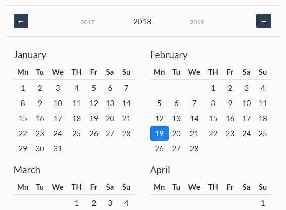
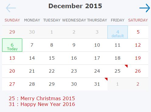
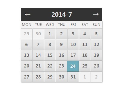
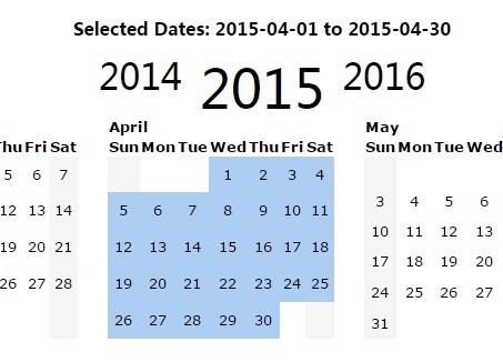
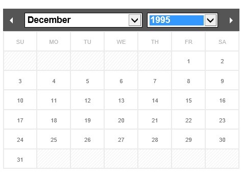
... <link rel="stylesheet" type="text/css" href="./css/ws-calendar.default.min.css" /> <script src="http://code.jquery.com/jquery-1.11.3.min.js"></script> <script type="text/javascript" src="./js/ws-calendar-min.js"></script> ... <script type="text/javascript"> $( function() { $( ".myOwnClass" ).wsCalendar(); }); </script> ... <body> <!-- Range Selection --> <div class="myOwnClass"> <input name="dateFrom" type="text" value="2015-12-09"> ~ <input name="dateTo" type="text" value="2015-12-31"> </div><br><br> <!-- Auto Dimming --> <div class="myOwnClass"> <input name="dateBegin" type="text" value="2015-12-09" readonly> ~ <input name="dateEnd" type="text" value="2015-12-31"> </div><br><br> <!-- Single Pick --> <div class="myOwnClass"> <input name="myBirthDay" type="text" value="2010-10-22"> </div> ...The following images are rendering results of the code fragments above.
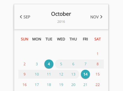
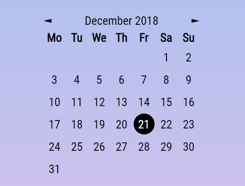
-
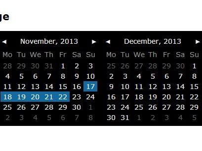
Range selection

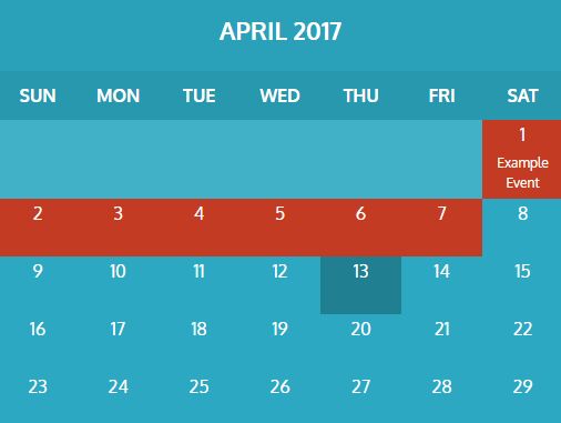
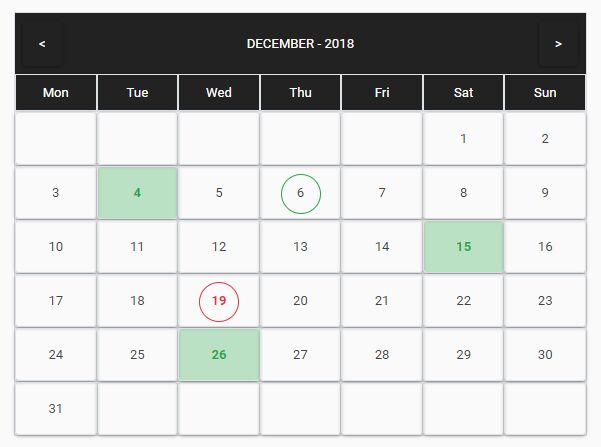
-
Auto Dimming

-
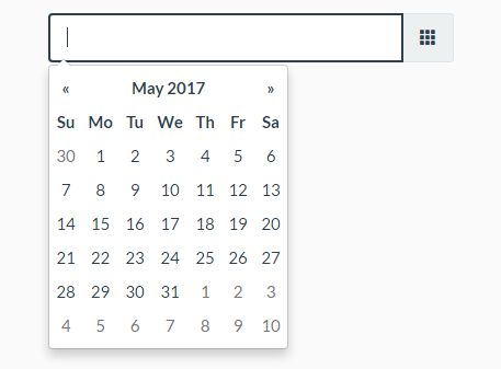
Single Pick


Construction
wsCalendar is a sort of plug-in of jQuery. So construction could be done like below.
<script type="text/javascript"> $( "div.specificSelector" ).wsCalendar(); // or $( "div.specificSelector" ).wsCalendar( { /* options.. */ } ); </script>Features
wsCalendar has some of customizable options and built-in options which are user can not modifying. The customizable options can be modified when contruction-time via parameters.
Built-in features
Auto Dimming
Automatically block user actions for readonly input fields.
Auto input field style transformation
Automatically transform plain text input fields to CSS styled composite input fields.
Customizable Options
All of customizable options could be combined when construct the wsCalendar.
Changing icon images
User can customize images by change option key-value pair when contruct.
In general, just define your own image-base-url( eg. "./images" ).
( Some of the case, CSS definition has to be changed. )
$( "div.ws-datepicker" ).wsCalender({ "image-base-url" : "./images" , "icon-picker" : "btn_icon_ws_datepicker_picker_default.gif" });- option key
- image-base-url
- icon-picker
- icon-remover
- icon-close
- icon-input-locked
- icon-locked
- icon-today
- icon-prev-month
- icon-next-month
- bg-img-readonly-cover
- bg-img-footer
- option vlaue
- image file name( eg. "my-calendaer-image.gif" )
Input-filter
The wsCalendar using YYYY-MM-DD format internally. So, if you want to use another date format, you can simply override converting filter function when construct. In case of this, you have to override output-filter as well.
// When date format is YYYY.MM.DD $( "div.ws-datepicker" ).wsCalender({ "input-filter" : function( inputValue ) { return inputValue.replace( /[\.]/g, "-" ); } });- option key : input-filter
- option value : funtion definition( must return YYYY-MM-DD formatted date string object from your own formatted string. )
Output-filter
As metioned in input-filter description, the wsCalendar produces YYYY-MM-DD format originally. So, if you overrided input filter, you have to override output-filter also.
// When date format is YYYY.MM.DD $( "div.ws-datepicker" ).wsCalender({ "output-filter" : function( wsFormattedDateString ) { return wsFormattedDateString.replace( /[-]/g, "." ); } });- option key : output-filter
- option value : function definition( must return your own date format string from YYYY-MM-DD formatted string object. )
Day offset marker
When there are two or more input fields, the wsCalendar turns into the range selection mode. In this case, wsCalendar shows date offset marker that indicates days between two dates on calendars. This day-offset-marker not only shows offset between dates, but also directly jump to specific date after user input. This option switch enable and disable this option. Default value if true.
// Disable day-offset-marker( default : true ) $( "div.ws-datepicker" ).wsCalender({ "day-offset-marker" : false });- option key : day-offset-marker
- option value : true(default) / false
Day offset begin
The offset between two days can be presented by several ways. The same day could be 1 day-offset and 0 day-offset either. Assume that first picked day of first calendar is 2015-12-11, and second one is 2015-12-11. In some case, this is 1 day long. But in other case, this is 0 day long. It is totally depending on a business requirements. So, wsCalendar provide the option to clarify this ambiguous situation.
// In the case of 2015-12-11 ~ 2015-12-11 is 0 day long. $( "div.ws-datepicker" ).wsCalender({ "day-offset-begin" : 0 }); // In the case of 2015-12-11 ~ 2015-12-11 is 1 day long. $( "div.ws-datepicker" ).wsCalender({ "day-offset-begin" : 1 }); // In the case of 2015-12-11 ~ 2015-12-11 is 2 days long.( What? ) $( "div.ws-datepicker" ).wsCalender({ "day-offset-begin" : 2 });- option key : day-offset-begin
- option value : offset value when picked dates are same.
Calendar Tip
When wsCalendar is activated, you could set the tri-angular tip on the top-left corner of the picker pane. This value is true by default.
// Hide tri-angular tip on the top-left corner of datepicker $( "div.ws-datepicker" ).wsCalender({ "show-calendar-tip" : false });- option key : show-calendar-tip
- option value : true(default) / false
Prevent inversion of dates
When there are two or more input fields in wrapping div, wsCalendar renders two or more pickable calendars automatically. In this case, dates must be sequencial(ascending) order from first to the end. This option provides sort of UI validation. It is enable by default, but if you want to turn it off, construct wsCalendar with false option of it.
// Turn off Prevent-Inversion-of-Dates $( "div.ws-datepicker" ).wsCalender({ "prevent-inversive-date" : false });- option key : prevent-inversive-date
- option value : true(default) / false
Customizing confirm text
In the multiple calendars mode, the plugin could not know when the user input ends. So, user must click "Confirm" button when complete picking. This button enables automatically when multiple calendars mode activated. This option can set the text of the button.
// Confirm button text for i18n. $( "div.ws-datepicker" ).wsCalender({ "confirm-text" : "확인" });- option key : confirm-text
- option value : string( "Ok" is default value )
Customizing day names
For internationalization(i18n), the day names could be set by option. It must be started with Sunday in forms of string array. English names are default value.
// Korean $( "div.ws-datepicker" ).wsCalender({ "day-names-array" : [ "일", "월", "화", "수", "목", "금", "토" ] }); // English( default ) $( "div.ws-datepicker" ).wsCalender({ "day-names-array" : [ "Sun", "Mon", "Tue", "Wed", "Thu", "Fri", "Sat" ] }); // Chinese $( "div.ws-datepicker" ).wsCalender({ "day-names-array" : [ "天", "一", "二", "三", "四", "五", "六" ] });- option key : day-names-array
- option value : string array starts with Sunday.
Customizing colors of days
As far as I know, many of calendars presents Sunday as red, Saturday as blue, and weekdays as black. But this can be changed by option using CSS color codes array. As same as "day-names-array" above, Sunday's color must be first element of the array.
$( "div.ws-datepicker" ).wsCalender({ "colors-of-days-array" : [ "#D50000", "#2A2A2A", "#2A2A2A", "#2A2A2A", "#2A2A2A", "#2A2A2A", "#1A1AFF" ] });- option key : colors-of-days-array
- option value : CSS color codes array start with Sunday's color.
Minimum value of year
Sets the minimum value of year selector. By default, the min. value is 10 years before from today.
// Mininum year is 20 years before from today. $( "div.ws-datepicker" ).wsCalender({ "min-year" : ( new Date() ).getFullYear() - 20 });- option key : min-year
- option value : Positive integer can be year value( YYYY )
Maximum value of year
Sets the maximum value of year selector. By default, the max. value is 10 years later from today.
// Maximum year is 20 years after from today. $( "div.ws-datepicker" ).wsCalender({ "max-year" : ( new Date() ).getFullYear() + 20 });- option key : max-year
- option value : Positive integer can be year value( YYYY )
Input field editable
Sets whether input fields can be edited or not when the wsCalendar picker pane is activated. By default, user could not edit input field directly when datepicker pane is activated.
// Enable user editing when datepicker is activated. $( "div.ws-datepicker" ).wsCalender({ "editable" : true });- option key : editable
- option value : true / false( default )
Arrow key enabled
When the "Input field editable" option is on, user can adjust date value by arrow keys. If upward key pressed, date value will be increased. If downward key pressed, date value will be decreased.
// Disable arrow key capturing $( "div.ws-datepicker" ).wsCalender({ "arrow-key-enabled" : false });- option key : arrow-key-enabled
- option value : true( default ) / false


