tinyDatePicker and calendar
This 5KB (gZip; 12.5KB minified) small date/time picker provides a lot of hooks for developers to write calendars, agendas, booking systems, plugins, etc. This is not only a picker but a set of modules that can be used to build a date/agenda based app. The flexibility of this tool makes integration of bootstrap or other frameworks easy.
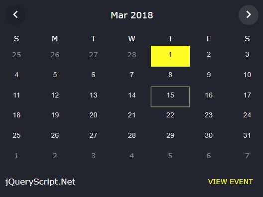
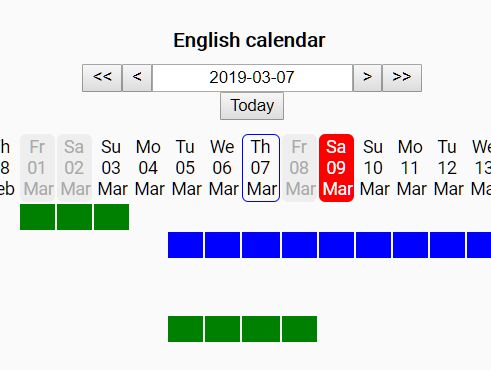
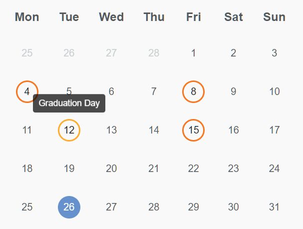
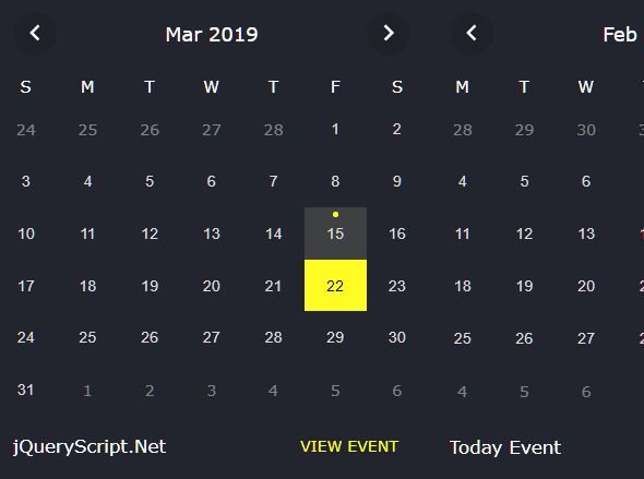
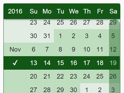
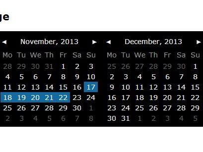
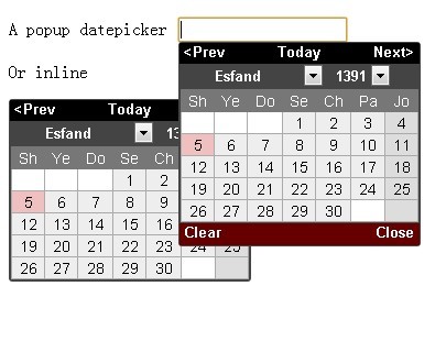
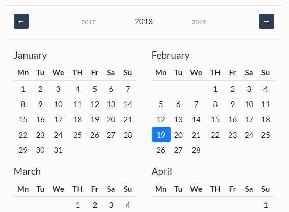
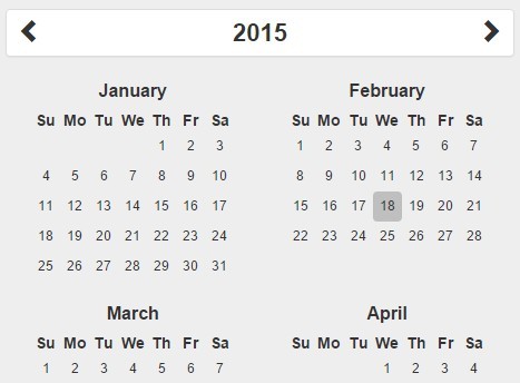
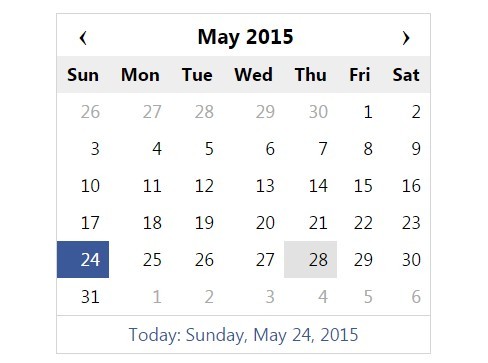
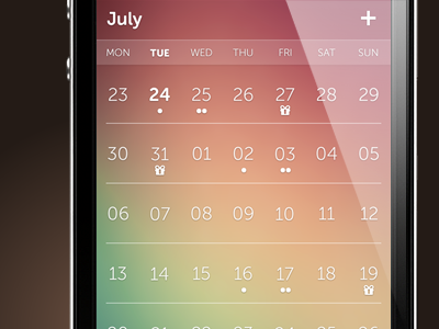
##Demo See demos at:
- dematte.at/tinyDatePicker
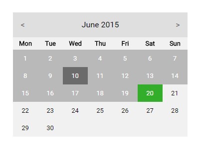
- or a clean version at dematte.at/tinyDatePicker/themes/naked
- extended clean version in white dematte.at/tinyDatePicker/themes/white
Usage
<script type="text/javascript" src="jqDatePicker.min.js"></script> <script type="text/javascript"> $('.date').datePicker([options]); // that's it </script>jqDatePicker.min.js (the jQuery version) holds all necessary files such as calendar.js, datePicker.js and jqDatePicker.js. So, it is not needed to include anything else than this file (except some CSS that makes your datePicker look nice).
If you need to debug things for development, you can also use calendar.js, the month/week rendering module, datePicker.js, the javascript UI and picker module and jqDatePicker.js, the jQuery wrapper separately.
<script type="text/javascript" src="calendar.js"></script> <script type="text/javascript" src="datePicker.js"></script> <script type="text/javascript" src="jqDatePicker.js"></script> <script type="text/javascript"> $('.date').datePicker([options]); </script>If you don't want a jQuery dependency just use datePicker.min.js (the javascript version):
<script type="text/javascript" src="datePicker.min.js"></script> <script type="text/javascript"> var myDates = new DatePicker('.date', [options]); // first arg. can also be ElementCollection/Array or $() </script>or for debugging:
<script type="text/javascript" src="calendar.js"></script> <script type="text/javascript" src="datePicker.js"></script> <script type="text/javascript"> var myDates = new DatePicker('.date', [options]); // first arg. can also be ElementCollection/Array or $() </script>datePicker.js doesn't render anything or installs event listeners for the UI and doesn't initialize Caledar until you first use it (focusing / clicking an input field) to save memory and keep markup as small as possible.
The standard date/time formats datePicker works with is: 'YYYY-MM-DD HH:MM:SS AM' whereas -DD is optional if no time is set and :SS, AP/PM and the time as such is also optional. It is possible to only set the time though too. Then datePicker works as a time picker only. See also demo on how to use data attributes in input fields to pick up some options from there.
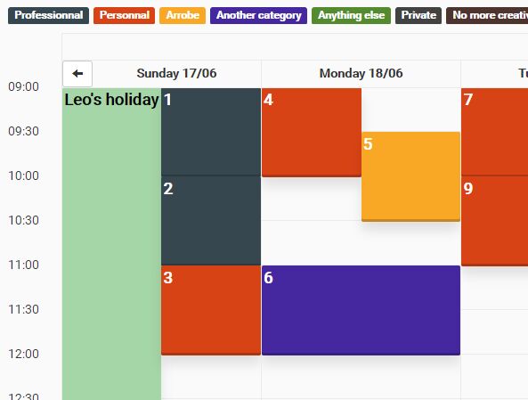
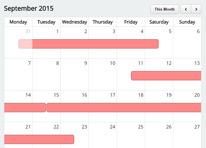
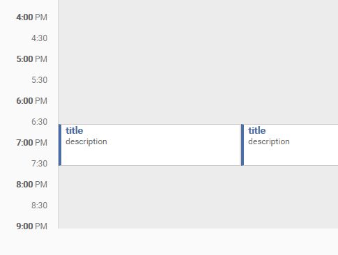
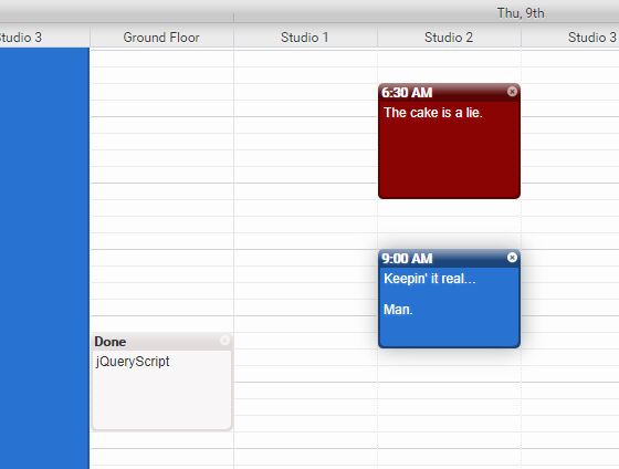
See the Demos at /demo/index.html or dematte.at/tinyDatePicker for more examples on how calendar.js and datePicker.js can be used. You can also build a whole agenda app with only a fiew options added...
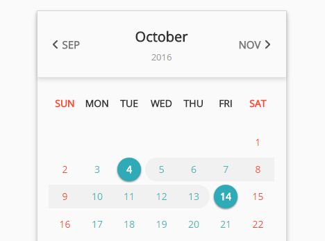
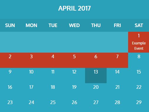
Themes
calendar and datePicker are, because of their options, very flexible in how to render markup so that it is very easy to change the look and feel and the grade of information you want to provide in your calendars. Changing from a table-based month view to a div-based view (see month.js) is that easy and you're also free in chooseing, changing and adding your own class names and markup.
The CSS in the demo is not very useful (quick and dirty), so you might want to make your own anyhow. (demo/month.css holds some rendering of the common month rendering incl. events etc., demo/datePicker.css is the CSS for the UI of datePicker excluding the months). I prepared a simple, unstyled version in ./naked/index.html (including CSS and days-of-week rendering) to show you a clean starting point for your styling.
So, feel free to participate and create some nice themes and let me know where they are: I'll publish the links to your work right here.
- See "white" simple demo at ./themes/white/index.html or dematte.at/tinyDatePicker/themes/white/
AMD / CommonJS wrapper
tinyDatePicker supports AMD and CommonJS import in all, the minified versions and the single files (calendar.js, datePicker.js and jqDatePicker.js).
// example for requirejs configuration requirejs.config({ baseUrl: 'scripts', paths: { jquery: 'lib/jquery-2.2.1.min' }, shim: { 'datePicker': { deps: [ 'jquery' ], exports: 'jQuery.fn.datePicker' } } }); // then use tinyDatePicker in your module... (function (root, factory) { if (typeof define === 'function' && define.amd) { define(['jquery', 'jqDatePicker'], function (jQuery) { return factory(root, jQuery); }); } else { factory(root, root.jQuery); } }(this, function(window, $){ $('.date').datePicker(options); }));jqDatePicker.js
jqDatePicker.js is a jQuery plugin (actually just a wrapper for datePicker.js) and uses an instance of Calendar (from calendar.js) for rendering months and weeks. It passes the options to that instance, so some values might be the same when inspecting...
$('.date').datePicker({ // the datePicker options useCache: false, // disables calendar's cash for use with ranges closeOnSelect: true // weather the picker auto closes after picking a date or not elements: '.date', // the selector for the input fields using datePicker body: document.body, // element the picker should be depended on pickerAttribute: 'data-picker', // attribute used for internal date transfer datePickerClass: 'date-picker', // class name of the datePicker wrapper selectedDayClass: 'selected-day', // class name for date representing the value of input field disabledClass: 'disabled', // class name for disabled events initCallback: function(elements) {}, // callback used right after datePicker is instantiated (no calendar available) // the following callbacks hold standard routines that can be overwritten renderCallback: function(container, element, toggled) {}, // every time the picker gets toggled or redrawn (by UI action) renderValue: function(container, element, value) {}, // when date is picked, the value needs to be transferred to input readValue: function(element) {}, // when toggling the datePicker, this will pick up the value of the input field header: 'some HTML', // the HTML rendered before the display of the month. The following strings will be replaced: // {{disable-prev}}, {{prev}}, {{disable-next}}, {{next}}, {{day}}, {{month}}, {{months}}, {{year}}, {{years}} // look at the code (original option HTML) and it's clear what all those placeholders mean nextLabel: 'Next month', // text written instead of {{next}} prevLabel: 'Previous month', // text written instead of {{prev}} minDate: '1969-01-01', // standard minimal displayable date maxDate: '2050-12-31', // standard maximal displayable date minDateAttribute: 'data-mindate', // attribute that could hold minimal displayable date data maxDateAttribute: 'data-maxdate', // attribute that could hold maximal displayable date data // classes for event listeners (click) nextButtonClass: 'dp-next', // next month button class name prevButtonClass: 'dp-prev', // previous month button class name selectYearClass: 'dp-select-year', // select year element class name selectMonthClass: 'dp-select-month', // select month element class name footer:'some HTML', // the HTML rendered after the display of the month. The following strings will be replaced: // {{hour}}, {{hours}}, {{minute}}, {{minutes}}, {{second}}, {{seconds}}, {{am-pm}}, {{am-pms}} timeFormat: '', // can be HH:MM:SS AM, HH:MM AM, HH:MM:SS or HH:MM timeFormatAttribute:'data-timeformat', // attribute holding the timeFormat information if different from standard doAMPM: false, // switch for standard AM / PM rendering minuteSteps: 5, // steps of minutes displayed as options in {{minutes}} secondSteps: 10, // steps of seconds displayed as options in {{seconds}} AMPM: ['AM', 'PM'], // rendered strings in picker options and input fields // classes for event listeners (change of selects) selectHourClass: 'dp-select-hour', // class name of select for hours selectMinuteClass: 'dp-select-minute', // class name of select for minutes selectSecondClass: 'dp-select-second', // class name of select for seconds selectAMPMClass: 'dp-select-am-pm', // class name of select for AM/PM rangeStartAttribute: 'data-from', // attribute holding the name of the other input in a range collective (either rangeEndAttribute or name attribute) rangeEndAttribute: 'data-to' // attribute holding the name of the other input in a range collective // the Calendar options picker: {}, // reference to instance of datePicker sundayBased: true, // renders weeks starting with Monday or Sunday renderWeekNo: false, // enables / disables rendering of week numbers renderDaysOfWeek: true, // depends also on template.start. {{days}} has to be returned as well equalHight: false, // renders extra days in next month to keep heights (row count) of all months the same useCache: true, // month that has been rendered will be cached on never be calculated again (also events) months: ['Jan', ...], // array of strings of all months in a year weekDays: ['Su', ...], // array of strings of week days workingDays: [1, 2, 3, 4, 5], // Date() based; 0 = Sun; others will be signed as week-end events: [], // see below for more information, template: { // holds all template based elements: start: function() {return '<table class="cal-month">{{days}}<tbody><tr>'}, // callback that returns the HTML needed for the beginning of a month. {{days}} will be replaced by days of week HTML (if enabled) daysOfWeekStart: '<thead><tr>', daysOfWeek: '<th class="day-of-week">{{day}}</th>', daysOfWeekEnd: '</tr></thead>', daysOfWeekHead: '', colGlue: '</tr><tr>', // HTML for connecting every week (row) weekNo: '<td class="">{{day}}</td>', // HTML used to render a week number row: '<td class="">{{day}}</td>', // HTML used to render a regular day end: function() {return '</tr></tbody></table>'}, // callback that returns the HTML needed for the end of a month today: _noop, // callback that returns the HTML for replacing {{today}} in template.row day: _noop, // callback that returns the HTML needed for replacing {{day-event}} in template.row event: _noop, // callback that returns the HTML needed for replacing {{event}} in template.row }, todayClass: 'today', // class name for the current day weekEndClass: 'week-end', // class name for week-end day prevMonthClass: 'previous-month', // class name for day in previous month nextMonthClass: 'next-month', // class name for day in next month currentMonthClass: 'current-month', // class name for day in current month weekNoClass: 'week-no' // class name for week numbers });The rendering engine of Calendar
datePicker's power lies in its flexibility. It might seem a little complicated but if you got the idea, you'll love it.
in calendar.js you have all the options for rendereing seperated in options.template. Calendar loops through all the days and replaces some placeholders in template strings, defined in several other options, with every day. Most replacements are done by the return value of a function (start, end, today, day, event (where this is the instance and scope of the function)) and the others are strings that can hold placeholders that then are replaced (weekNo, row). colGlue is the HTML used to end a row (in case you're using tables).
The placeholders {{year}}}, {{month}}, {{day}} are the simple replacements (only numbers) and {{day-event}}, {{today}} and {{event}} get replaced by the callbackFunction's return value ( day(), today() and event()). So, row and weekNo are the most important options for every-day-rendering. They hold the most placeholders. (In your callBack functions you can certainly define your own placeholders that can be replaced somewhere else...)
For example: In the default options you'll find:
row: '<td class="">{{day}}</td>'So with every day, {{day}} gets replaced by the number of the day. That's it. It's also handy to define the attribute class="" inside this template string (row or weekNo) as it will automatically be filled with the class names you defined earlier in your options (todayClass, weekEndClass (reverse defined by options.workingDays), prevMonthClass, nextMonthClass, currentMonthClass, weekNoClass)
Here is a more complex example:
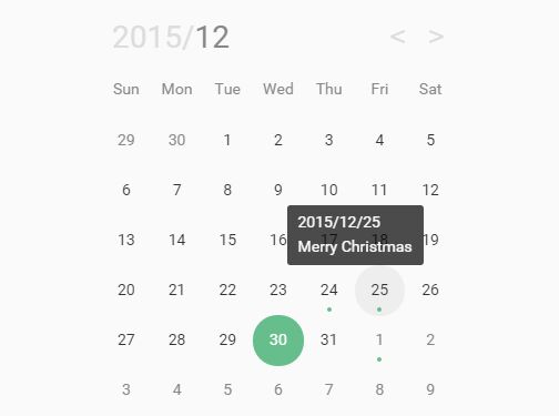
row: '<td class=""{{event}}>{{day}}</td>', event: function(day, date, event) { return ' data-events="true"'; }Let's assume it's June 12th, so in this case, if there where an event defined in options.events for that specific day, the rendering engine would output the following:
<td class="current-month event" data-events="true">12</td>start(), end() and today() are a bit special callbacks as they get rendered only once (if at all, as today might not exist in current displayed month...). You might have guessed already, start() gets only rendered at the beginning, end() only at the end of the HTML rendering and today() only if the current rendered day is actually today.
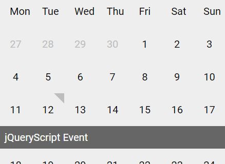
In the demo page you can see how I use start() to render the days of the week ('Mo, Tu, We, ...) in a <thead>. By defining options.template.start you have to keep in mind that you're actually overwriting the default callback, so the default rendering doesn't happen any more (The same for initCallback, renderCallback, renderValue and readValue, the callBack functions of datePicker.js you'll hear about later on).
The rendering in datePicker() works with the same idea: options.header and options.footer can be replaced by some other markup and placeholders like {{prev}} etc. will be replaced the same way (see default HTML with its placeholders and replaced HTML in browser and you'll see the logic behind, it's quite straight forward)
datePicker.js
datePicker.js works the same way as jqDatePicker.js. It's the javascript only version and has the same options. Only the initialization works differently (See Usage)
Methods
datePicker.js
destroy(): removes all event listeners, detaches the markup from the document and removes some variables.
toggle(on[, element]): toggles the datePicker on its last trigger or on element; true = on
calendar.js
addEvent(event, id): Adds an event to the list of events and automatically converts the dates to the internal format. See format of events below (Some tips). id marks the events for easy removal later on. Doesn't necessarily be unique.
removeEvent(id): Removes above described events marked by the id attribute.
getMonth(year, month, week): Returns markup described by the template options from a given year / month. If optional week is set (relative to month) you'll only get this week.
getWeekNumber(date): Returns the number of the week described by ISO 8601. date can be a date object, a number as milliseconds or a string that converts to a date if passed to Date.
convertDateString(string, end): Receives a string stringlike 'YYYY-MM-DD HH:MM:SS' where the time is optional. end is a boolean that adds 23:59:59 to the date to make it the very end of the day. Returns a date in milliseconds.
See the following section or the demos on how the callbacks work and what you can do with them...
Some tips
Callbacks from datePicker.js
All callbacks deliver this as a reference to the instance of DatePicker()
initCallback: function(elements) {} Is called right after DatePicker() is initialized. Calendar() is not available yet. elements is the list of all elements (for example $('.date')) that are listening to the click or focus events.
renderCallback: function(container, element, toggled) {} Is called every time the picker gets visible, hidden or redrawn. toggled is true if the picker was just toggled on or off. To determine if it was turned on or off you can read the attribute this.isOpen. toggled is undefined when callback gets called on resize. If you define your own function and still want the default action to happen (positioning, hideing), return a true or the element the picker should be positioned to, or return falsy value if you do your own stuff and want to prevent default behaviour (maybe you need to position above, aside, ...).
renderValue: function(container, element, value) {} Is a method that gets called when the user clicked on a date on the picker. It gives you access to the container, the picker UI, element, the current input field and value, the choosen value in the format YYYY-MM-DD HH:MM:SS AM where as -DD, :SS and AM are optional. If you define your own function and still want the default action to happen, return a true or the element the value should be passed to. Otherwhise nothing will happen unless you wrote it in your own code.
readValue: function(element) {} Method called when the picker opens and picks up the value where as element is the input field that was focused. Return your own value if not from default input field.
Other Callbacks from calendar.js
calendar.js has some callbacks in its templating engine to return a string that replaces a certain string in the template or get called in the beginning or end of the rendering.
start: function() {}, gets called befor the month/week gets rendered. Use this, for example to render the start of a table...
end: function() {}, Same as above, just at the end of the rendering.
today: function() {}, replaces {{today}} in your row template
day: function() {}, replaces {{day-event}} in your row template
event: function() {}, replaces {{event}} in your row template
All callbacks are called in the context of this, the instance of its constructor. So, inspect the instance to discover some more helpful properties of the model such as date, the rendered date, currentDate the value of the current input field, currentInput and currentPartner, the input field and a possible connected input field for ranges, etc.

