bootstrap-modal-alerts
jQuery Plugin emulating the Bootstrap alerts that are modal Contributors: jklein / YoloBits License: MIT
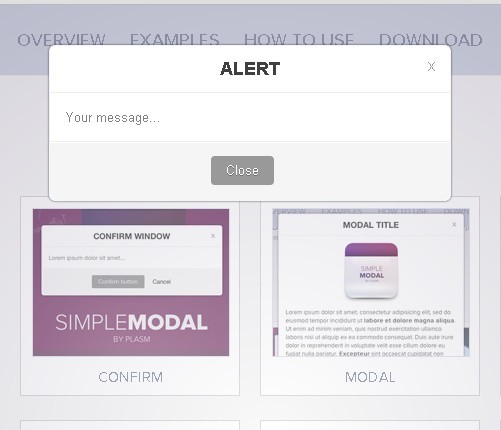
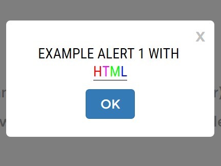
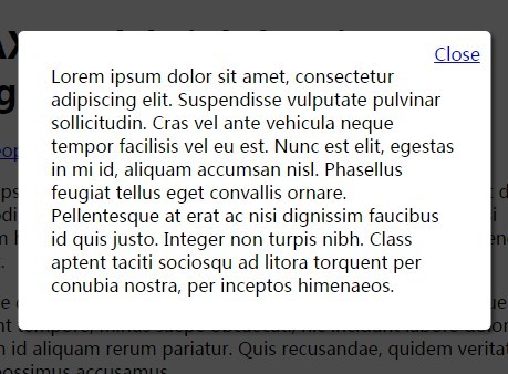
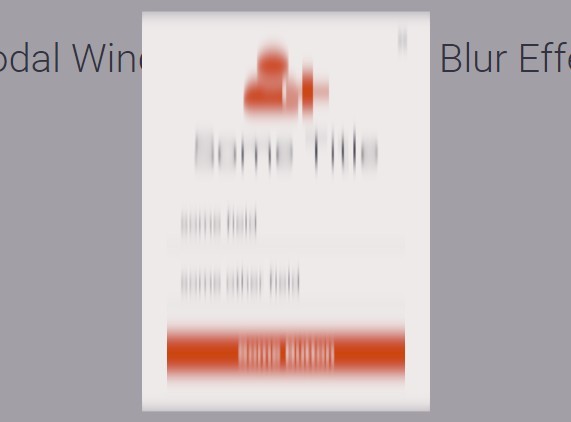
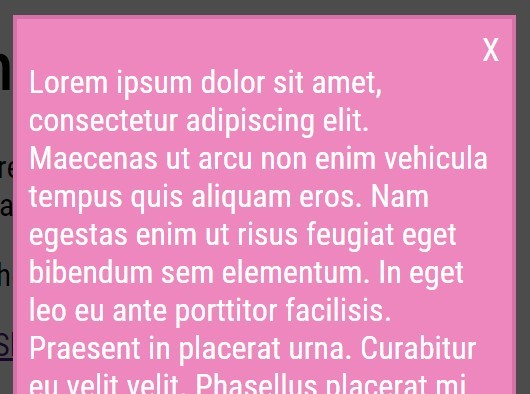
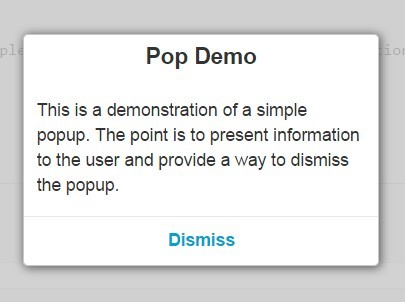
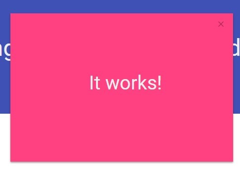
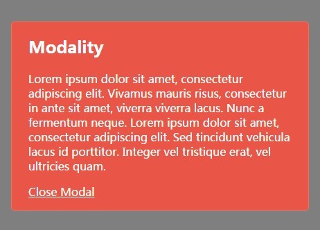
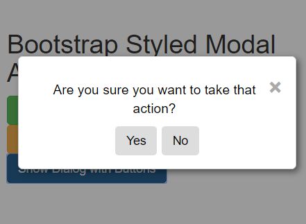
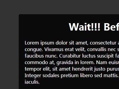
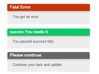
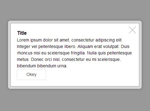
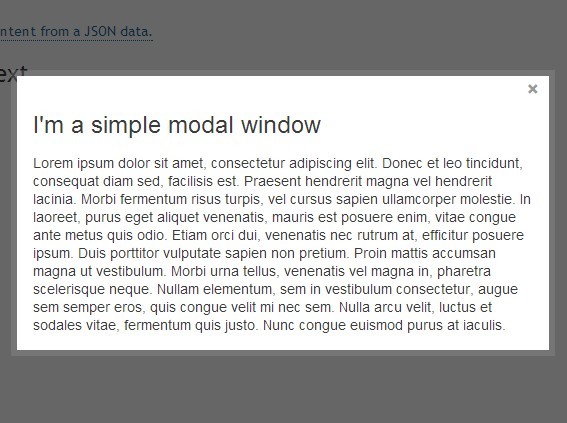
Bootstrap like Alerts that are modal and Popover. Simple to use jQuery plugin. Supports Bootstrap CSS
== Description ==
Simple jQuery plugin for enabling BootStrap style alerts that are popover and modal.
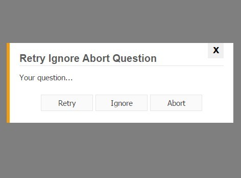
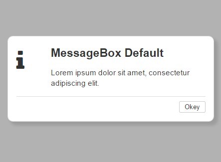
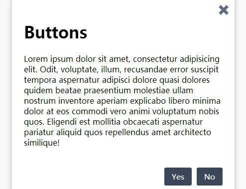
Also supports a single or two button dialog that can be used for Confirmation dialogs and Alerts with a single button.
Callback function feature lets you know when the modal has been dismissed and what button was used to dismiss the dialog. Pass data to the dialog and have it returned to you in the callback.
== Installation and usage == The plugin overview and a description of many of the features go to: http://yolobits.com/bootstrap-modal-alerts/
See the boot-modal-alerts.html file for fully working samples or go to: http://yolobits.com/bootstrap-modal-alert/demo/boot-modal-alerts.html for a demo
- include alert-modal.css or alert-modal.min.css into your page
- include alert-modal.js or alert-modal.min.js into your page
- include bootstrap on your page.
- create a div with the class alert-modal
- initialize the modal in your jQuery onReady function.
- show the modal using the plugin's show method passing it the required json input.
== Frequently Asked Questions ==
- How can I change the buttons on the dialog?
- The buttons use the bootstrap classes "btn" and "btn-primary" so if you override those two classes, you will get the buttons defined by those two CSS classes.
== Upgrade Notice ==
= 1.0.1 =
initial release
== Changelog ==


