pop.js
Simple JavaScript Popup Library
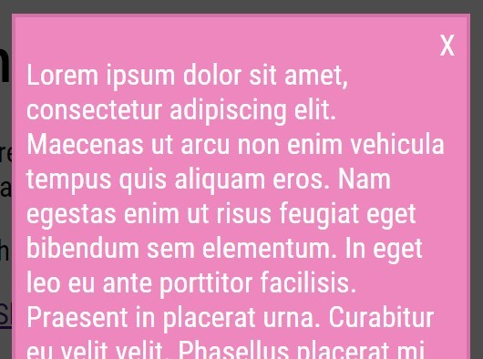
pop.js is a simple to implement, option-based, jQuery dependent, client-side Javascript library. The Library is designed to allow the developer to simply reference the pop.js file and accompanying pop.css file in their project, then call a simple function and pass an options object in JSON format. pop.js is a powerful way to deliver highly customizable popup notifications to the end user.
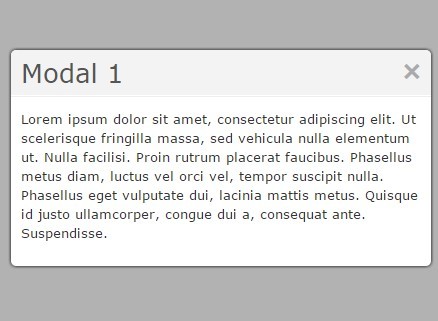
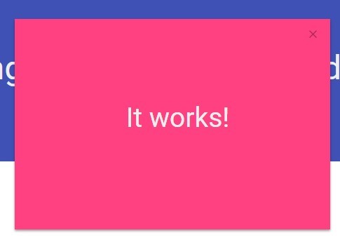
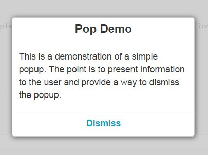
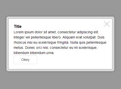
###Default Pop up Call the `simplePopup({options},[callback])` function and pass a Title, Body, and the text for the popup dismissal button in a JSON object as seen in the following example:
Source Code
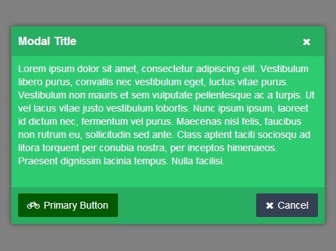
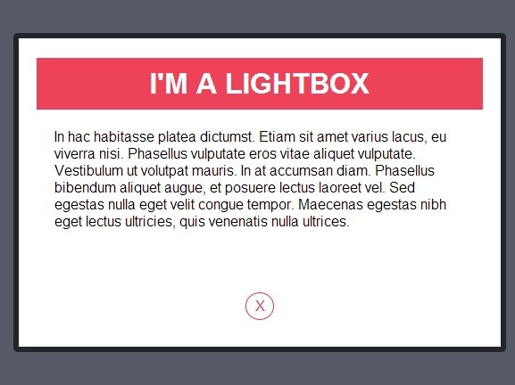
simplePopup({ 'pop-title': 'Pop Default Demo', 'pop-body': 'This is a demonstration of a simple popup. The point is to present information to the user and provide a way to dismiss the popup.', 'btn-text': 'Dismiss' });Example Server
To run the example server with the provided example page, perform the following steps:
- Ensure that you have
node.jsorio.jsinstalled on your system. - Clone the pop.js repository.
- Open a terminal and cd to the
exampledirectory. - Run
npm install. - Run
node app. - Copy
pop.min.jsandpop.min.cssto theexample/public/directory. - Open your browser and point it to
localhost:3000.
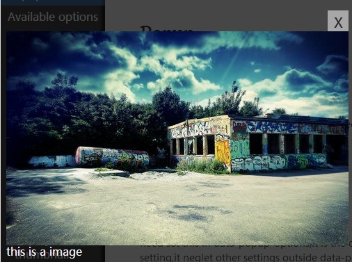
##Options A full range of option are available in order to customize the popup's look and feel. Below is a full list of optional object literals dispalying the literal name and possible literal values:
AVAILABLE OPTIONS
| Option Name | Options (defaults highlighted) | ||||
|---|---|---|---|---|---|
| shrink-in: | true | false | |||
| slide-in: | true | false | |||
| slide-out: | true | false | |||
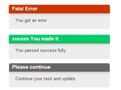
| btn-style: | 'primary' | 'error' | 'success' | 'default' | 'none' |
| round-corners: | true | false | |||
| head-align: | 'left' | 'center' | 'right' | ||
| body-align: | 'left' | 'center' | 'right' | ||
| foot-align: | 'left' | 'center' | 'right' | ||
| header-bg-shade: | true | false | |||
| footer-bg-shade: | true | false | |||
| dragable: | true | false | |||
| auto-break: | -1 | [integer] | |||
| pop-title: | {string} | ||||
| pop-body: | {string} | ||||
| btn-text: | {string} | ||||
| click-fn: | {function} | ||||
##Option Definitions
-
shrink-in: This option, when set to true, causes the popup to shrink slightly while fading in.
-
slide-in: This option, when set to true, causes the popup to slide upward slightly while fading in.
-
slide-out: This option, when set to true, causes the popup to slide downward slightly while fading out.
-
btn-style: This option allows a choice between four different color schemes (primary=blue, error=red, success=green, default=grey) for the dismissal button as well as a fifth option (none) where no "button" is displayed but the entire popup footer becomes the button.
-
round-corners: This option, when set to true, causes the popup to have rounded corners.
-
head-align: This option aligns the contents of the header bar to the setting designated - left, center, or right.
-
body-align: This option aligns the contents of the popup body to the setting designated - left, center, or right.
-
foot-align: This option aligns the contents of the footer bar to the setting designated - left, center, or right.
-
header-bg-shade: This option toggles a shaded background on the header bar.
-
footer-bg-shade: This option toggles a shaded background on the footer bar.
-
dragable: This option, when set to true, allows the popup to be dragged by the header bar to a new position.
-
auto-break: This option, by setting the value to a positive integer, modifies the text supplied in the 'pop-body' so that it word wraps at the first white space after the count of characters equal to the supplied integer. This option only applys to text only content. Content containing hypertext markup will be inserted as-is.
-
click-fn: The 'click-fn' (click function) option can be defined in the options object literal to cause a custom action to occur at popup dismissal. This can be handled in one of two ways:
Anonymous Function
'click-fn': function() { some code here;}
Named Function
'click-fn': doThatThing // where 'doThatThing' is a call to a valid function
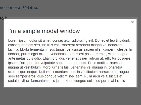
###Custom Pop up
Below is an example of a customized popup using some of the options discussed above.
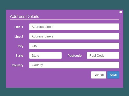
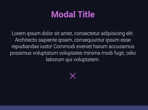
simplePopup({ 'shrink-in':true, 'slide-in':true, 'slide-out':true, 'btn-style':'success', 'round-corners':true, 'head-align':'center', 'body-align':'center', 'foot-align':'right', 'header-bg-shade':false, 'footer-bg-shade':true, 'dragable':true, 'auto-break': 25, 'pop-title':'Pop Custom Demo', 'pop-body':'This is a demonstration of a customized popup. Notice the differences in style and presentation.', 'btn-text':'Dismiss', 'click-fn':sampleExitTask });


