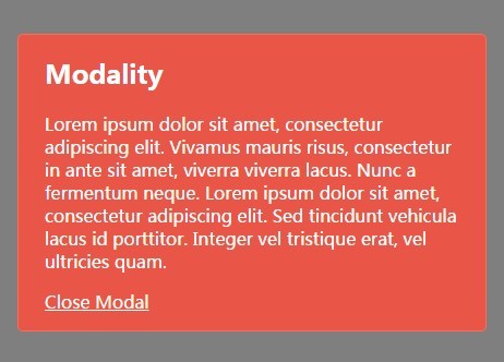
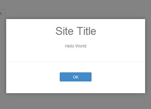
Modality
Modality is an unstyled, simple, lightweight and extremely versatile jQuery AND JavaScript plugin for modal windows.
Features
- Free
- Easy to Use
- No Default Styling
- Accessible
- Two Versions (JS & jQuery)
- Mobile Friendly
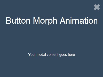
- CSS3 Animations
- Easily Customizable
- Extendable Framework
- Multiple Instances
- Lightweight (3kb)
- Browser Friendly
- jQuery: IE 6+
- JavaScript: IE 8+
Getting Started
1. Add this to the head.
<link rel="stylesheet" href="path/to/your/modality.min.css">2. Add this before the closing body tag. If you want to use the jQuery version of the plugin, add jQuery and modality.jquery.min.js to your page instead.
<script src="path/to/your/modality.min.js"></script>3. Create your modal and give it an id.
<div id="yourModalId"> <!-- your content here --> </div>4. Create triggers for your modal by adding href="#yourModalId" to an anchor OR data-target="#yourModalId" to a controller element, like a button. (Outside will open it, Inside will close it).
<a href="#yourModalId">Open Modal</a> <button data-target="#yourModalId">Open Modal</button>5. Initiate your modal(s) via JavaScript OR data attribute.
$('#yourModalId').modality(); // jQuery Modality.init('#yourModalId'); // JavaScript- or -
<div id="yourModalId" data-modality="auto"></div>Settings
Options can be passed via data attributes or JavaScript. For data attributes, append the option name to data-, as in data-effect="".
| Name | Default | Description |
|---|---|---|
| accessible | true | set false to prevent accessible features |
| bind | true | set false to bind triggers manually |
| class | "" | add a class name to the container |
| clickoff | true | set false to prevent closing when clicking off of modal |
| effect | "" | CSS3 animation, effects listed below |
| enabled | true | set false to disable modal |
| inner** | "modality-inner" | class name on the inner container of each modal |
| keyboard | true | closes modal when 'Esc' is pressed |
| open | false | set true to open modal on page load |
| onClose* | "" | add callback function when modal is closed |
| onOpen* | "" | add callback function when modal is opened |
| outer** | "modality-outer" | class name on the outer-most container of each modal |
| *These settings cannot be set via data attributes | ||
| **These class names match those in modality.css, if changed here, must also be changed there. |
Usage
$('.modal').modality( {effect: "scale-up"} ); // jQuery Modality.init( '.modal', {effect: "slide-left"} ); // JavaScript- or -
<div id="yourModalId" data-effect="slide-left"></div>Effects
These animations use CSS 3 and will not work for IE7-9.
"scale-up","scale-down""slide-left","slide-right""slide-up","slide-down""sticky-top","sticky-bottom""horizontal-flip","vertical-flip""spin-up","spin-down""fall-left","fall-right""swing-down","swing-up""swing-left","swing-right""front-flip","back-flip"
Styling
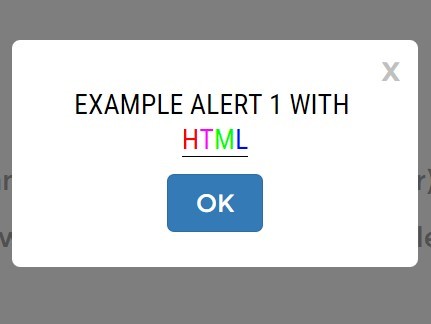
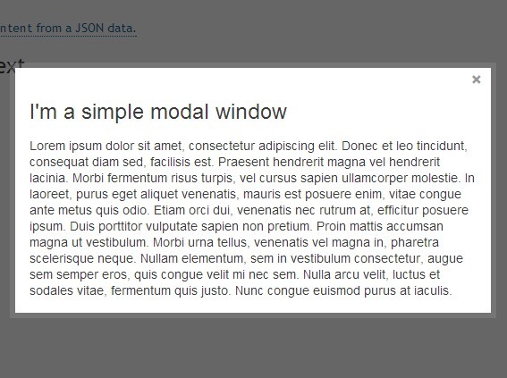
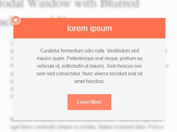
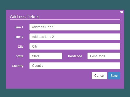
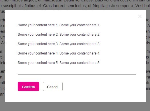
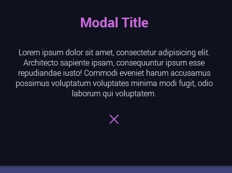
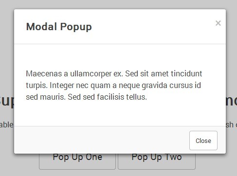
Modality is unique, it uses CSS to position itself horizontally AND vertically. The modal will automatically resize to best fit its content and the screen-size – all without a line of JavaScript.
By design, Modality is not styled in order to give you complete creative control. And since all the positioning and sizing is done for you, all you need to worry about is your modal's appearance, while keeping a few things in mind —
Max-Width
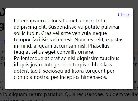
Modality is only ever as wide as it's content or the user's viewport (unless you style it otherwise). But in most cases, it is a good idea to give your modal a max-width so that it wont grow too wide on a desktop, but will resize for a mobile device.
.yourModalClass { max-width: 500px; }Backdrop
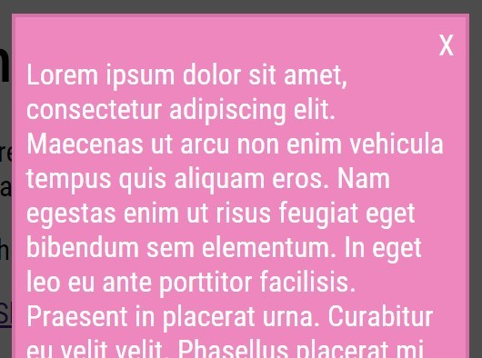
Modality's backdrop/background-mask has a default styling of rgba(0, 0, 0, 0.5). To override or change this, add a custom class to modality's container via the 'class' option in the settings, then add your new background styles to that, like this:
$('#yourModalId').modality( {class:"yourNewClass"} ); // jQuery Modality.init( '#yourModalId', {class:"yourNewClass"} ); // JavaScript.yourNewClass[aria-hidden="false"] { background: rgba( 255, 0, 0, 0.5 ); }Percentage Width
If you want your modal to be a percentage of the window, first, add a class to Modality's container via the 'class' option in the settings, then apply the percentage to Modality's 'inner' container via a decendant selector like so:
$('#yourModalId').modality( {class:"yourNewClass"} ); // jQuery Modality.init( '#yourModalId', {class:"yourNewClass"} ); // JavaScript.yourNewClass .modality-inner { max-width: 75%; }Hide on Load
If your modal is visible for a second before Modality can hide it for you, manually hide it with an inline style. Modality will remove that style when initialized.
<div id="yourModalId" style="display:none;"></div>Focus Event
For accessiblity reasons, the tabindex attribute is added to your modal dynamically to make it focusable. Modality does not add any styles for the focus event, but if you want to, here is how you would do it.
.yourNewClass:focus { outline: -webkit-focus-ring-color auto 5px; }Example
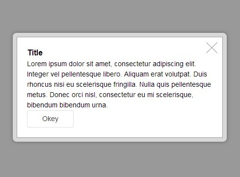
In case you want some help styling your modal, here is a simple example.
.yourModalClass { background-color: #ffffff; border: 1px solid #cccccc; padding: 1em 1.5em 1em; border-radius: 5px; max-width: 500px; position: relative; }Accessibility
Setup
By design, when a user reaches the end of the modal's content their focus will automatically return to the top of the modal until the modal is dismissed. However, there is one problem with this method: if the keyboard-only user wants to leave the webpage entirely while a modal is open, they cannot. The solution: place your modals at the top of your webpage – this will allow users to navigate up and out of the html page and back to their browser.
<body> <!-- place modal(s) first in body --> <div id="yourModalId"></div> <!-- your content --> </body>Role
Add role="dialog" to your modal. This tells assistive technologies that the content requires the user’s response or confirmation. If the modal is more of an error or alert message that requires the user to input something before proceeding, then use role="alertdialog" instead.
<div id="yourModalId" role="dialog"> <!-- your content here --> </div>Modal's Label
If your modal has a heading, use the aria-labelledby attribute. Set your heading’s ID as it's value. If your modal doesn’t have a heading (not recommended), then at least use the aria-label attribute to provide a concise label about the element that screen readers can use.
<div id="yourModalId" role="dialog" aria-labelledby="yourHeadingId"> <h1 id="yourHeadingId">...</h1> </div>Trigger's Label
Add aria-label="open" or aria-label="close" to your trigger elements to let screen readers know what their purpose is.
<a href="#yourModalId" aria-label="open">Open Modal</a> <button data-target="#yourModalId" aria-label="close">Close Modal</button>Disable
To prevent averting the users focus to the modal when it is opened and back to the trigger when it is closed, you can easily disable these accessible features.
$('.modal').modality( {accessible: false} ); // jQuery Modality.init( '.modal', {accessible: false} ); // JavaScript- or -
<div id="yourModalId" data-accessible="false"></div>Advanced Usage
Methods
| Name | Parameters | Returns | Description |
|---|---|---|---|
| addTrigger( ) | html element | instance | add an element to toggle the modal |
| close( ) | function* | instance | closes the modal |
| disable( ) | none | instance | disables all triggers for the modal |
| enable( ) | none | instance | enables all triggers for the modal |
| isOpen( ) | none | boolean | tells you if the modal is open or not |
| open( ) | function* | instance | opens the modal |
| removeTrigger( ) | html element | instance | remove an element from toggling the modal |
| toggle( ) | function* | instance | opens the modal if closed and vice versa |
| *Optional callback function. |
Attributes
| Name | type | Description |
|---|---|---|
| id | string | the modal's ID |
| modal | html element | your modal <div id="yourModalId"> |
| settings | json | the modal's current settings |
| triggers | array | all the modal's triggers and their respective event handles |
| triggered | html element | the most recent trigger used to open or close the modal |
| wrapper | html element | the modal's outer-most container <div class="modality-outer"> |
Retreiving an Instance
There are two ways to retrieve an instance.
1. The first and easiest way is when initializing the modal. If you are initializing more than one modal at a time, Modality will return an array of the modals initialized.
var inst = $('#yourModalId').modality(); // jQuery inst.open(); var inst = Modality.init('#yourModalId'); // JavaScript inst.open();2. Second, you can retreive any instance at anytime with it's id:
var inst = $.modality.instances['yourModalId']; // jQuery inst.open(); var inst = Modality.instances['yourModalId']; // JavaScript inst.open();Chaining
You can chain most of Modality's methods together. If you want to replicate this capability with your own methods, make sure to return the instance return this;.
// jQuery $('#yourModalId').modality().addTrigger( $('#someId') ).show(); // JavaScript var newTrigger = document.getElementById('someId'); Modality.init('#yourModalId').addTrigger( newTrigger ).show(); Extension
You can easily extend Modality to add your own methods for additional and customized functionality.
// jQuery ;(function($) { $.extend( $[ "modality" ].prototype, { newClassAttribute: "foo", newClassMethod: function () { ... } }); $.extend( $[ "modality" ], { newStaticAttribute: "bar", newStaticMethod: function () { ... } }); })(jQuery); // JavaScript ;(function ( Modality ) { Modality.extend( Modality.prototype, { newClassAttribute: "foo", newClassMethod: function () { ... } }); Modality.extend( Modality, { newStaticAttribute: "bar", newStaticMethod: function () { ... } }); })( Modality );AJAX
Even though Modality does NOT have built-in AJAX functionality, you can easily add this ability via extension or callback. Follow the pattern above for extension, below is an example for callback.
// In these examples, a callback function is added to // the 'onOpen' setting that will insert the response // of an AJAX request into the modal as it is opened. // jQuery $('.yourModalClass').modality({ onOpen: function() { var inst = this; $.ajax({ url: "http://path/to/your/data.txt", success: function ( result ) { inst.modal.html( result ); } }); } }); // JavaScript Modality.init('.yourModalClass', { onOpen: function () { var inst = this, xmlhttp = new XMLHttpRequest(); xmlhttp.onreadystatechange = function() { if ( xmlhttp.readyState == 4 && xmlhttp.status == 200 ) { inst.modal.innerHTML = xmlhttp.responseText; } } xmlhttp.open( 'get', "http://path/to/your/data.txt", true ); xmlhttp.send(); } }); Template
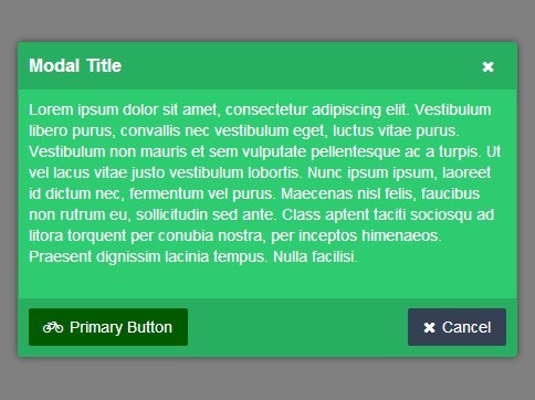
Here is a basic template to help you get started.
<!doctype html> <html lang="en"> <head> <meta charset="utf-8"> <meta name="viewport" content="width=device-width, initial-scale=1"> <title>Modality Example</title> <link rel="stylesheet" href="css/modality.min.css"> <!-- Sample styles for your modal --> <style> .yourModalClass { background-color: #ffffff; border: 1px solid #cccccc; padding: 0 1.5em 1em; border-radius: 5px; max-width: 500px; } </style> </head> <body> <!-- Your Modal --> <div id="yourModalId" class="yourModalClass" role="dialog" aria-labelledby="yourModalHeading" style="display:none;" > <!-- Sample Content --> <h2 id="yourModalHeading">Modality Rocks!</h2> <p>Modality was designed to be the only modal plugin you would ever need.</p> <!-- This closes your modal --> <a href="#yourModalId" aria-label="close">Close Modal</a> </div> <!-- This opens your modal --> <a href="#yourModalId" aria-label="open">Open Modal</a> <!-- jQuery --> <!-- <script src="https://code.jquery.com/jquery-1.11.2.min.js"></script> <script src="js/modality.jquery.min.js"></script> <script>$('#yourModalId').modality( {effect:'slide-up'} );</script> --> <!-- JavaScript --> <script src="js/modality.min.js"></script> <script>Modality.init( '#yourModalId', {effect:'slide-up'} );</script> </body> </html>License
The MIT License (MIT) Copyright (c) 2015 Mark McCann, http://www.markmccann.me Permission is hereby granted, free of charge, to any person obtaining a copy of this software and associated documentation files (the "Software"), to deal in the Software without restriction, including without limitation the rights to use, copy, modify, merge, publish, distribute, sublicense, and/or sell copies of the Software, and to permit persons to whom the Software is furnished to do so, subject to the following conditions: The above copyright notice and this permission notice shall be included in all copies or substantial portions of the Software. THE SOFTWARE IS PROVIDED "AS IS", WITHOUT WARRANTY OF ANY KIND, EXPRESS OR IMPLIED, INCLUDING BUT NOT LIMITED TO THE WARRANTIES OF MERCHANTABILITY, FITNESS FOR A PARTICULAR PURPOSE AND NONINFRINGEMENT. IN NO EVENT SHALL THE AUTHORS OR COPYRIGHT HOLDERS BE LIABLE FOR ANY CLAIM, DAMAGES OR OTHER LIABILITY, WHETHER IN AN ACTION OF CONTRACT, TORT OR OTHERWISE, ARISING FROM, OUT OF OR IN CONNECTION WITH THE SOFTWARE OR THE USE OR OTHER DEALINGS IN THE SOFTWARE. 


