Bootstrap Context Menu
A context menu plugin using Bootstrap's dropdown component.
It's made to be usable without having to add any specific HTML for it in the page, and to allow dynamically changing the state of its options easily.
Depends on jQuery. It uses Bootstrap's styling classes, and if using the iconClass option, also Font Awesome.
Installation
The easiest way to use BootstrapMenu is installing it from NPM:
npm install bootstrap-menu and include it with your with your build system (Browserify, Webpack, etc).
var BootstrapMenu = require('bootstrap-menu'); var menu = new BootstrapMenu('#dropdownButton', { actions: /* ... */ });Alternatively you can use the standalone build found at dist/BootstrapMenu.min.js. It expects jQuery to be included, and exposes BootstrapMenu globally.
<script src="//code.jquery.com/jquery-2.1.4.min.js"></script> <script src="dist/BootstrapMenu.min.js"></script> <script> var menu = new BootstrapMenu('#dropdownButton', { actions: /* ... */ }); </script>To run the examples locally, run:
npm install ./build.sh # rebuild dist/Then open a webserver in the project's root:
node_modules/.bin/static . # serving "." at http://127.0.0.1:8080Usage
BootstrapMenu receives a string with the selector of the elements to listen to as first argument, and an options object as second argument.
The options object must have at least an actions array containing the actions to show in the context menu.
Basic example:
var menu = new BootstrapMenu('#button', { actions: [{ name: 'Action', onClick: function() { // run when the action is clicked } }, { name: 'Another action', onClick: function() { // run when the action is clicked } }, { name: 'A third action', onClick: function() { // run when the action is clicked } }] });Extended example (live demo):
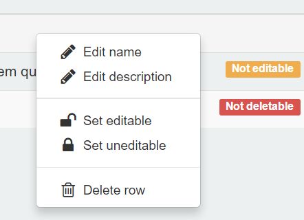
<table> <tr> <th>#</th> <th>Name</th> <th>Description</th> </tr> <!-- the modal will open right-clicking anywhere inside a .demoTableRow --> <tr class="demoTableRow" data-row-id="1"> <td>1</td> <td>First row</td> <td>Lorem ipsum dolor sit amet</td> </tr> <tr class="demoTableRow" data-row-id="2"> <td>2</td> <td>Second row</td> <td>Nemo enim ipsam voluptatem quia voluptas</td> </tr> <tr class="demoTableRow" data-row-id="3"> <td>3</td> <td>Third row</td> <td>Ut enim ad minima veniam</td> </tr> </table>/* A centralized container of the table data. You could hold the * row-specific data in a data-whatever-info="" attribute in each * row, you decide what fetchElementData() does! */ var tableRows = { '1': { name: 'First row', isEditable: true, isRemovable: true }, '2': { name: 'Second row', isEditable: true, isRemovable: true }, '3': { name: 'Third row', isEditable: true, isRemovable: true } }; var menu = new BootstrapMenu('.demoTableRow', { /* $rowElem is the jQuery element where the menu was opened. The * returned value is the `row` argument passed to each function. */ fetchElementData: function($rowElem) { var rowId = $rowElem.data('rowId'); return tableRows[rowId]; }, /* group actions by their id to make use of separators between * them in the context menu. Actions not added to any group with * this option will appear in a default group of their own. */ actionsGroups: [ ['setEditable', 'setUneditable' ], ['deleteRow'] ], /* you can declare 'actions' as an object instead of an array, * and its keys will be used as action ids. */ actions: { editName: { name: 'Edit name', iconClass: 'fa-pencil', onClick: function(row) { /* ... */ }, isEnabled: function(row) { return row.isEditable; } }, editDescription: { name: 'Edit description', iconClass: 'fa-pencil', onClick: function(row) { /* ... */ }, isEnabled: function(row) { return row.isEditable; } }, setEditable: { name: 'Set editable', iconClass: 'fa-unlock', onClick: function(row) { /* ... */ }, isShown: function(row) { return !row.isEditable; } }, setUneditable: { name: 'Set uneditable', iconClass: 'fa-lock', onClick: function(row) { /* ... */ }, isShown: function(row) { return row.isEditable; } }, deleteRow: { name: 'Delete row', iconClass: 'fa-trash-o', onClick: function(row) { /* ... */ }, isEnabled: function(row) { return row.isEditable && row.isRemovable; } } } });Options
Context menu initialization options:
| Name | Type | Description |
|---|---|---|
menuSource | string | What the source of the context menu should be when opened. Valid values are mouse and element. Defaults to mouse. |
menuPosition | string | How to calculate the position of the context menu based on its source. Valid values are aboveLeft, aboveRight, belowLeft, and belowRight. Defaults to belowLeft. |
menuEvent | string | The event to listen to open the menu. Valid values are click, right-click, hover. Defaults to right-click. |
fetchElementData | function | Obtain specific data about the currently opened element, to pass it to the rest of user-defined functions of an action. |
actions | array|object | Array or object containing the list of actions to be rendered in the context menu. |
actionsGroups | array | Array to group actions to render them next to each other, with a separator between each group. |
Actions attributes:
Every function attribute is called before rendering the menu each time it is opened. If fetchElementData was defined, these functions will receive as first argument its returned value for the currently selected element.
| Name | Type | Description |
|---|---|---|
name | string|function | The name of the action. |
onClick | function | Handler to run when an action is clicked. |
iconClass | string | Optional, Font Awesome class of the icon to show for the action. |
classNames | string|object|function | Optional, classes to add to the action. |
isShown | function | Optional, decides if the action should be shown or hidden in the context menu. |
isEnabled | function | Optional, decides if the action should appear enabled or disabled in the context menu. |
License
MIT license - http://www.opensource.org/licenses/mit-license.php


