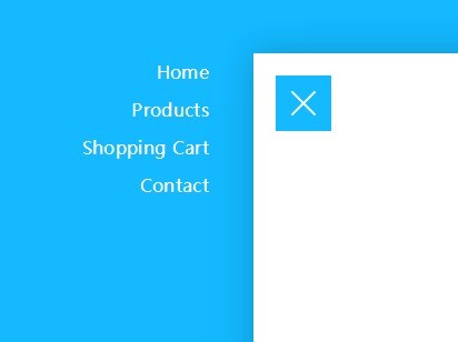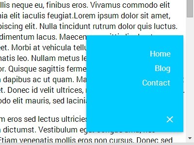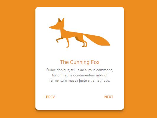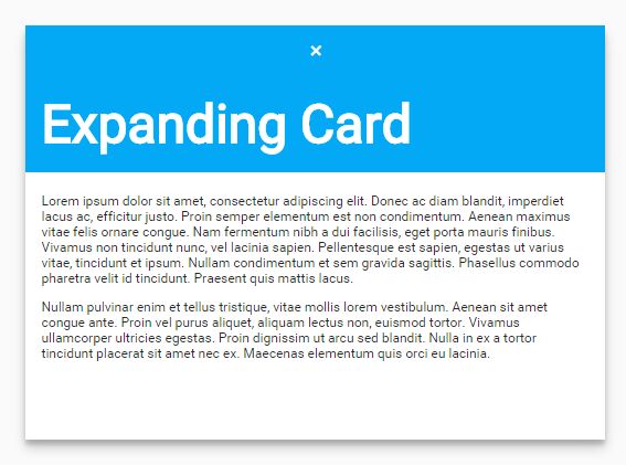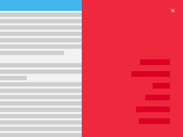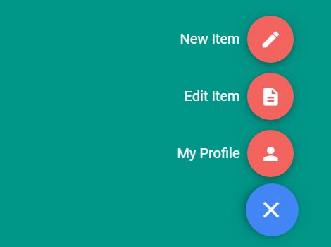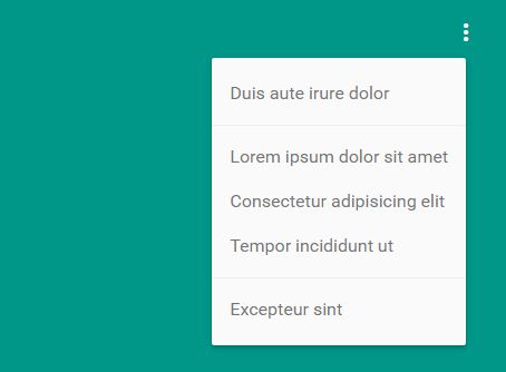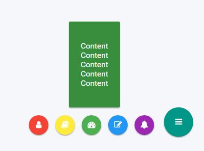
Material Cards
Simple user card based on Google Material Color palette and jQuery.

Less files
material-cards.less gm-variables.less mixin.less material-color.less
material-cards.lessis the main.lessfile that includes the other .less files.
gm-variables.lesscontains all the color palette with the color accent.
mixin.lesscontains some utilities.
material-color.lesscontains the material color variant based ongm-variables.less
Installation
You can download full package and check the demo folder for implementation example or you can use bower:
bower install material-cards Demo files require Font Awesome
Usage
Material Cards must be used in conjunction with jQuery.
You can choose to use it as a jQuery plugin or not. Demos for both usages are available in the demos folder. Using it as a jQuery plugin easies the management of options, methods and events for full customization.
Inside the js/ folder you can find the two files: jquery.material-cards.js and jquery.material-cards.min.js
Init jQuery Material Card
$('.material-card').materialCard(options);Options
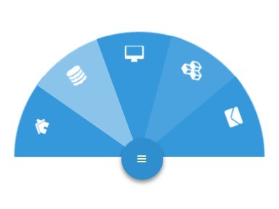
options = { icon_close : 'fa-arrow-left', //string icon_open : 'fa-bars', //string icon_spin : 'fa-spin-fast', //string card_activator : 'click' //string: click or hover });The icons are from Font Awesome, fa-spin-fast is similar to fa-spin but spin faster.
The default card_activator is the click event on button card, but you can also use hover (this option remove the button).
Methods
toggle: change selected material card state
$('.material-card').materialCard('toggle');open: open selected material card
$('.material-card:eq(1)').materialCard('open');close: close selected material card
$('.material-card:eq(2)').materialCard('close');isOpen: check material card status, return true or false
if($('.material-card:eq(3)').materialCard('isOpen') === true) { // do something }Events
show.material-card: triggered immediately when the open instance method is calledshown.material-card: triggered when the card becomes visible to the user (will wait the end of the CSS transitions)hide.material-card: triggered immediately when the close instance method is calledhidden.material-card: triggered when the card has become hidden to the user (will wait for end of CSS transitions)
Examples
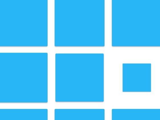
$('.material-card').on('shown.material-card', function (event) { console.log(event.type, event.namespace, $(this)); //that return //shown material-card [article.material-card...] });var fullCardEvent = 'shown.material-card show.material-card hide.material-cards hidden.material-cards'; $('.material-cards').on(fullCardEvent, function (event) { // do something });Material cards and Masonry grid library
check demo/material-cards_jquery-plugin_masonry.html material cards without a fixed height (use this less file less/material-cards-auto-height.less) and awesome javascript Masonry grid library.

