jquery.msb.js
msb manage button states, it means changing the label, css class, icon (animated or not), disabled attribute... I've writed this plugin to have a one line function to improve user experience during form submiting.
It's my really first jQuery plugin, so any help or suggestions are welcome! ♥
Demo
- See the jquery.msb.js Getting Started Demo with very basic exemples.
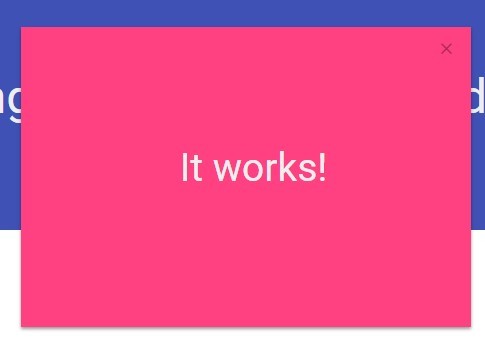
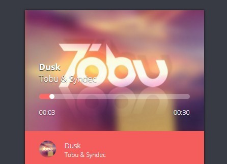
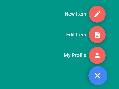
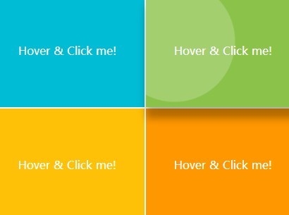
- a real life exemple with ajax submiting, states overriding, init callback, state updates, and updates callbacks...
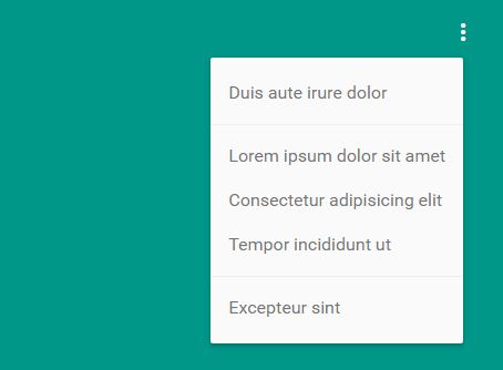
- Here a generic form demo, where button updates are defined with $.ajaxPrefilter
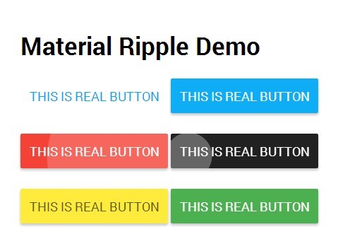
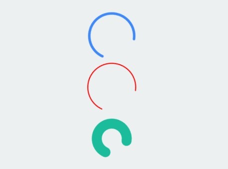
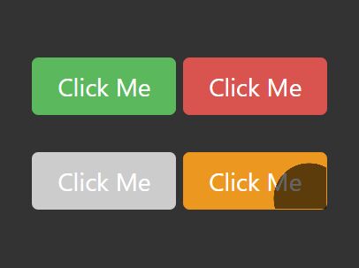
- All the CSS provided are for the icons animations See all icons animations
Features
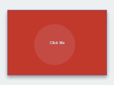
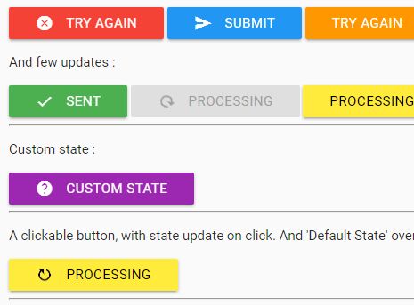
- 5 (customizable) defaults states (default, success, error, warning, process)
- Add your custom states
- Update the button state on the fly
- Animated icons
- Callbacks
- Compatibility with MaterializeCSS and Font-Awesome icons collections
- Status Bar decoration
Install
jQuery is required, so include it first. Download jquery.msb.js and include the script in your HTML file:
<script src="jquery.msb.js" type="text/javascript"></script> It looks really nice with MaterializeCSS because default options are using MaterializeCSS Classes, but you can override the defaults states cssClass options with Twitter Bootstrap classes. Glyph icons and Font Awesome icons collections are planned to be supported.
Usage
HTML
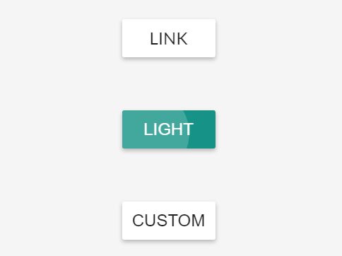
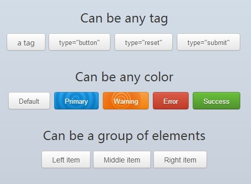
<a class="btn" data-state="error"> <i class="material-icons left">cloud</i> button </a> <a class="btn waves-effect waves-light" data-state="warning"> <i class="material-icons right">cloud</i> button label </a> <a class="btn"> button without icon </a> <button class="btn waves-effect waves-light" data-state="default"> <i class="material-icons left">cloud</i> button </button> Use the data attribute
data-state="stateName"wherestateNameis a string registered in theoptionsto identify which state will be set on init. Ifdata-stateisn't writen in the HTML, it will be automatically added and setted todeafulton jquery-msb init.
It's not recommanded to assign color classes in the HTML, you can set it in the
options(cssClass) by overriding states or using custom states. All the classes you put in HTML are kept during all button updates. So if you have color classes in your HTML, it will be kept after button update and you will get a CSS conflict (2 color classes).
JAVASCRIPT
Default init
$(function() { $('.btn').msb(options, callback); }); Where
optionsandcallbackare optional parameters. Once initialized, the button's label and icon are updated by the plugin. The initial button's classes are kept.
Custom state init
$('.custom').msb({ "customState": { "cssClass": "waves-effect waves-light pink", "label": "custom state", "icon": { "name": "help" }, "disabled": true } }); Default state override init
$('.override').msb({ "success": { "icon": { "name": "thumb_up", "anim": "bounce" }, "disabled": true }, "process": { "cssClass": "yellow red-text", "label": "please wait...", "icon": { "name": "send", "anim": "fly" } } } }); You can partially init the options for
defaults statesorcustom states, it will be merged with the default options.
Update button state
$('a.msb').first().msb('update','success'); $('button#submit)').msb('update','customState'); Be careful to use the proper DOM selector if you have several .msb buttons in your document. The
idattribute is the safer selector. After button init, the initial classes (writen in the HTML) of are kept (such asbtn, waves-effect, waves-light...). More exemples in the demo.
Options
The default options are:
{ "default": { "cssClass": "blue", "label": "submit", "icon": { "name": "send", "anim": false }, "disabled": false, "stateBar": "" }, "success": { "cssClass": "green", "label": "sent", "icon": { "name": "check", "anim": false }, "disabled": true, "stateBar": "" }, "warning": { "cssClass": "orange", "label": "try again", "icon": { "name": "warning", "anim": false }, "disabled": false, "stateBar": "" }, "error": { "cssClass": "red", "label": "try again", "icon": { "name": "cancel", "anim": false }, "disabled": false, "stateBar": "" }, "process": { "cssClass": "yellow black-text", "label": "processing", "icon": { "name": "refresh", "anim": "rotate" }, "disabled": true, "stateBar": "msb-anim-chameleon" } } Where:
cssClass: (string) is a CSS class to style the button (default options are using MaterializeCSS classes).label: (string) is the button's label.icon.name: (string) is the Material Design icon label or the Font Awesome class name without the fa- prefixe.icon.anim: (mixedstring|false) is the animation class name (without prefix) to animate the icon,falseif no animation. Check the animation list and a live demo link below.disabled: (boolean) istrueorfalseto set or not the disabled attribute to the BUTTON markup, MaterializeCSS will override yourcssClasscolors as it usually do with disabled elements.Disabledis not working on a A markup so in this case it will apply thecssClasscolors.stateBar: (mixedstring|false) is a CSS class to style the state bar. The State Bar is an additionnal button decoration, it allow to keep a colored border when a button isdisabledand color is forced to gray by the CSS framework. A multicolor animated background is available under the name: msb-anim-chameleon.
Icons animations list:
- rotate | spin (aliases)
- bounce
- flash
- blink
- pass | pass-ltr (aliases)
- pass-reverse | pass-rtl (aliases)
- shake
- ring
- pulse
- fall
- burst
- tada
- fly
You can all icons animations on this demo
Coming soon features
You can follow the coming soon features in the todo list.