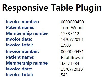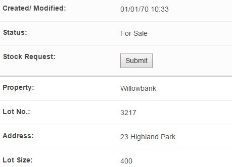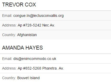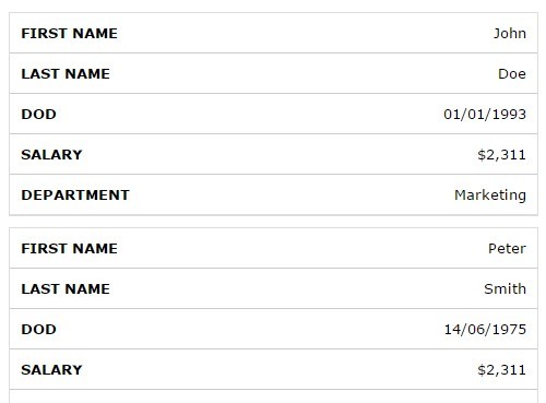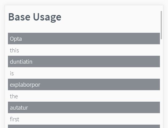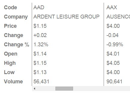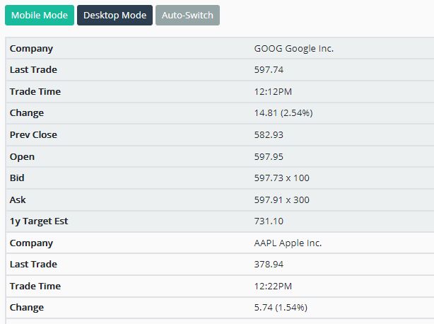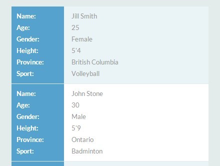
jQuery-RWD-Tables
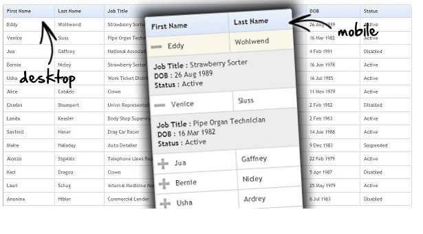
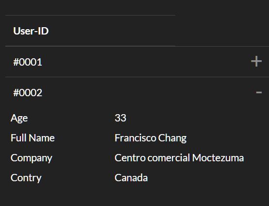
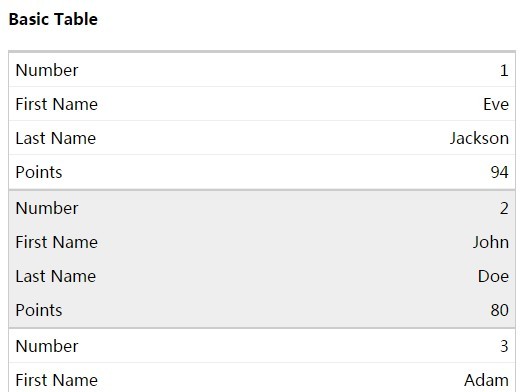
jQuery Plugin to make html tables responsive to display on small devices. The jQuery plugin is in the jquery.rwd-tables.js file, also included is a jQuery script,,rwd-tables.js, which does the same thing incase you want to customize the script and add it to your own js scripts.
This plugin was inspired by Chris Coyier blog post on Responsive Data Tables.
See my blog post for more details or checkout the demo here.
Set Up
Add the script to the head section of your html doc. It requires jQuery.
<script type="text/javascript" src="https://code.jquery.com/jquery-1.11.2.min.js"></script> <script type="text/javascript" src="js/jquery.rwd-tables.js"></script> Next add the css to the head section of your html doc. This css uses the rwd-tables class to select tables which have this class or have a parent node with this class.
<link rel="stylesheet" type="text/css" href="css/rwd-tables.css"> Give your html tables an rwd-tables class or to one of their parent nodes.
<body> <div class="rwd-tables"> <table> <!-- rwd-tables css will be applied to this table --> <!-- html omitted for brevity --> </table> </div> <table class="rwd-tables"> <!-- rwd-tables css will be applied to this table --> <!-- html omitted for brevity --> </table> <table> <!-- rwd-tables css will NOT be applied to this table --> <!-- html omitted for brevity --> </table> </body> And finally call the rwdTables() function on the tables you wish to make responsive.
$(document).ready(function(){ $( ".rwd-tables table, .table.rwd-tables" ).rwdTables(); });