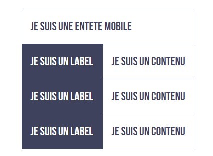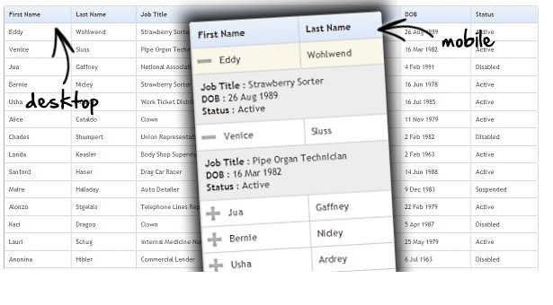
Responsive Tables
Responsive Tables is a simple & lightweight jQuery plugin to fill the gap for responsive tables.
The plugin runs once on page load and again when the screen resizes to the guarantee that the end user will always have a great user experience.
Installation
Include script after the jQuery library:
<script src="/path/to/js/responsivetables.js"></script> Responsive tables includes a CSS style for the project and be included as below:
<link rel="stylesheet" href="/path/to/css/responsivetables.css"/> NOTE
Currently the plugin is only available on Github, but there is plans to release to bower and possible NPM in the near future.
Also CDN versions will be release soon.
Usage
<script> $( "table" ).ResponsiveTable(); </script> Options
breakpoint
While the default breakpoint for the plugin is 640px, we understand that every table may require a different trigger point.
This option allows you to customise the breakpoint as required per project or selector.
$( "table" ).ResponsiveTable({ breakpoint: 1024 });