respTables jQuery plugin
A jQuery plugin that helps make your table responsive

How to initialize
- Include the CSS file
<link rel="stylesheet" type="text/css" href="styles.css">
- Include jQuery and the plugin
<script src="http://code.jquery.com/jquery-1.11.3.min.js"></script>
<script src="respTables.js"></script>
- Prepare your table markup with a wrapper element that has the class
tableWrapper. Just be sure the heading tags are insidethor override the default option with your custom class (See the Settings at the end how to override the default).
Also if tableWrapper class does not work for you you can change it but do not forget to update the CSS file with your new class
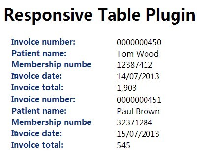
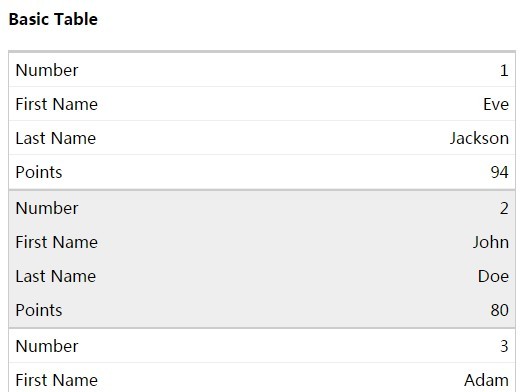
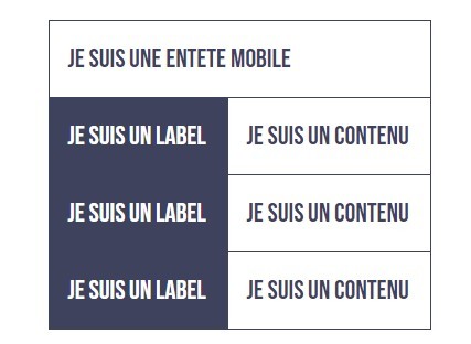
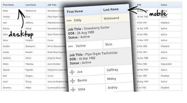
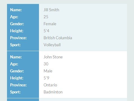
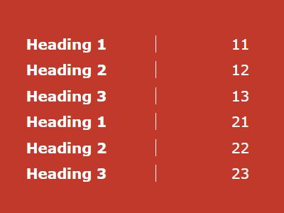
<div class="tableWrapper"> <table> <thead> <tr> <th> Heading 1 </th> <th> Heading 2 </th> <th> Heading 3 </th> </tr> </thead> <tbody> <tr> <td> 11 </td> <td> 12 </td> <td> 13 </td> </tr> <tr> <td> 21 </td> <td> 22 </td> <td> 23 </td> </tr> </tbody> </table> </div> You can use as many rows you want:

- Init the plugin inside
$(document).readyor$(window).on('load'..function with the class name you used (.tableWrapper)
$(document).ready(function(){ $('.tableWrapper').respTables(); }); Settings
| Option | Type | Default | Description |
|---|---|---|---|
| heading | String | 'th' | Class or element where you will put your headings |
Init with custom element example
$(document).ready(function(){ $('.tableWrapper').respTables({ heading: '.heading' }); });