responsive-table
responsive table by using jQuery and Bootstrap
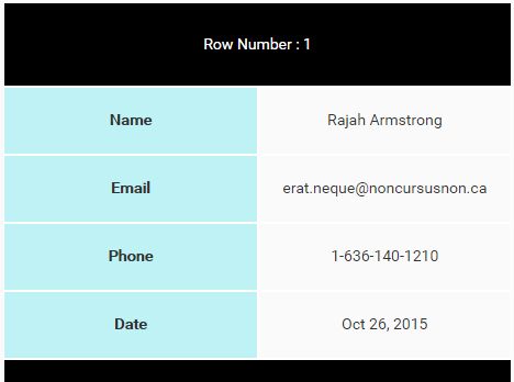
Make Your Table Responsive :)
DOC :
- Link your website with Bootstrap and jQuery
- Link your website with js.js file
- on page load function add the below :
1- add one of the below functions :
-
responsiveTable('table'); // to select the table by html tag
-
responsiveTable('.table-class'); // or if you want to select the table by table class
-
responsiveTable('#table-id'); // or select the table with table id
2- add the below function to balance both cells size for each row in the small screens
balanceSize();
- You can use balanceSize function in $(window).resize() to balance the size on resizing the page


