jquery.table-shrinker

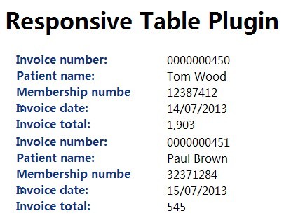
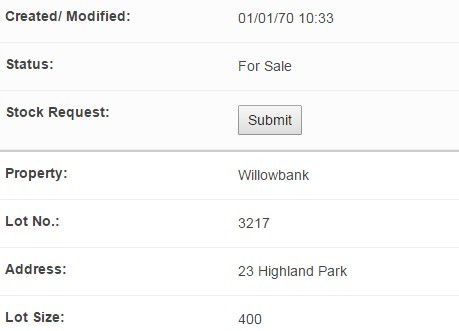
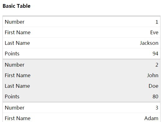
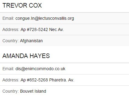
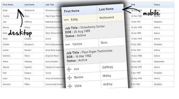
A Jquery plugin to make HTML Table responsive across all devices, the right way!

Reasons you should go for it
- It has highly customizable page-breaks.
- It Won't break your table's primordial design, it uses css only to re-structure table for mobile.
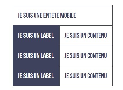
- It's Designed to attend fat-fingers concept to prevent missclicking, you can tap anywhere in the row and it will trigger the collapser.
- You can maintain all previous functions working anywhere inside the elements of the table. (ie: a dropdown in table headers)
- It's free, it's fast and it's lightweight.
- I think it's unique... I couldn't find another plugin in the web which support nested tables. (ie: tables within tables)
Limitations
- It does not support irregular headers. (ie: vertical headers)
- It does not support multiline headers.
- It does not support colspan attr.
Prerequisites
<script src="https://cdnjs.cloudflare.com/ajax/libs/jquery/3.3.1/jquery.min.js" crossorigin="anonymous"></script>Installing
Insert the .css
<link rel="stylesheet" href="jquery.table-shrinker.min.css">Insert the .js
<script src="jquery.table-shrinker.min.js"></script>How to use
First, add shrink class to the table you want to be shrinked
<table class="shrink">Next, start the plugin right after the DOM finished rendering.
options = { useZebra: false // i don't like zebras } $("table.shrink").tableShrinker(options)If you need a table that will have another table inside it and both will use the tableShrinker to shrink their contents, you should call chained() method before the initializer.
$("table.shrink").chained().tableShrinker(options)And finally, add shrink-XX classes to the header to tell them when you want them to be shrinked
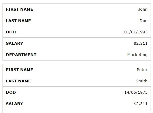
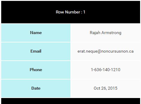
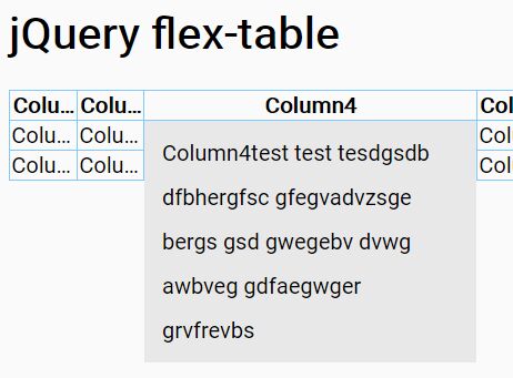
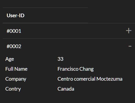
<thead> <tr> <th> User-ID </th> <!-- never shrinks --> <th class="shrink-xxs" > First Name </th> <!-- shrinks @ 320px --> <th class="shrink-xs" > Last Name </th> <!-- shrinks @ 480px --> <th class="shrink-sm" > Driver Licence </th> <!-- shrinks @ 768px --> <th class="shrink-md" > Phone number </th> <!-- shrinks @ 992px --> <th class="shrink-lg" > e-mail</th> <!-- shrinks @ 1200px --> <th class="shrink-xl" > Street address </th> <!-- always shrinks --> </tr> </thead>Additionally, there's a shrinkable class which make texts containers responsive This is usefull if you like to keep displaying a large info cell in a tiny devices, preventing its texts to breakline.
<th class="shrinkable"> Full Name </th>Basically that's it. your table should be shrinked by now.
Below there's the options explanation and some hints of use.
Options
useZebra
default: true
Table rows inside wrapper became striped.
useTransitions
default: true
Animate when collapsing the wrapper.
transitionSpeed
default: 300
name says it all.
ignoreWhenHit
default: "input, button, a, .btn"
If you have a customized radiobutton or selectbox on each row you might want to ignore them too. you can add then to this selector.
so if any tap/click event hit any of these elements it's event propagation is stoped, and they keep their functionality inside the shrinked table container.
showToggle
default: true
You can disable the toggle icon and still show/hide the shrinked content by hiting the anywhere in the row (except for the ignoreWhenHit elements).
customToggle
default: ["<span>˅</span>","<span>˄</span>"]
A list of two html's that alternate when wrapper collapses, you can add classes or change it's content and control the toggle's design using your own css rules.
showToggleAll
default: true
You can disable the toggle icon and still show/hide the shrinked content by hiting the anywhere in the row (except for the ignoreWhenHit elements).
customToggleAll
default: ["<span>˅</span>","<span>˄</span>"]
A list of two html's that alternate when all wrapper collapses, you can add classes or change it's content and control the toggle's design using your own css rules.
loadCollapsed
default: null
If true, forces all shrinked elements to be visible on window first load, else it will look for load-collapsed classes for each table separately.
Quick Tips
Classname Property Controls
You can add "shrink-[property-name]" classes to each individual table to control their behaviour separately, this way you can call the plugin constructor just once. just remember to not override their defaults on options array.
-
shrink-use-zebra
-
shrink-show-toggle-all
-
shrink-show-toggle
-
shrink-load-collapsed
For example:
<table class="shrink shrink-load-collapsed "> (...) </table>Instant Load
The table can be instantly rendered at the first graphic engine loop of the browser by adding the same shrink-XX and shrinkable classes that you used on the table headers to every table cell
For example:
<thead> <tr> <th> User-ID </th> <!-- never shrinks --> <th class="shrink-xs"> Age </th> <th class="shrink-xs shrinkable" > Full Name </th> <th class="shrink-md" > e-mail </th> <th class="shrink-lg" > Phone number </th> </tr> </thead> <tbody> <tr> <td> #0001 </td> <td class="shrink-xs"> 27 </td> <td class="shrink-xs shrinkable" > Hubert Blaine Wolfeschlegelsteinhausenbergerdorff Sr. </td> <td class="shrink-md" > [email protected] </td> <td class="shrink-lg" > +(66) 666.66666-6666 </td> </tr> <tr> (...) </tbody>This way your table first loads directly in it's shrinked state!
There's no impact in performance speed, the only downside of this is that if you have tables that renders 100+ rows in the same page your DOM tree can get very large.
Larger than desktops
If you want to show more data in the same table but even desktops width can't handle, just keep adding columns with shrink-xl
(...) <th class="shrink-xl" > Addtional Info </th> <th class="shrink-xl" > Addtional Info </th> </tr> </thead>Blank Header
You can use a blank header to add a full-width column, perphaps you want to shrink just a single button.. in this case:
<thead> <tr> <th> User-ID </th> <th> Username </th> <th class="shrink-xs"> </th> <!-- blank headers --> </tr> </thead> <tbody> <tr> <td> #0001 </td> <td> Foo </td> <td> <!-- this becomes full width when shrinked --> <button type='button'> Click me! </button> <!-- you can customize the container of this cell to go full width too in your own css --> </td> </tr> </tbody>Collapsable Nested Tables
To add a collapsable table row you can combine the previous 'XL' hint and the chained() method.
<thead> <tr> <th> User-ID </th> <th> Username </th> <th class="shrink-xl"> </th> <!-- shrink-xl / blank headers --> </tr> </thead> <tbody> <tr> <td> #0001 </td> <td> Foo </td> <td> <table class="shrink"> <!-- start shrinked / full width table --> (...) </table> </td> </tr> <tr> <td> #0002 </td> <td> Bar </td> <td> <table class="shrink"> <!-- start shrinked / full width table --> (...) </table> </td> </tr> </tbody>