
bootstrap-tabs-x


Extended Bootstrap Tabs with ability to align tabs in multiple ways, add borders, rotated titles, load tab content via ajax including caching, and more. This plugin includes various CSS3 styling enhancements and various tweaks to the core Bootstrap 3 Tabs plugin.

NOTE: The latest release of the plugin is v1.3.3. The plugin supports Bootstrap v4.x with release v1.3.3. Refer the CHANGE LOG for details.
Features
The plugin offers these enhanced features:
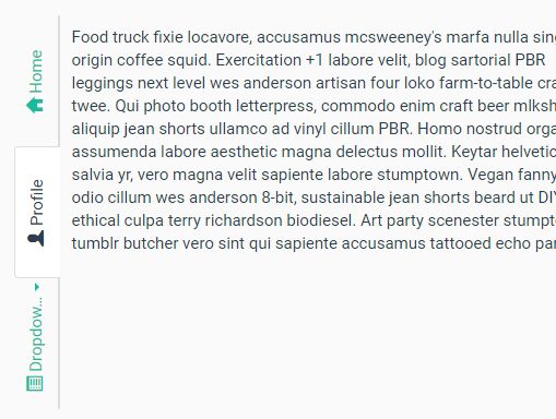
- Supports various tab opening directions:
above(default),below,right, andleft. - Allows you to box the tab content in a new
borderedstyle. This can work with any of the tab directions above. - Allows you to align the entire tab content to the
left(default),center, orrightof the parent container/page. - Automatically align & format heights and widths for bordered tabs for
rightandleftpositions. - Allows a rotated
sidewaystab header orientation for therightandlefttab directions. - Auto detect overflowing header labels for
sidewaysorientation (with ellipsis styling) and display full label as a title on hover. - Ability to load tab content via ajax call.
- With release v1.3.0, you can use this like an enhanced jQuery plugin using the function
$fn.tabsXon the.tabs-xparent element.
Demo
View the plugin documentation and plugin demos at Krajee JQuery plugins.
Pre-requisites
- Bootstrap 3.x (Requires bootstrap
tabs.js) - Latest JQuery
- Most browsers supporting CSS3 & JQuery.
Installation
Using Bower
You can use the bower package manager to install. Run:
bower install bootstrap-tabs-x Using Composer
You can use the composer package manager to install. Either run:
$ php composer.phar require kartik-v/bootstrap-tabs-x "@dev" or add:
"kartik-v/bootstrap-tabs-x": "@dev" to your composer.json file
Manual Install
You can also manually install the plugin easily to your project. Just download the source ZIP or TAR ball and extract the plugin assets (css and js folders) into your project.
Usage
Load Client Assets
You must first load the following assets in your header.
<!-- bootstrap 4.x is supported. You can also use the bootstrap css 3.3.x versions --> <link rel="stylesheet" href="https://maxcdn.bootstrapcdn.com/bootstrap/4.0.0-beta/css/bootstrap.min.css"> <!-- bootstrap 4.x requires bootstrap-tabs-x-bs4.css, while bootstrap 3.x requires bootstrap-tabs-x.css --> <link href="path/to/css/bootstrap-tabs-x-bs4.css" media="all" rel="stylesheet" type="text/css" /> <script src="https://code.jquery.com/jquery-3.2.1.min.js"></script> <!-- popper.min.js below is needed if you use bootstrap 4.x. You can also use the bootstrap js 3.3.x versions without popper.min.js. --> <script src="https://cdnjs.cloudflare.com/ajax/libs/popper.js/1.11.0/umd/popper.min.js"></script> <!-- bootstrap.min.js below is needed for modal dialog dependency. bootstrap 4.x is supported. You can also use the bootstrap js 3.3.x versions. --> <script src="https://maxcdn.bootstrapcdn.com/bootstrap/4.0.0-beta/js/bootstrap.min.js" type="text/javascript"></script> <script src="path/to/js/bootstrap-tabs-x.js" type="text/javascript"></script>If you noticed, you need to load the bootstrap.min.css, jquery.min.js, and bootstrap.min.js in addition to the bootstrap-tabs-x.css and bootstrap-tabs-x.js for the plugin to work with default settings.
Note: The plugin extends the bootstrap tabs plugin and hence the
bootstrap.min.jsmust be loaded beforebootstrap-tabs-x.js.
Markup
You just need to setup the markup for the extended bootstrap tabs to work now. Refer documentation for details.
Bootstrap 3.x
<!-- BOOTSTRAP 3 MARKUP --> <legend>Tabs Above Centered (Bordered)</legend> <div class="tabs-x align-center tabs-above tab-bordered"> <!-- Nav tabs --> <ul class="nav nav-tabs" id="myTab" role="tablist"> <li role="presentation" class="active"><a href="#home" aria-controls="home" role="tab" data-toggle="tab">Home</a></li> <li role="presentation"><a href="#profile" aria-controls="profile" role="tab" data-toggle="tab">Profile</a></li> <li role="presentation" class="dropdown"> <a href="#" class="dropdown-toggle" id="myTabDrop1" data-toggle="dropdown" aria-controls="myTabDrop1-contents"> Dropdown <span class="caret"></span></a> <ul class="dropdown-menu" aria-labelledby="myTabDrop1" id="myTabDrop1-contents"> <li><a href="#dropdown1" role="tab" id="dropdown1-tab" data-toggle="tab" aria-controls="dropdown1">Dropdown 1</a></li> <li><a href="#dropdown2" role="tab" id="dropdown2-tab" data-toggle="tab" aria-controls="dropdown2">Dropdown 1</a></li> </ul> </li> </ul> <!-- Tab panes --> <div class="tab-content"> <div role="tabpanel" class="tab-pane fade in active active" id="home">...</div> <div role="tabpanel" class="tab-pane" id="profile">...</div> <div role="tabpanel" class="tab-pane" id="settings">...</div> <div class="tab-pane fade" id="dropdown1" role="tabpanel" aria-labelledby="dropdown1-tab">...</div> <div class="tab-pane fade" id="dropdown2" role="tabpanel" aria-labelledby="dropdown2-tab">...</div> </div> </div>Bootstrap 4.x
<!-- BOOTSTRAP 4 MARKUP --> <legend>Tabs Above Centered (Bordered)</legend> <div class="tabs-x align-center tabs-above tab-bordered"> <!-- tabs --> <ul class="nav nav-tabs" id="myTab" role="tablist"> <li class="nav-item"> <a class="nav-link active" id="home-tab" data-toggle="tab" href="#home" role="tab" aria-controls="home" aria-expanded="true">Home</a> </li> <li class="nav-item"> <a class="nav-link" id="profile-tab" data-toggle="tab" href="#profile" role="tab" aria-controls="profile">Profile</a> </li> <li class="nav-item dropdown"> <a class="nav-link dropdown-toggle" data-toggle="dropdown" href="#" role="button" aria-haspopup="true" aria-expanded="false"> Dropdown </a> <div class="dropdown-menu"> <a class="dropdown-item" id="dropdown1-tab" href="#dropdown1" role="tab" data-toggle="tab" aria-controls="dropdown1">Dropdown 1</a> <a class="dropdown-item" id="dropdown2-tab" href="#dropdown2" role="tab" data-toggle="tab" aria-controls="dropdown2">Dropdown 2</a> </div> </li> </ul> <!-- tab panes --> <div class="tab-content" id="myTabContent"> <div class="tab-pane fade show active" id="home" role="tabpanel" aria-labelledby="home-tab">...</div> <div class="tab-pane fade" id="profile" role="tabpanel" aria-labelledby="profile-tab">...</div> <div class="tab-pane fade" id="dropdown1" role="tabpanel" aria-labelledby="dropdown1-tab">...</div> <div class="tab-pane fade" id="dropdown2" role="tabpanel" aria-labelledby="dropdown2-tab">...</div> </div> </div>Via Javascript
The javascript methods and events available in the core bootstrap tabs plugin will be available here as well. Note as in the earlier markup methods, the tabsX plugin function behavior is auto-initialized if you set the CSS class tabs-x on a container element on the page (e.g. div). You can optionally enable tabsX behavior manually via javascript, by not assigning the tabsX class on your container. For example if your markup is like below:
<div id="tabs-container" class="align-center"> <ul class="nav nav-tabs"> ... </ul> <div class="tab-content"> ... </div> </div>You can enable the tabsX plugin via javascript like below:
$("#tabs-container").tabsX({ enableCache: true, maxTitleLength: 10 });Documentation
View the plugin documentation at Krajee plugins.
License
bootstrap-tabs-x is released under the BSD 3-Clause License. See the bundled LICENSE.md for details.


