Visor Carousel
Bootstrap 3 & Font Awesome 4 compatible, modern, HTML5 + CSS3 + jQuery carousel
What is?
Visor Carousel is a Bootstrap 3 compatible carousel designed to achieve two main purposes:
- To create a light-weight carousel which supports multi-item view
- Be this as Bootstrap 3 compatible as possible
You can find live demo samples in the project sites: http://assarte.github.io/visor-carousel/
Features
- 99% Bootstrap 3 compatibility (only really very few additional codes are recommended)
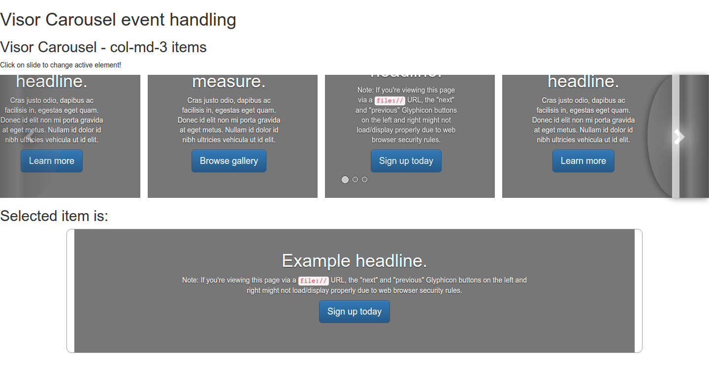
- Can be used for create thumbnail slider (see visor browse sample about
selectedevent handler) - Supports landscape and portrait layouts, which are detected automatically on-the-fly: on portrait layout the carousel realignes itself to single-slide up-down slider
- CSS3 animations, event handlers to wait animations/transitions end (no need to hard-code it into the JS source)
- Able to support multiple animations by adding to
VisorCarousel.ANIMATIONS(look up the JS code for structure and working - it's very simple!)
How to?
It's simple:
<link rel="stylesheet" type="text/css" href=".../assarte-visor-carousel/css/jquery.visor-carousel.css"> <script type="text/javascript" src=".../assarte-visor-carousel/js/jquery.visor-carousel.js"></script>You should replace ... by your assets path. For production mode you could use minified versions found in the dist/ folder. I recommend to consult the samples for a better knowledge of what kind of additional CSS would be need (maybe, a very few would be necessary). All HTML sources of these samples are found in the samples/ folder.
Bootstrap 3 carousel look-alike example
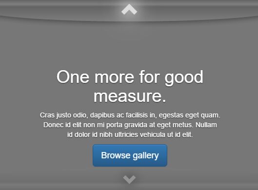
<div id="myVisor" class="visor-carousel slide" data-ride="visor"> <!-- Indicators --> <ol class="carousel-indicators"> <li data-target="#myVisor" data-slide-to="0" class="active"></li> <li data-target="#myVisor" data-slide-to="1"></li> <li data-target="#myVisor" data-slide-to="2"></li> </ol> <div class="carousel-inner" role="listbox"> <div class="item col-md-12 active"> <img class="first-slide" src="data:image/gif;base64,R0lGODlhAQABAIAAAHd3dwAAACH5BAAAAAAALAAAAAABAAEAAAICRAEAOw==" alt="First slide"> <div class="container"> <div class="carousel-caption"> <h1>Example headline.</h1> <p>Note: If you're viewing this page via a <code>file://</code> URL, the "next" and "previous" Glyphicon buttons on the left and right might not load/display properly due to web browser security rules.</p> <p><a class="btn btn-lg btn-primary" href="#" role="button">Sign up today</a></p> </div> </div> </div> <div class="item col-md-12"> <img class="second-slide" src="data:image/gif;base64,R0lGODlhAQABAIAAAHd3dwAAACH5BAAAAAAALAAAAAABAAEAAAICRAEAOw==" alt="Second slide"> <div class="container"> <div class="carousel-caption"> <h1>Another example headline.</h1> <p>Cras justo odio, dapibus ac facilisis in, egestas eget quam. Donec id elit non mi porta gravida at eget metus. Nullam id dolor id nibh ultricies vehicula ut id elit.</p> <p><a class="btn btn-lg btn-primary" href="#" role="button">Learn more</a></p> </div> </div> </div> <div class="item col-md-12"> <img class="third-slide" src="data:image/gif;base64,R0lGODlhAQABAIAAAHd3dwAAACH5BAAAAAAALAAAAAABAAEAAAICRAEAOw==" alt="Third slide"> <div class="container"> <div class="carousel-caption"> <h1>One more for good measure.</h1> <p>Cras justo odio, dapibus ac facilisis in, egestas eget quam. Donec id elit non mi porta gravida at eget metus. Nullam id dolor id nibh ultricies vehicula ut id elit.</p> <p><a class="btn btn-lg btn-primary" href="#" role="button">Browse gallery</a></p> </div> </div> </div> </div> <a class="left carousel-control layout-landscape" href="#myVisor" role="button" data-slide="prev"> <span class="glyphicon glyphicon-chevron-left" aria-hidden="true"></span> <span class="sr-only">Previous</span> </a> <a class="left carousel-control layout-portrait" href="#myVisor" role="button" data-slide="prev"> <span class="glyphicon glyphicon-chevron-up" aria-hidden="true"></span> <span class="sr-only">Previous</span> </a> <a class="right carousel-control layout-landscape" href="#myVisor" role="button" data-slide="next"> <span class="glyphicon glyphicon-chevron-right" aria-hidden="true"></span> <span class="sr-only">Next</span> </a> <a class="right carousel-control layout-portrait" href="#myVisor" role="button" data-slide="next"> <span class="glyphicon glyphicon-chevron-down" aria-hidden="true"></span> <span class="sr-only">Next</span> </a> </div><!-- /.visor -->Notice the additional carousel controls (this is for both layouts: prev/next is left-right on landscape, but up-down on portrait) and col-md-12 classes added into items class list (by aligning reasons).
Data API
You can use the same data API which Bootstrap 3 carousel supports, extended by a few additional features:
data-slide-toextended to support jQuery selectors also- new
data-slide-byattribute can be used for sliding to relative position: positive integer means forward, negative backwards (eg.data-slide-by="1"works just likedata-slide="next",data-slide-by="-1"likedata-slide="prev")
Contribution and Legal info
I'd like to thought that I made my best when I spent a little non-stop week for creating this extension, while I know that there could be some bugs, problems and further needs which I forgot to implement or didn't know. Please, feel free to contribute!
Choosed licence for this project is 


