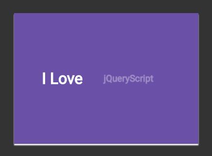
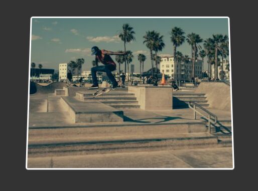
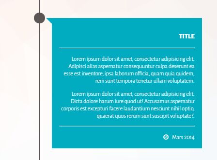
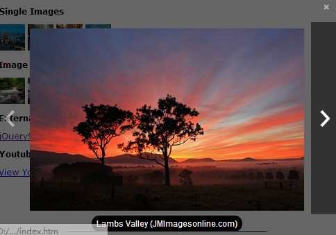
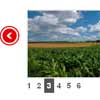
 This is a HTML | CSS | JQuery Fully Responsive Portfolio in a pinterest style with a lightbox. It will adapt to the width of its container so you can put it anywhere and you can put anything inside the boxes. Also you don’t have to load all the images at once (for performance purposes) so you can specify the number of images to load when it first load and the number of images to load when you click the “load more images” button.
The navigation filter bar is generated automatically from the categories you specify to each image.Features:Fully responsive grid and lightboxLazy Load FeatureThe Lightbox Support images and iframes of any dimensions and it will keep the right proportionsThe filter navigation bar is generated automatically from the categories you specify to each thumbnailSet the number of images to load at start and when you click the “load more images” buttonSupport thumbnails for the grid only to the images you want to improve performanceFully Responsive Grid and LightboxFull width, the grid will adapt to the 100% of its container if you set the width of each column to ‘auto’You can specify a static width for each column or specify number of columnsWhen specifying the number of columns you can set the minimum width for each columnCSS3 EffectsDirection aware hover effectLightbox with slideshow (play, pause, auto-play)Easy implementationCompatible with Twitter Bootstrap
This is a HTML | CSS | JQuery Fully Responsive Portfolio in a pinterest style with a lightbox. It will adapt to the width of its container so you can put it anywhere and you can put anything inside the boxes. Also you don’t have to load all the images at once (for performance purposes) so you can specify the number of images to load when it first load and the number of images to load when you click the “load more images” button.
The navigation filter bar is generated automatically from the categories you specify to each image.Features:Fully responsive grid and lightboxLazy Load FeatureThe Lightbox Support images and iframes of any dimensions and it will keep the right proportionsThe filter navigation bar is generated automatically from the categories you specify to each thumbnailSet the number of images to load at start and when you click the “load more images” buttonSupport thumbnails for the grid only to the images you want to improve performanceFully Responsive Grid and LightboxFull width, the grid will adapt to the 100% of its container if you set the width of each column to ‘auto’You can specify a static width for each column or specify number of columnsWhen specifying the number of columns you can set the minimum width for each columnCSS3 EffectsDirection aware hover effectLightbox with slideshow (play, pause, auto-play)Easy implementationCompatible with Twitter Bootstrap
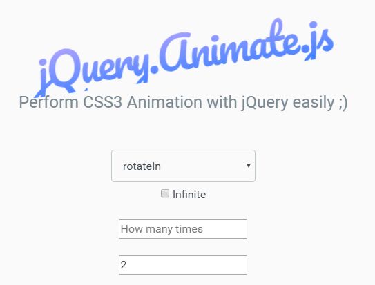
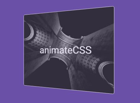
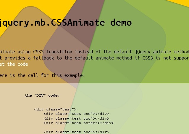
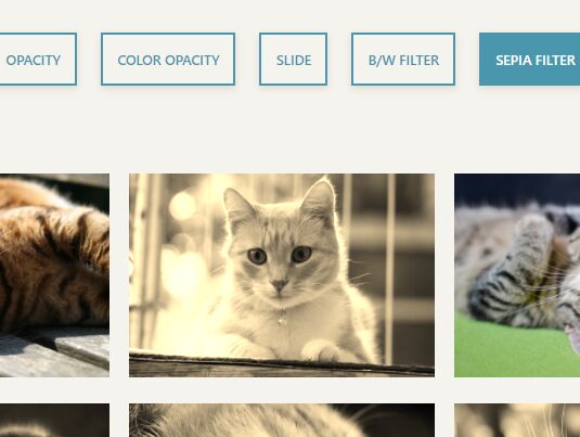
You May Also Like


jQuery Plugins
- 3D Slider
- AutoComplete
- Barcode
- Blur Effect
- Calculator
- Captcha
- Checkbox
- Color Picker
- Confirm Dialog
- Context Menu
- Cookies
- Countdown Timer
- Coverflow
- Currency Format
- DateTime Picker
- Dialog
- Editable
- Event Calendar
- File Upload
- Filter
- Fixed Header
- Flipbook
- Form Submit
- Form Validation
- Form Wizard
- Fullscreen
- Geolocation
- Grid
- History
- Html5 Audio Player
- HTML5 canvas
- Html5 Local Storage
- Html5 Video Player
- Image Crop
- Image Hover Effect
- Lazy Load
- Login
- Mask
- Mega Menu
- MultiSelect
- News Ticker
- Notification
- Parallax
- Placeholder
- Portfolio
- Preloader
- Progress Bar
- Range Slider
- Rating
- Rotate Image
- Scrollbar
- Scrolling Effects
- SelectBox
- Shopping Cart
- Side Menu
- Social Share
- Sorting
- Timeline
- Tooltip
- Treeview
- Video Background
- Weather
- Website Tour
- Wysiwyg Editor
- YouTube
AngularJs Plugins
- Accordion
- Animation
- Application
- Autocomplete
- Bootstrap
- Calendar
- Carousel
- Chart_Graph
- Date_Time
- Drag_Drop
- Forms
- Gallery
- Maps
- Menu_Navigation
- Modal_Popup
- Plugins
- Premium
- Slider
- Table
- Tabs
- Text Effects
- Tutorials
- Video_Audio
- Zoom