Bootstrap Date Paginator
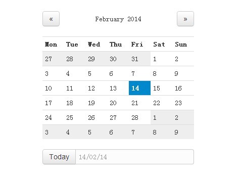
A jQuery plugin which takes Twitter Bootstrap's already great pagination component and injects a bit of date based magic. In the process creating a hugely simplified and modularised way of paging date based results in your application.
For full documentation and examples, please visit Bootstrap Date Paginator Website
Requirements
Where provided these are the actual versions bootstrap-datepaginator has been tested against. Other versions should work but you use them as your own risk.
Usage
A full list of dependencies required for the bootstrap-datepaginator to function correctly.
<!-- Required Stylesheets --> <link href="./css/bootstrap.css" rel="stylesheet"> <link href="./css/bootstrap-datepicker.css" rel="stylesheet"> <!-- Required Javascript --> <script src="./js/jquery.js"></script> <script src="./js/moment.js"></script> <script src="./js/bootstrap-datepicker.js"></script> <script src="./js/bootstrap-datepaginator.js"></script> The component will bind to any existing DOM element.
<div id="paginator"></div> The most basic usage, in most cases this is all you'll need.
$('#paginator').datepaginator(); For advanced configuration, an options object can be passed on initialization.
var options = { selectedDate: '2013-01-01', selectedDateFormat: 'YYYY-MM-DD' } $('#paginator').datepaginator(options); Options
endDate
String, or Moment. Default: End of time
Sets the latest date that may be selected, all later dates will be disabled.
endDateFormat
String. Default: 'YYYY-MM-DD'
Sets the date format used when parsing string representations of endDate.
highlightSelectedDate
Boolean. Default: true
Whether or not to distinguish visually the selected date.
###highlightToday Boolean. Default: true
Whether or not to distinguish visually today's date.
hint
String. Default: 'dddd, Do MMMM YYYY'
Format used for on hover hint. String tokens are parsed against a given date.
injectStyle
Boolean. Default: true
By default the required styles are injected into the DOM automatically and no external css reference is required. In the event that you want to override and customize the default style, set injectStyle to false and ensure that bootstrap-datepaginator.css (or your modified css) is referenced.
Please note - where multiple paginators are applied to the same page, all must be set to injectStyle false otherwise the DOM injected style takes precedence.
itemWidth
Integer. Default: 35
Minimum width specified in pixels for an item.
navItemWidth
Integer. Default: 20
Minimum width specified in pixels for the nav items e.g. left and right arrows
offDays
String (csv). Default: 'Sat,Sun'
Sets days of the week to be considered off days, visually greyed out.
offDaysFormat
String. Default: 'ddd'
Sets the format used when evaluating offDays. For example, 'ddd' formats as a 3 letter abbreviation representing the day of the week, therefore Saturday becomes 'Sat'.
Please review Moment.js formatting guide for a full list of supported options.
selectedDate
String, or Moment. Default: moment(), equivalent to new Date()
Sets the initial selected date, provided as either a Moment.js moment object or String.
*If you're planning on providing a String, please ensure you review the dateFormat option.
selectedDateFormat
String. Default: 'YYYY-MM-DD'
Sets the date format used throughout the components lifecycle when parsing the selected date object.
selectedItemWidth
Integer. Default: 120
Minimum width specified in pixels for the selected item.
showCalendar
Boolean. Default: true
Whether or not to display the clickable calendar icon visible on selected date. By setting to false you are effectively removing the calendar date select functionality from the user.
showOffDays
Boolean. Default: true
Whether or not to display off days.
showStartOfWeek
Boolean. Default: true
Whether or not to display the start of week divider.
size
String. Default: normal
Sets the height of the paginator component. Accepts small, normal, large.
startDate
String, or Moment. Default: Beginning of time
Sets the earliest date that may be selected, all earlier dates will be disabled.
startDateFormat
String. Default: 'YYYY-MM-DD'
Sets the date format used when parsing string representations of startDate.
startOfWeek
String. Default: 'Mon'
Sets for display purposes the start of the week, visually illustrated by a thicker dividing line betweeen dates.
startOfWeekFormat
String. Default: 'ddd'
Sets the format used when evaluating startOfWeek. For example, 'ddd' formats as a 3 letter abbreviation representing the day of the week, therefore Saturday becomes 'Sat'.
Please review Moment.js formatting guide for a full list of supported options.
squareEdges
Boolean. Default: false
Toggles the border radius between Bootstrap's default rounded edges (border-radius: 4px) and overridden square edges (border-radius: 0px).
text
String. Default: 'ddd<br/>Do'
Format used for item text i.e. date format. String tokens are parsed against a given date.
textSelected
String. Default: 'dddd<br/>Do, MMMM YYYY'
Format used for the selected item text. String tokens are parsed against a given date.
width
Integer. Default: 0 (auto)
By default the paginator will automatically fill the entire width of it's container. However, if you require more control over the component you can specify any given width in pixels e.g. width: 400.
Methods
setSelectedDate
Sets the selected date, triggering a refresh to reflect the new state.
$('#paginator').datepaginator('setSelectedDate', ['2013-10-05', 'YYYY-MM-DD']); If called without passing a format argument, selectedDateFormat will be used.
$('#paginator').datepaginator('setSelectedDate', '2013-10-05'); remove
Removes the date paginator component. Removing attached events, internal attached objects, and added HTML elements.
$('#paginator').datepaginator('remove'); Events
selectedDateChanged
Fired when the selected date changes. You can bind to it using either the callback handler or the standard jQuery .on method
Example using options callback handler:
var options = { onSelectedDateChanged: function(event, date) { // Your logic goes here } } $('#event-example').datepaginator(options); and using jQuery .on method
$('#event-example').on('selectedDateChanged', function(event, date) { // Your logic goes here }); Copyright and License
Copyright 2013 Jonathan Miles
Licensed under the Apache License, Version 2.0 (the "License"); you may not use this file except in compliance with the License. You may obtain a copy of the License at http://www.apache.org/licenses/LICENSE-2.0
Unless required by applicable law or agreed to in writing, software distributed under the License is distributed on an "AS IS" BASIS, WITHOUT WARRANTIES OR CONDITIONS OF ANY KIND, either express or implied. See the License for the specific language governing permissions and limitations under the License.
