bootstrap-popover-picker
Generic jQuery plugin template for building pickers using Bootstrap popovers, fully customizable with a powerful base API, including jQuery.UI position plugin.
How to use the plugin without inputs
Instantiation
You can call the plugin in several ways:
// Create instance if not exists (returns a jQuery object) $('.my').picker(); $('.my').picker({ /*options*/ }); // you can also specify options via data-* attributes // For the first matched element, access to a plugin property value $('.my').data('picker').pickerProperty; // For the first matched element, call a plugin instance method with the given args $('.my').data('picker').pickerMethod('methodArg1', 'methodArg2' /* , other args */); // Call and apply a plugin method to EACH matched element. $.picker.batch('.my', 'pickerMethod', 'methodArg1', 'methodArg2' /* , other args */); ->Options
These are the default options
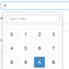
{ title: false, // Popover title (optional) only if specified in the template selected: false, // use this value as the current item and ignore the original defaultValue: false, // use this value as the current item if input or element item is empty placement: 'bottom', // WIP (has some issues with auto and CSS). auto, top, bottom, left, right collision: 'none', // If true, the popover will be repositioned to another position when collapses with the window borders animation: true, //hide picker automatically when a value is picked. it is ignored if mustAccept is not false and the accept button is visible hideOnSelect: false, showFooter: false, searchInFooter: false, // If true, the search will be added to the footer instead of the title mustAccept: false, // only applicable when there's an picker-btn-accept button in the popover footer selectedCustomClass: 'bg-primary', // Appends this class when to the selected item // List of valid items items: ['0', '1', '2', '3', '4', '5', '6', '7', '8', '9', 'A', 'B', 'C', 'D', 'E', 'F'], itemProperty: null, // Defines which property will be accessed to show the value, in case of the items be an array of objects. input: 'input', // children input selector (you can change this to anything even if it's not an input) component: '.input-group-addon', // children component selector or object, relative to the parent element container: false, // WIP. Appends the popover to a specific element. If true, appends to the jQuery element. updateComponentOnChange: true, // If false, it will not update the content in the component pickerItemClass: "picker-item", // Defines the selector class of the picker item, itemValueSelector: "i", // Defines the selector of the element that contains the value of an item // Plugin templates: templates: { popover: '<div class="picker-popover popover"><div class="arrow"></div>' + '<div class="popover-title"></div><div class="popover-content"></div></div>', footer: '<div class="popover-footer"></div>', buttons: '<button class="picker-btn picker-btn-cancel btn btn-default btn-sm">Cancel</button>' + ' <button class="picker-btn picker-btn-accept btn btn-primary btn-sm">Accept</button>', search: '<input type="search" class="form-control picker-search" placeholder="Type to filter" />', picker: '<div class="picker"><div class="picker-items"></div></div>', pickerItem: '<div class="picker-item"><i></i></div>', } }Triggered Events
All of them exposes the plugin instance through event.pickerInstance
In order of call:
- pickerCreate
- pickerCreated
- pickerShow
- pickerShown
- pickerSelect (also exposes event.pickerItem and event.pickerValue)
- pickerUpdate
- pickerInvalid (also exposes event.pickerValue)
- pickerSetValue (also exposes event.pickerValue)
- pickerSetSourceValue (also exposes event.pickerValue)
- pickerUpdated
- pickerSelected (also exposes event.pickerItem and event.pickerValue)
- pickerHide
- pickerHidden
- pickerDestroy
- pickerDestroyed
Popover placement extensions
This plugin comes with more placement options than the original Bootstrap Popover. Here are all the possibilities in detail:
1 2 3 4 5 G 6 F 7 E 8 D C B A 9 0. inline (no placement, display as inline-block) 1. topLeftCorner 2. topLeft 3. top (center) 4. topRight 5. topRightCorner 6. rightTop 7. right (center) 8. rightBottom 9. bottomRightCorner A. bottomRight B. bottom (center) C. bottomLeft D. bottomLeftCorner E. leftBottom F. left (center) G. leftTop Note: The position plugin is embedded with the picker plugin, but uses a different namespace: $.fn.pos, for avoiding other plugin issues.
To-Do
- Fix extra placements: rightTop, rightBottom, leftBottom and leftTop
- Implement inline mode
- Implement optional accept/cancel buttons
- Hide on blur input, but not if the blur is caused because we clicked the popover
- Fix css: soft lines showing under popover arrows
- Auto placement when popover offsets the window (also due to scroll)
- Container: Fix placements when container is different from the element parent
- Implement component mode (if present, the trigger must be the component and not the input)
- Fix arrow positions for all new placements
- Detach popover HTML from DOM when destroy is called
- Fix: has-error is not set in component mode
- Max rows (limit popover height)
- Filtered search (input accepts regular expressions)
- Generalize the library (not using font awesome)


