Bootstrap MaxLength 
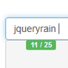
This plugin integrates by default with Twitter bootstrap using badges to display the maximum length of the field where the user is inserting text. This plugin uses the HTML5 attribute "maxlength" to work.
The indicator badge shows up on focusing on the element, and disappears when the focus is lost.
Configurable options
- alwaysShow: if true the threshold will be ignored and the remaining length indication will be always showing up while typing or on focus on the input. Default: false.
- threshold: this is a number indicating how many chars are left to start displaying the indications. Default: 10.
- warningClass: it's the class of the element with the indicator. By default is the bootstrap "label label-success" but can be changed to anything you'd like.
- limitReachedClass: it's the class the element gets when the limit is reached. Default is "label label-important label-danger" (to support Bootstrap 2 and 3).
- separator: represents the separator between the number of typed chars and total number of available chars. Default is "/".
- preText: is a string of text that can be outputted in front of the indicator. preText is empty by default.
- postText: is a string outputted after the indicator. postText is empty by default.
- showMaxLength: if false, will display just the number of typed characters, e.g. will not display the max length. Default: true.
- showCharsTyped: if false, will display just the remaining length, e.g. will display remaining length instead of number of typed characters. Default: true.
- placement: is a string, define where to output the counter. Possible values are: bottom ( default option ), left, top, right, bottom-right, top-right, top-left, bottom-left and centered-right.
- appendToParent: appends the maxlength indicator badge to the parent of the input rather than to the body.
- message: an alternative way to provide the message text, i.e. 'You have typed %charsTyped% chars, %charsRemaining% of %charsTotal% remaining'. %charsTyped%, %charsRemaining% and %charsTotal% will be replaced by the actual values. This overrides the options separator, preText, postText and showMaxLength. Alternatively you may supply a function that the current text and max length and returns the string to be displayed. For example, function(currentText, maxLength) { return '' + Math.ceil(currentText.length / 160) + ' SMS Message(s)'; }
- utf8: if true the input will count using utf8 bytesize/encoding. For example: the '£' character is counted as two characters.
- showOnReady: shows the badge as soon as it is added to the page, similar to alwaysShow
- twoCharLinebreak: count linebreak as 2 characters to match IE/Chrome textarea validation.
- customMaxAttribute: String -- allows a custom attribute to display indicator without triggering native maxlength behaviour. Ignored if value greater than a native maxlength attribute. 'overmax' class gets added when exceeded to allow user to implement form validation.
- allowOverMax: Will allow the input to be over the customMaxLength. Useful in soft max situations.
- placement: is a string, object, or function, to define where to output the counter.
- Possible string values are: bottom ( default option ), left, top, right, bottom-right, top-right, top-left, bottom-left and centered-right. Are also available : bottom-right-inside (like in Google's material design, top-right-inside, top-left-inside and bottom-left-inside.
- Custom placements can be passed as an object, with keys top, right, bottom, left, and position. These are passed to $.fn.css.
- A custom function may also be passed. This method is invoked with the {$element} Current Input, the {$element} MaxLength Indicator, and the Current Input's Position {bottom height left right top width}.
Events
- maxlength.reposition on an input element triggers re-placing of its indicator. Useful if textareas are resized by an external trigger.
- maxlength.shown is triggered when the indicator is displayed.
- maxlength.hidden is triggered when the indicator is removed from view.
Examples
Basic implementation:
$('input[maxlength]').maxlength();Change the threshold value:
$('input.className').maxlength({ threshold: 20 });An example with some of the configurable options:
$('input.className').maxlength({ alwaysShow: true, threshold: 10, warningClass: "label label-info", limitReachedClass: "label label-warning", placement: 'top', preText: 'used ', separator: ' of ', postText: ' chars.' });The same example using the message option:
$('input.className').maxlength({ alwaysShow: true, threshold: 10, warningClass: "label label-info", limitReachedClass: "label label-warning", placement: 'top', message: 'used %charsTyped% of %charsTotal% chars.' });An example allowing user to enter over max characters. NOTE: you cannot have the maxlength attribute on the input element. You will need to provide the customMaxAttribute attribute
Sample HTML element:
<textarea class="form-control" id="xyz" name="xyz" maxlength="10"></textarea>// Setup maxlength $('.form-control').maxlength({ alwaysShow: true, validate: false, allowOverMax: true, customMaxAttribute: "90" }); // validate form before submit $('form').on('submit', function (e) { $('.form-control').each( function () { if ($(this).hasClass('overmax')) { alert('prevent submit here'); e.preventDefault(); return false; } } ); });An example of triggering a maxlength.reposition event whenever an external autosize plugin resizes a textarea:
$('textarea').on('autosize:resized', function() { $(this).trigger('maxlength.reposition'); });