vue-fraction-grid
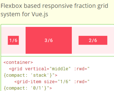
Flexbox based responsive fraction grid system for Vue.js
Live Demo and Full Documentation
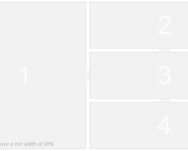
<container> <grid vertical="middle" :rwd="{compact: 'stack'}"> <grid-item size="1/6" :rwd="{compact: '0/1'}"> ... </grid-item> <grid-item size="3/6" :rwd="{compact: '1/1'}"> ... </grid-item> <grid-item size="2/6" :rwd="{compact: '1/1'}"> ... </grid-item> </grid> </container>Installation
Install the package using yarn or npm:
$ yarn add vue-fraction-grid # or $ npm install --save vue-fraction-gridGlobal
Load the plugin by calling Vue.use():
import Vue from "vue"; import VueFractionGrid from "vue-fraction-grid"; Vue.use(VueFractionGrid);Now you have access in your templates to <container>, <grid> and <grid-item> components.
Local
You may prefer to explicitly import the components in your templates:
<template> <container> <grid> <grid-item size="1/2"> ... </grid-item> <grid-item size="1/2"> ... </grid-item> </grid> </container> </template> <script> import Container from "vue-fraction-grid/components/Container"; import Grid from "vue-fraction-grid/components/Grid"; import GridItem from "vue-fraction-grid/components/GridItem"; export default { components: { Container, Grid, GridItem } }; </script>CDN
Load the script file from CDN:
<div id="root"></div> <script src="//cdnjs.cloudflare.com/ajax/libs/vue/2.2.1/vue.min.js"></script> <script src="//unpkg.com/vue-fraction-grid"></script> <script> new Vue({ el: "#root", template: "<container>...</container>" }); </script>Settings
Vue.use(VueFractionGrid, { container: "1020px", gutter: "24px", approach: "mobile-first", breakpoints: { compact: "320px 414px" } });Configure grid by passing options as a second argument of Vue.use(). Configuration is merged to defaults that are listed above.
Available settings:
container - Default containers width. Works with any valid CSS values like: '1440px', '52em', '100vw' etc. Set it to '100%' to use full-width fluid grid. Because this is the maximum value, the grid will scale nicely for smaller viewports. gutter - Gutter width. Works with any valid CSS values like '30px', '1rem' etc. approach - 'mobile-first' or 'desktop-first'. Choose which approach of responsive web design do you prefer. Breakpoint rules are based on this option. breakpoints - List the grid breakpoints. Key is the breakpoint name for `:rwd` prop. Value is the size and can include one or two CSS values separated with a space. Components
Container
Syntax:
<container [width="<length>|<percentage>" ]></container>Center content of the site in the container:
<container> ... </container>Override container's maximum width with width prop. This is useful when you need more than one container's type e.g. regular and full-width.
<container width="100%"> ... </container><container width="25vw"> ... </container>Grid
Syntax:
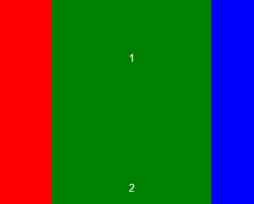
<grid [horizontal="left|center|right" vertical="top|middle|bottom" direction="reverse|stack|stack-reverse" wrap="nowrap|wrap|wrap-reverse" :rwd="{ breakpointName: direction }" flat pair] ></grid>The most common usage and simple example of the grid:
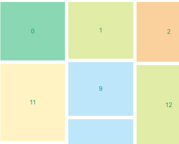
<grid> <grid-item size="1/3"> ... </grid-item> <grid-item size="2/3"> ... </grid-item> </grid>Nest grids however you like, the gutter is always the same. There is no need to wrap nested grids with containers.
<grid> <grid-item size="2/3"> <grid> <grid-item size="1/2"> ... </grid-item> <grid-item size="1/2"> ... </grid-item> </grid> </grid-item> <grid-item size="1/3"> ... </grid-item> </grid>Horizontal alignment of grid items. This works simillar to justify-content attribute.
<grid horizontal="left"> ... </grid><grid horizontal="center"> ... </grid><grid horizontal="right"> ... </grid><grid horizontal="around"> ... </grid><grid horizontal="between"> ... </grid>Vertical alignment of grid items. This works simillar to align-items attribute.
<grid vertical="top"> ... </grid><grid vertical="middle"> ... </grid><grid vertical="bottom"> ... </grid>Remove gutter from grid items.
<grid flat> ... </grid>Align content of the first item to the left and content of the second item to the right.
<grid pair> ... </grid>Set the grid items direction. This works simillar to flex-direction attribute.
<grid direction="reverse"> ... </grid><grid direction="stack"> ... </grid><grid direction="stack-reverse"> ... </grid>Set the grid items wrap. This works simillar to flex-wrap attribute.
<grid wrap="wrap"> ... </grid><grid wrap="wrap-reverse"> ... </grid>Mix props however you want to.
<grid horizontal="right" vertical="bottom" direction="reverse" pair> ... </grid>Grid Item
Syntax:
<grid-item size="<number>/<number>" |grow="<number>" |shrink="<number>" [:rwd="{ breakpointName: size }" ] ></grid-item>Use any size written in the fraction format. Grid item should be nested directly in the grid. Items fractions don't have to sum to 1. Denominator can't be equal 0!
<grid-item size="123/456"> ... </grid-item>Fill the grid with a grid item by setting its size to 1/1:
<grid-item size="1/1"> ... </grid-item>Hide the grid item by setting its size to 0/1:
<grid-item size="0/1"> ... </grid-item>Use grow and shrink props instead of size. They work simillar to flex-grow and flex-shrink attributes. Never mix size, grow and shrink into a single item!
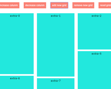
<grid-item grow="2"> ... </grid-item><grid-item shrink="0.5"> ... </grid-item>Responsive Design
Responsive design is based on two options from settings: approach and breakpoints.
If you set approach to mobile-first breakpoints with a single value will respond to media queries using min-width attribute. If you use desktop-first instead, breakpoints will respond to max-width.
Breakpoints with two values respond to (min-width: <length>) and (max-width: <length>) query.
Following configuration:
Vue.use(VueFractionGrid, { approach: "desktop-first", breakpoints: { compact: "415px", tablet: "416px 1100px" } });Is translated to this declaration from CSS:
@media (max-width: 415px) { ...; } /* compact */ @media (min-width: 416px) and (max-width: 1100px) { ...; } /* tablet */API
Change the direction of a grid for specific breakpoints.
<grid :rwd="{compact: 'reverse'}"> ... </grid><grid direction="stack" :rwd="{compact: 'stack-reverse'}"> ... </grid>Change size of a grid item for specific breakpoints.
<grid-item size="3/4" :rwd="{compact: '0/1'}"> ... </grid-item>Mix responsive design props for grid and items.
<grid :rwd="{compact: 'stack'}"> <grid-item size="1/6" :rwd="{tablet: '0/1', compact: '1/1'}"> ... </grid-item> <grid-item size="1/2" :rwd="{tablet: '1/2', compact: '0/1'}"> ... </grid-item> <grid-item size="1/3" :rwd="{tablet: '1/2', compact: '1/1'}"> ... </grid-item> </grid>Development
-
Clone the repository:
$ git clone [email protected]:brtjkzl/vue-fraction-grid.git
-
Run scripts from package.json using
npm run/yarn runin the main directory:demo - Start demo page with implementation of all examples test - Run tests using Jest lint - Lint JS and CSS code of components, utils and installation docs - Start docs locally deploy - Deploy docs to GitHub Pages dist - Create an optimized bundle in UMD format
Code is open sourced on GitHub. Up to date changelog is available under the releases section.