react-awesome-query-builder


User-friendly React component to build queries.
Forked from https://github.com/fubhy/react-query-builder
Inspired by jQuery QueryBuilder
Using awesome Ant Design for widgets
Master branch uses antd v2 (because of more compact style) and versions 0.1.*. For antd v3 see branch antd-3 and versions 0.2.*.
Features
- Highly configurable
- Fields can be of type:
- simple (string, number, bool, date/time/datetime, list)
- structs (will be displayed in selectbox as tree of members)
- custom type (dev should add its own widget component for this) (it's not complex, you can add slider for example)
- Comparison operators can be:
- binary (== != < > ..)
- unary (is empty, is null)
- 'between' (for numbers)
- complex operators like 'proximity'
- Values of fields can be compared with values -or- another fields (of same type)
- Reordering support for rules and groups of rules
- Using awesome Ant Design
- Export to MongoDb or SQL
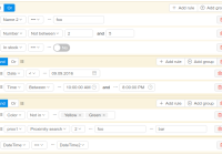
Demo

Install
Install: npm i react-awesome-query-builder
See examples/demo as example of usage and configuration.
For full reordering support you need to add class query-builder-container for dom-element which is holding your querybuilder component AND has scrolling. If there is no such dom-element (only body) you can do nothing.
Use
import React, {Component} from 'react'; import {Query, Builder, Utils as QbUtils} from 'react-awesome-query-builder'; import config from './config'; //see below 'Config format' import 'react-awesome-query-builder/css/styles.scss'; import 'react-awesome-query-builder/css/compact_styles.scss'; import 'react-awesome-query-builder/css/denormalize.scss'; class DemoQueryBuilder extends Component { render() { return ( <div> <Query {...config} //you can pass object here, see treeJSON at onChange //value=transit.fromJSON(treeJSON) get_children={this.getChildren} onChange={this.onChange} ></Query> </div> ); } getChildren(props) { return ( <div> <div className="query-builder"> <Builder {...props} /> </div> <div>Query string: {QbUtils.queryString(props.tree, props.config)}</div> <div>Mongodb query: {QbUtils.mongodbFormat(props.tree, props.config)}</div> </div> ) } onChange(tree) { //here you can save tree object: //var treeJSON = transit.toJSON(tree) } }Use can save tree as serialized Immutable object with transit.toJSON/transit.fromJSON -or- as plain JS, see loadTree = function(serTree) {...} at examples/demo/demo.js (using Immutable.fromJS with a little trick)
Config format
import {Widgets, Operators} from 'react-awesome-query-builder'; const { TextWidget, NumberWidget, SelectWidget, MultiSelectWidget, DateWidget, BooleanWidget, TimeWidget, DateTimeWidget, ValueFieldWidget } = Widgets; import en_US from 'antd/lib/locale-provider/en_US'; export default { conjunctions: { 'AND': { label: 'And', //label for conjunctions swicther //(for building query string) function to join rules into group // children - list of already formatted queries (strings) to be joined with conjuction // isForDisplay - false by default, for building query string for SQL/expression/etc., // true can be used to format query string displayed on collapsed query group // (not used for now, see Issue #2) formatConj: (Immultable.List children, string conj, bool not, bool isForDisplay) => string, reversedConj: 'OR', //'AND' reverses to 'OR' //for building mongodb query: mongoConj: '$and', }, 'OR': ...same as for 'AND' }, fields: { //Example of atomic field: name: { label: 'Quantity', type: 'number', //one of types described below in section 'types' //Settings for widgets // Available settings for Number widget: min, max, step fieldSettings: { min: 2, }, //List of values for Select widget listValues: { //<key>: <label to display at list of options>, yellow: 'Yellow', green: 'Green', }, //(optional) You can override here some options of config of corresponding type: // 'operators', 'defaultOperator', 'widgets', 'valueSources' (see below at section 'types') }, //Example of special struct field: members: { //key of field label: 'Members', //label to display at list of fields type: '!struct', //special type for struct subfields: { //only for type == '!struct' subname: { //key of subfield label: 'Subname', //label for list of fields //label for field menu's toggler (for config.renderFieldAndOpAsDropdown == true) label2: 'MemberName', type: 'text', //one of types described below in section 'types' }, }, }, ...other fields }, types: { number: { //type key //(optional) Values of fields can be compared with values or another fields // (see settings.valueSourcesInfo). If you want to compare values of this type // only with values or other fields of this type, edit: valueSources: ['value'], //Available widgets for type and its configs: widgets: { number: { //widget key, see section 'widgets' below //List of operators can be applied to this type (see section 'operators' below) operators: ['greater', 'less'], defaultOperator: 'greater', //default operator to be selected for this type //Config for this widget (all optional): widgetProps: { //for example, here you can overwrire 'valueLabel', 'valuePlaceholder', // for date/time: 'timeFormat', 'dateFormat', 'valueFormat' //also you can pass props directly to widget, for example enable search for Select widget: customProps: { showSearch: true } }, //Config for operators for this widget (all optional): opProps: { between: { //operator key //for example, here you can overwrire 'valueLabels' }, ...other ops }, }, //Most of types can have only 1 widget, but for list there can be 2: // single-select widget (for op ==) and multi-select widget (for op 'in') ...other widgets if applicable //'field' is special widget to compare values of field of this type // with another fields (of this type) field: { ...you can overwrire 'operators' for example } } }, ...other types }, operators: { equal: { //operator key label: '==', //label for selectbox labelForFormat: '==', //string used for formatting query, only if 'formatOp' is not present reversedOp: 'not_equal', //operator opposite to current cardinality: 1, //number of right operands (1 for binary, 2 for 'between') isUnary: true, //(for building query string) function to format rule // value - string (already formatted value) for cardinality==1 // -or- Immutable.List of strings for cardinality>1 formatOp: (string field, string op, mixed value, string valueSrc, string valueType, Object opDef, Object operatorOptions, bool isForDisplay) => string, //(for building mongodb query) function to format rule // value - mixed for cardinality==1 -or- Array for cardinality>2 mongoFormatOp: (string field, string op, mixed value) => object, //for cardinality==2 ('between') valueLabels: ['Value from', {label: 'Value to', placeholder: 'Enter value to'}], textSeparators: [null, 'and'], ...also see examples/demo for config of 'proximity' operator }, }, widgets: { text: { type: "text", //see 'types' section valueSrc: 'value', //'value' or 'field' (only for special 'field' widget) factory: (props) => <TextWidget {...props} />, //React component //(for building query string) function to format widget's value formatValue: (mixed val, Object fieldDef, Object wgtDef, bool isForDisplay) => string, //(for building mongodb query) function to convert widget's value mongoFormatValue: (mixed val, Object fieldDef, Object wgtDef) => object, //func to validate widget's value validateValue: (mixed val, Object fieldDef) => bool, //Options: // common: valueLabel: "Text", valuePlaceholder: "Enter text", // for date/time widgets: timeFormat: 'HH:mm', dateFormat: 'YYYY-MM-DD', valueFormat: 'YYYY-MM-DD HH:mm', // ...for your custom widgets you can add here your options // also you can pass customProps, for example to enable search for select widget: customProps: { showSearch: true } }, ...other widgets (you can add your custom ones here) ...also there should be special 'field' widget, see examples/demo }, settings: { //Locale used for AntDesign widgets locale: { short: 'en', full: 'en-US', antd: en_US, }, //To shorten long labels of fields/values (by length, i.e. number of chars) maxLabelsLength: 50, //Placement of antdesign's dropdown pop-up menu (default: 'bottomLeft') dropdownPlacement: 'bottomRight', //Don't show conjunctions switcher for only 1 rule? hideConjForOne: true, //Size of AntDesign components renderSize: 'small', //How to render conjunctions switcher? true - use RadioGroup, false - use ButtonGroup renderConjsAsRadios: false, //How to render fields/ops list? true - use Dropdown/Menu, false - use Select renderFieldAndOpAsDropdown: false, //You can pass props to Select field widget customFieldSelectProps: { showSearch: true }, // You can change the position of the group actions to the following: // oneOf [topLeft, topCenter, topRight (default), bottomLeft, bottomCenter, bottomRight] groupActionsPosition: 'topRight', //Strategies for selecting operator for new field (used by order until success) // 'default' (default if present), 'keep' (keep prev from last field), 'first', 'none' setOpOnChangeField: ['keep', 'default'], //Clear value on field change? false - if prev & next fields have same type (widget), keep clearValueOnChangeField: false, //Clear value on operator change? clearValueOnChangeOp: false, //? setDefaultFieldAndOp: false, //Max nesting for rule groups maxNesting: 10, //Separaor for struct fields fieldSeparator: '.', //also used for formatting fieldSeparatorDisplay: '->', //used for toggler's text for renderFieldAndOpAsDropdown==true //Show labels under all ui fields? showLabels: false, //Show NOT together with AND/OR? showNot: true, //Next options are for localization: valueLabel: "Value", valuePlaceholder: "Value", fieldLabel: "Field", operatorLabel: "Operator", fieldPlaceholder: "Select field", operatorPlaceholder: "Select operator", deleteLabel: null, addGroupLabel: "Add group", addRuleLabel: "Add rule", readonlyMode: false, notLabel: "Not", delGroupLabel: null, valueSourcesPopupTitle: "Select value source", //Leave empty group after deletion or add 1 clean rule immediately? canLeaveEmptyGroup: true, //after deletion //(for building query string) function to format rule with reverse operator // which haven't 'formatOp' // q - already formatted rule for opposite operator (which have 'formatOp') // return smth like "NOT(" + q + ")" formatReverse: (string q, string operator, string reversedOp, Object operatorDefinition, Object revOperatorDefinition, bool isForDisplay) => string, //(for building query string) function to format field // parts - for struct field // label2 - with using of 'fieldSeparatorDisplay' //just return field (or label2 for isForDisplay==true) formatField: (string field, Array parts, string label2, Object fieldDefinition, Object config, bool isForDisplay) => string, //Values of fields can be compared with values or another fields //If you want to disable this feature and leave only comparing with values, remove 'field' valueSourcesInfo: { value: { label: "Value" }, field: { label: "Field", widget: "field", } }, //Activate reordering support for rules and groups of rules? canReorder: true, //(For comparing field with field) Function for building right list of fields to compare canCompareFieldWithField: (string leftField, Object leftFieldConfig, string rightField, Object rightFieldConfig) => { //for type == 'select'/'multiselect' you can check listValues return true; }, }, } Development
To build the component locally, clone this repo then run:
npm install npm run examples
Then open localhost:3001 in a browser.
Scripts:
npm run build-npm- Builds a npm module. Output path:build/npmnpm run build-global- Builds with webpack the self contained pack of the component. Output path:build/globalnpm run build-examples- Builds with webpack the examples. Output path:examplesnpm run examples- Builds with webpack the examples and runs a dev-server on localhost:3001.sh ./scripts/gh-pages.sh- Update gh pages
The repo sticks in general to the Airbnb JavaScript Style Guide.
Pull Requests are always welcomed :)
License
MIT. See also LICENSE.txt


