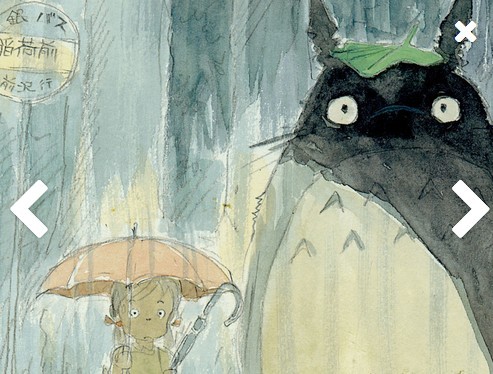
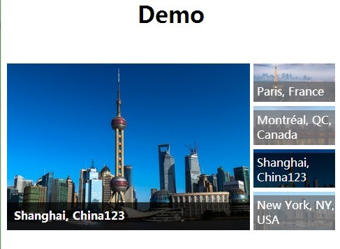
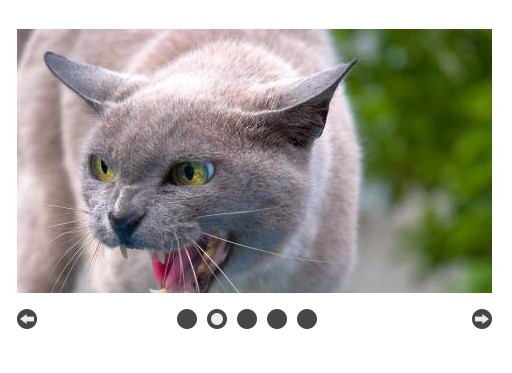
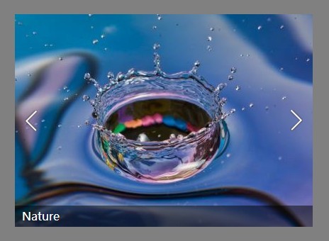
partialViewSlider
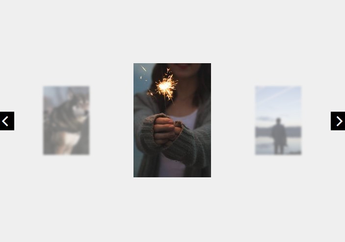
An extremely lightweight (9kb minified) jQuery slider that shows part of adjacent slides to the left and right.
Features
- Lightweight and Fast
- Responsive
- Touch ready
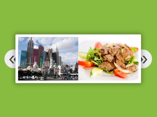
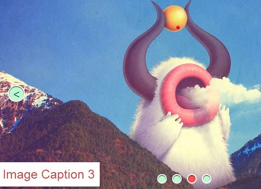
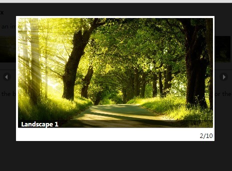
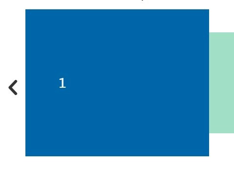
- Multiple modes (Partial View, Perspective, Regular)
- Adjustable center and side widths
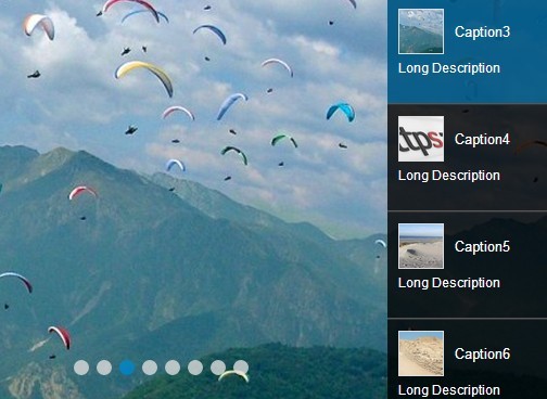
- [NEW] Added option to display multiple items
Getting Started
Include the required files
<link rel="stylesheet" type="text/css" href="dist/partialViewSlider.min.css"> <script src="src/jquery-3.3.1.min.js"></script> <script src="dist/partialViewSlider.min.js"></script> Add some html
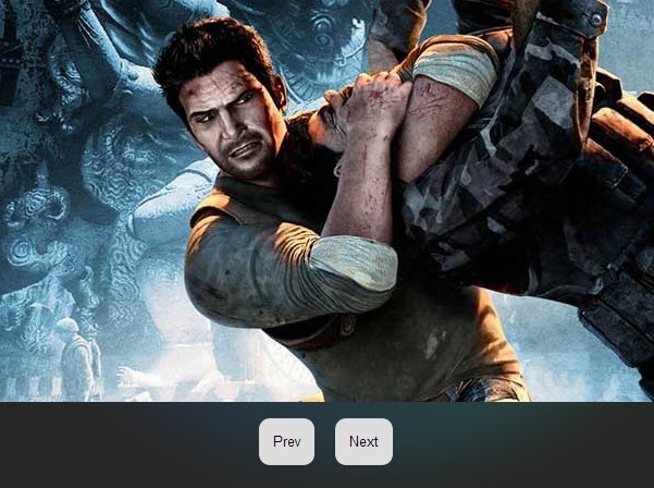
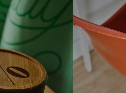
<ul id="partial-view"> <li> <img src="src/img/img1.jpeg" /> </li> <li> <img src="src/img/img2.jpeg" /> </li> <li> <img src="src/img/img3.jpg" /> </li> </ul> Initialize the plugin after including above files
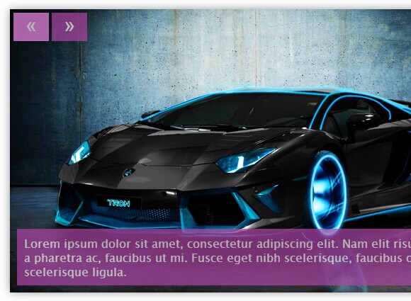
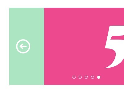
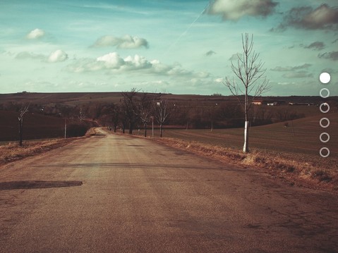
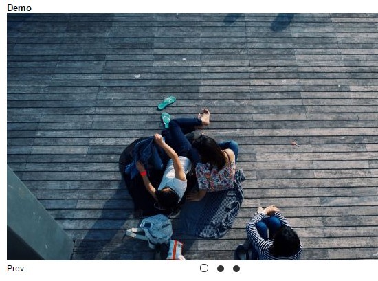
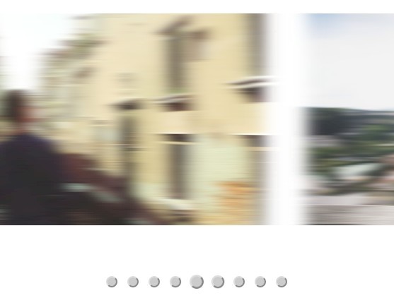
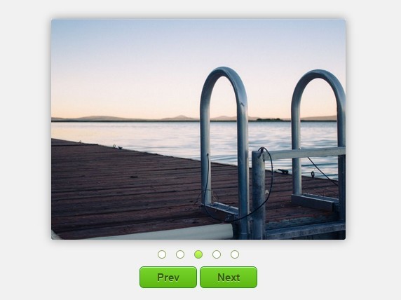
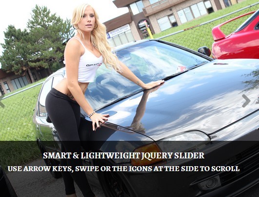
<script> $(document).ready(function(){ $('#partial-view').partialViewSlider(); }); </script> Result

Options
| Name | Type | Default | Descriptions |
|---|---|---|---|
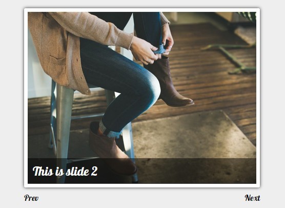
| width | int | 70 | Width of center item in percentage. Set to 100% for a regular slider |
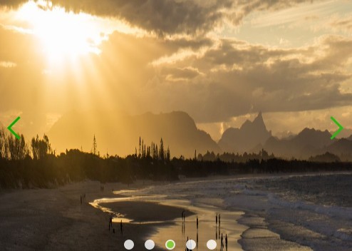
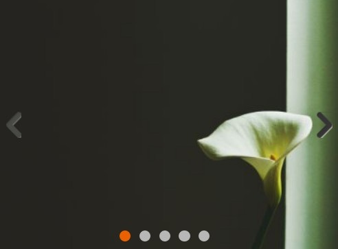
| controls | boolean | true | Whether to display arrow controls |
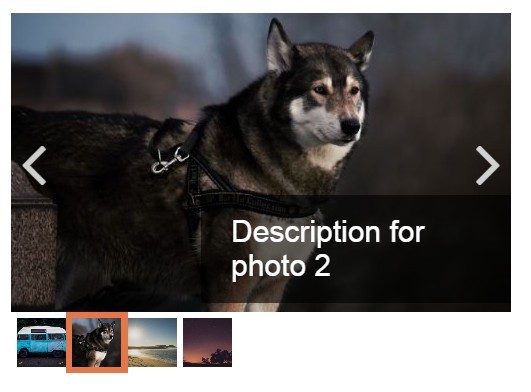
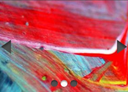
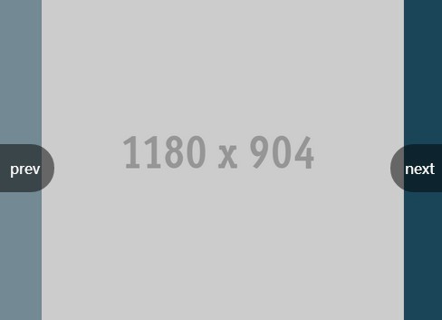
| controlsPosition | string | inside | inside: display arrows over the slides; outside: contract slides to make room for arrows on the outside; neighbors: push arrows out of the container and off the slides |
| backdrop | boolean | true | Whether to show dark bands over adjacent slides |
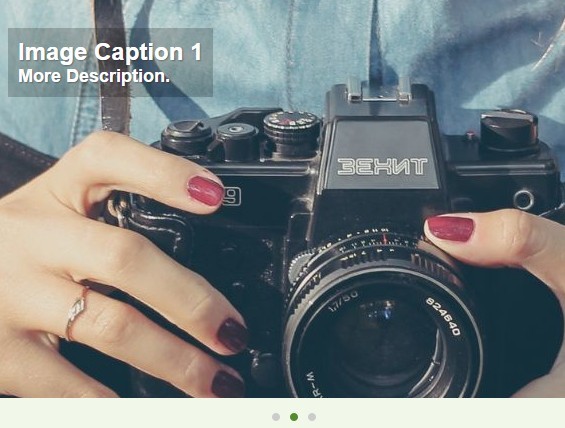
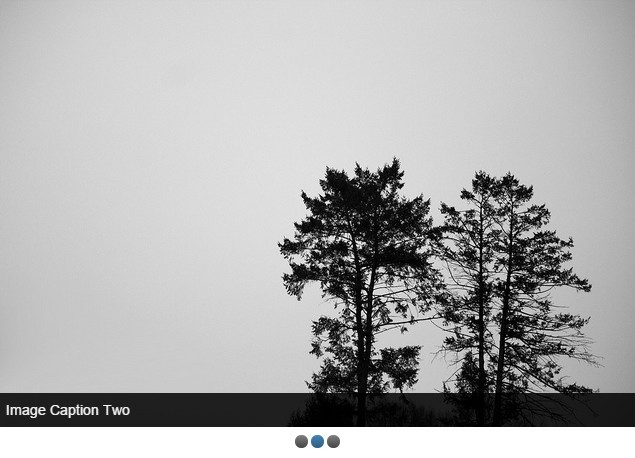
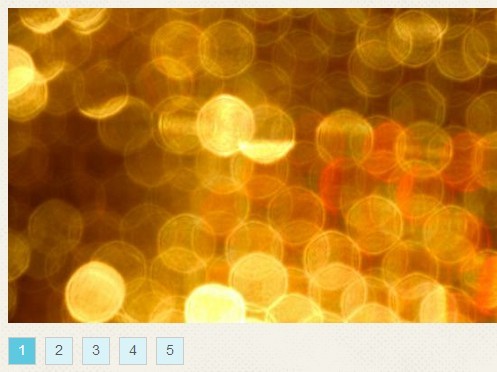
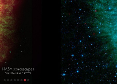
| dots | boolean | false | Whether dots navigation is displayed at the bottom |
| auto | boolean | true | Whether the slides move automatically at set intervals |
| transitionSpeed | int | 400 | time (ms) it takes to transition to another slide |
| delay | int | 4000 | time (ms) between a slide is transitioned |
| pauseOnHover | boolean | true | Whether autoplay can be paused when slider is hovered |
| keyboard | boolean | true | Whether slider can be controled with keyboard left/right arrow keys |
| perspective | boolean | false | Enable this to make adjoining slides smaller giving a perspective carousel look |
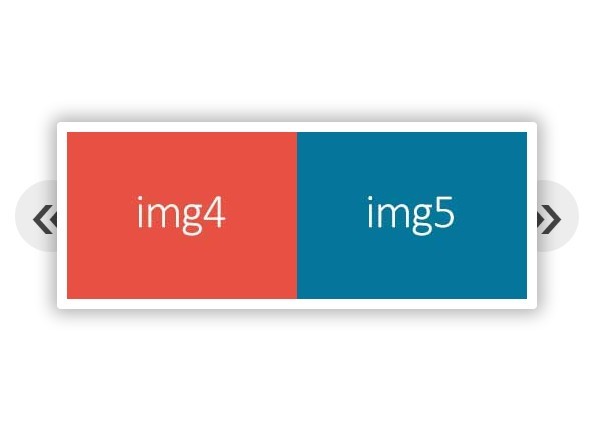
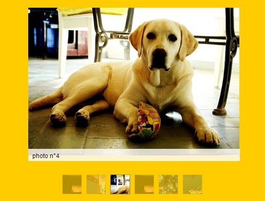
| items | object | {"0": 1} | Show multiple items at once. This is an object of resolutions and number of items above that resolution. For instance: {"0": 1, "600": 2, "992": 3} will show one item upto 600px, 2 items above 600px and and 3 items at 992px and above. Partial view is disabled if number of items are more than 1 |
| prevHtml | string | <i class="material-icons">chevron_left</i> | Html for previous slide button |
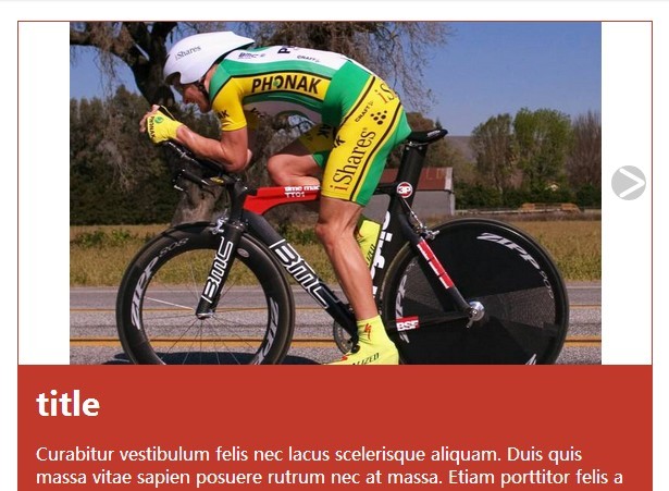
| nextHtml | string | <i class="material-icons">chevron_right</i> | Html for next slide button |
Events
| Name | Description |
|---|---|
| onLoad | Executed when slider is initialized. The initialized element is returned as one parameter |
| onSlideEnd | Executed when each slide finishes transition. The initialized element is returned as one parameter |
Methods
| Name | Description |
|---|---|
| prev | Go to previous slide |
| next | Go to next slide |
| play | Start autoplay |
| pause | Stop autoplay |
| goToSlide | Navigate to a particular slide. Pass the slide number in the Methods |
Example:
var partialView = $('#partial-view').partialViewSlider(); partialView.prev(); // Go to previous slide 


