$.hipsterSlider
IMPORTANT: New pluginname, new reponame:
The name of the plugin was changed to avoid collisions with other jQuery plugins such as jQuery UI slider...
//This is old, doesn't work anymore: //$('.slider').slider(/* options */); //Use this instead: $('.slider').hipsterSlider(/* options */); Why the name hipsterSlider?
I have no idea what's going wrong...
Features
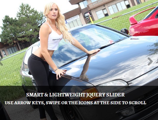
- can slide horizontal or vertical
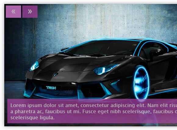
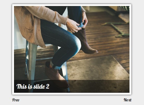
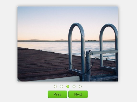
- can create a previous-button and next-button
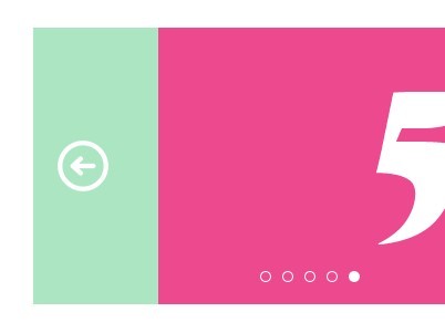
- can create pagers (numeric list of slides: 1, 2, 3...)
- has autoplay
- can play a infinite loop
- can produce a biglink (links each slide element with the href of the first link inside a slide)
- has touch support for mobile devices
- can autoresize items for example responsive websites
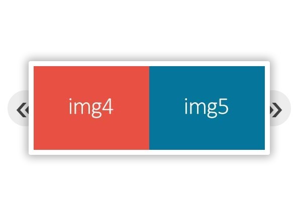
- can display multiple items in a slide in one slide position
- can skip more than one item in a slide
- has customizeable classnames for elements
- supports and detects hardware acceleration via css3 using translate3d and transition
Options
The slider provides a lot of options. If no options are defined, the slider initializes but doesn't perform any actions. To initialize the slider and provide some options take a look at the following code:
$('ul.slider').hipsterSlider({ someOption: 'a value', someOtherOption: 'an other value' }); Basics options:
width(number) - the plugin automaticly calculates the width of the slider depending on the width of the slides. If you want to force a width use this setting.height(number) - the plugin automaticly calculates the height of the slider depending on the height of the slides. If you want to force a height use this setting.orientation(string) - defines if the slides move horizontal or vertical inside the slideshow. The default setting is horizintal.
The following values are valid:'horizontal'or$.slider.HORIZONTAL'vertical'or$.slider.VERTICAL
infinite(boolean) - activates the possebility to slide continuous through all slides in one direction. After the last slide comes the first again. The default value isfalseautoplay(boolean) - activates the feature to automaticly change between the slides after a defined pause. For more details see the Autoplay options. The default value isfalse.duration(number) - is the time in milliseconds of the transition between the slides. Default value is500
Here is an example of all of these options in use:
$('ul.slider').hipsterSlider({ width: 800, height: 200, orientation: $.slider.VERTICAL, infinite: true, autoplay: true, duration: 1000 }); Button options:
buttons(boolean) - activates buttons for scrolling forward and backward. Default value isfalse.buttonsClass(string) - a classname for a button. Default value is'slider-button'.buttonPrevLabel(string) - a label for the previous button. Default value is'previous'.buttonPrevClass(string) - a classname for the previous button. Default value is'previous'.buttonNextLabel(string) - a label for the next button. Default value is'next'.buttonNextClass(string) - a classname for the next button. Default value is'next'.buttonDisabledClass(string) - a classname as indicator for a not available scrolling. Default value is'disabled'.buttonsWrap(boolean) - if this is set totrueit creates a wrapper div for the buttons. Default value isfalse.buttonsWrapClass(string) - a classname for the wrapper div. Default value is'slider-buttons'.
Here is an example of all of these options in use:
$('ul.slider').hipsterSlider({ buttons: true, buttonsClass: 'slider-button', buttonPrevLabel: 'previous', buttonPrevClass: 'previous', buttonNextLabel: 'next', buttonNextClass: 'next', buttonDisabledClass: 'disabled', buttonsWrap: true, buttonsWrapClass: 'slider-buttons' }); Pager options:
pager(boolean) - activates paging buttons. Default value isfalse.pagerWrapClass(string) - a classname for theullist of the pagers. Default value is'pager-buttons'.pagerClass(string) - a classname for thelipager entry. Default value is'pager-button'.pagerSelectedClass(string) - a classname for the selected/active page/slide. Default value is'selected'.
Here is an example of all of these options in use:
$('ul.slider').hipsterSlider({ pager: true, pagerWrapClass: 'pager-buttons', pagerClass: 'pager-button', pagerSelectedClass: 'selected' }); Autoplay options:
autoplay(boolean) - starts the slideshow automaticly. Default value isfalse.autoplayPause(number) - pause in miliseconds between each steps. Default value is3000.autoplayDelayQueued(boolean) - defines if the autoplay delay sould be queued for each slider. This requires a multiple jQuery-selection ($('ul.slider').length > 1). Default value isfalse.autoplayDelay(number) - defines the autoplay delay in miliseconds for each slider in a multiple jQuery-selection. Default value is500.autoplayDirection(number) - defines the slide direction for autoplay. It's possible to slide forward or backward. It depends on theorientation-option what forward or backward means. Forward slides to the right in horizontal orientation and slides down in vertical orientation. Backward slides left in the horizontal orientation and up in the vertical orientation. Possible values for forward are1or$.slider.FORWARD. For backward use-1or$.slider.BACKWARD. Default value is$.slider.FORWARD.
Here is an example of all of these options in use:
$('ul.slider').hipsterSlider({ autoplay: true, autoplayPause: 5000, autoplayDelayQueued: true, autoplayDelay: 250, autoplayDirection: $.slider.FORWARD }); Touch options:
touch(boolean) - enables / disables touchfeature for mobile and desktop browsers. Default value isfalse.touchTolerance(number) - defines the tolerance in pixels to move before slide to a next position. Default value is20.touchDirectionTolerance(number) - defines the tolerance in pixels until the regular touchsliding terminates when the other axis is used. Default value is75.
Hardware acceleration option:
The plugin always try to detect and use hardware acceleration via css3 using translate3d and transition. If the browser supports those features, the plugin automaticly use them and falls back to the basic css-properties when they are not available. If you don't want to use hardware acceleration set the useHardware-option to false:
- useHardware (boolean) - defines if the slider should detect css3-hardware-acceleration-features. Default value
true.
Other options:
There are some more options which are not documented yet. For more informations take a look at the source code...


