Vital UI Kit React
Simple, Themeable, Customizable React UI library
View Storybook »
Look for css version? »


Intro
Vital UI Kit provide many UI components which are built for Vital Cloud Services Family. Vital UI Kit React encapsulated css style and components in order to achieve these goals:
- Themeable, build with styled-components.
💅 - Compound style components allows hight flexibility.
- Consistent development environment, by encapsulating internal UI style.
- Easy to use, provide detailed API.
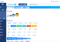
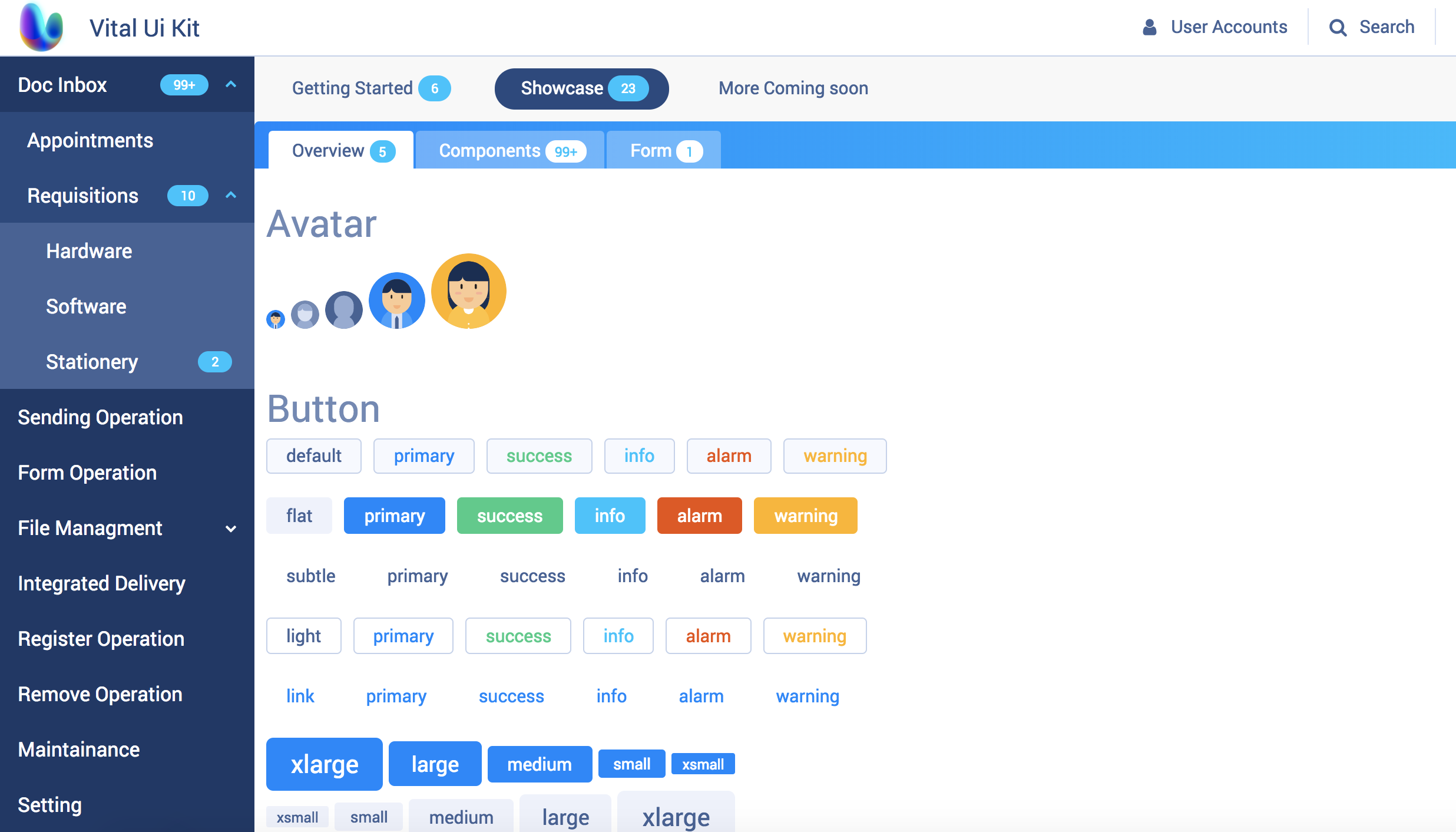
Demo
Speed
An example of Offical Document contains all Vital UI Kit components
Bit
Getting Started
Installation
# Install peer denpendcy, we use styled-components # yarn yarn add @vital-ui/react styled-components # npm npm i --save @vital-ui/react styled-components ## or install individual packages yarn add @vital-ui/react-avatar// VitalProvider contains default theme and icon, you can override it. import { ThemeProvier, Button } from '@vital-ui/react' // You can use `ThemeProvider` by styled-components, or @vital-ui/react-theme // recommend importing the global reset style. import { globalStyle } from '@vital-ui/react'; import { createGlobalStyle } from 'styled-components' const GlobalStyle = createGlobalStyle` ${globalStyle.linkStyle}; ${globalStyle.reset}; ${globalStyle.vitalTypographyStyle}; ${globalStyle.robotoFontFamily}; `; /* ... */ render() { return ( <ThemeProvider theme={YOUR_CUSTOM_THEME}> <GlobalStyle /> <Button>Vital 💜 React!</Button> </ThemeProvider> ) }Contributing
Make sure read our contributing guide to learn about our development process.
Roadmap
- docs
- Table(expand content)
- Calendar


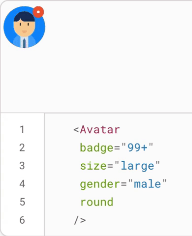


