Bootstrap Tab Collapse
Small bootstrap plugin that switches bootstrap tabs component to collapse component for small screens.
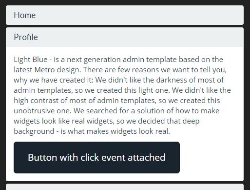
How it works
The most obvious way: bootstrap tab collapse generates accordion markup and appends it right away after tabs component. When accordion becomes (If accordion is) visible tabcollapse searchs for .tab-pane and detaches their content to appropriate accordion groups keeping all attached js data. Tabs component is given hidden-xs-class and accordion component is given visible-xs-class. That's it.
Use
Lets say you have your tabs component right from bootstrap's site:
<ul id="myTab" class="nav nav-tabs"> <li class="active"><a href="#home" data-toggle="tab">Home</a></li> <li><a href="#profile" data-toggle="tab">Profile</a></li> ... </ul> <div id="myTabContent" class="tab-content"> <div class="tab-pane fade in active" id="home"> <p>Raw denim you probably haven't...</p> </div> <div class="tab-pane fade" id="profile"> <p>Food truck fixie locavore, accus...</p> </div> ... </div> To activate tab collapse just include bootstrap-tabcollapse.js somewhere in your file and call:
$('#myTab').tabCollapse(); If you want to specify the class that is given to accordion and tabs components you can do so by passing options to tabCollapse:
$('#myTab').tabCollapse({ tabsClass: 'hidden-sm', accordionClass: 'visible-sm' }); The default class is hidden-xs. So it means that tabs component will be switched to accordion for 767px and below. You can define your own classes and use them. You can also use multiple Bootstrap classes in order to, for example, show accordion for mobile + tablets and tabs for desktop+:
$('#myTab').tabCollapse({ tabsClass: 'hidden-sm hidden-xs', accordionClass: 'visible-sm visible-xs' }); Events
There are four events tabcollapse triggers (for entire component, not for single tabs or accordion groups!):
- show-tabs.bs.tabcollapse - triggered before tabs component is shown
- shown-tabs.bs.tabcollapse - triggered after tabs component is shown
- show-accordion.bs.tabcollapse - triggered before accordion component is shown
- shown-accordion.bs.tabcollapse - triggered after accordion component is shown
To attach event handler just call:
$('#myTab').on('shown-accordion.bs.tabcollapse', function(){ alert('accordion is shown now!'); }); Attach an event handler when either tab or collapse is opened:
$(document).on("shown.bs.collapse shown.bs.tab", ".panel-collapse, a[data-toggle='tab']", function (e) { alert('either tab or collapse opened - check arguments to distinguish ' + e); }); How can I support developers?
- Star our GitHub repo
⭐️ - Create pull requests, submit bugs, suggest new features or documentation updates
🔧 - Follow us on Twitter
🐾 - Like our page on Facebook
👍
Contributors
Thanks to bdaenen for contributing.


