React-awesome-popover


Installation
via NPM
npm i react-awesome-popover via CDN (unpkg)
https://unpkg.com/react-awesome-popover@latest/build/index.umd.js UMD library exposed as ReactAwesomePopover
const Popover = ReactAwesomePopover;Do not forget to use the stylesheet.
import "react-awesome-popover/build/index.css";Example
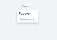
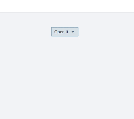
ReactDOM.render( <Popover> <button>The Target</button> <div>The content</div> </Popover>, document.body );The component supports server-side rendering
You can also use nested popovers
ReactDOM.render( <Popover> <button>The Target</button> <div> ... <Popover> <button>The Target</button> <div> ... <Popover> <button>The Target</button> <div>The content</div> </Popover> ... </div> </Popover> ... </div> </Popover>, document.body );Performing an animation
Set the renderer property to true. Second child becomes a function, It returns popperProps and arrowProps. You need to combine popper style with motion style
<Popover renderer> <button>Click</button> {(popperProps, arrowProps) => ( <Motion defaultStyle={{ rotateY: 90 }} style={{ rotateY: spring(0) }}> {({ rotateY, scale }) => { var motionStyle = { transform: `${popperProps.style.transform} rotateY(${rotateY}deg)` }; return ( <div {...popperProps} style={{ ...popperProps.style, ...motionStyle }} > <h3>Also works well with react-motion</h3> <div {...arrowProps} /> </div> ); }} </Motion> )} </Popover>You can also use as a tooltip.
Very simple!.

ReactDOM.render( <Popover> <button>The Target</button> <div> Lorem ipsum dolor sit amet, consectetur adipisicing elit. Voluptatibus error laudantium incidunt vitae dignissimos praesentium nesciunt, <Popover action="hover" placement="top"> <b>pariatur provident natus</b> <div>Wow man</div> </Popover> aperiam, corporis, quo libero sapiente recusandae! Distinctio deserunt dolor sequi, i </div> </Popover>, document.getElementById("app") );What about the arrow?
Starting from version 4.0.0, this component does not use the svg arrow. Basically you need to handle the arrow with css.
Arrow is built using css
.rap-popper-div-arrow[data-placement*="bottom"] { margin-top: -0.6em; /* argin of arrow */ } .rap-popper-div-arrow[data-placement*="bottom"]::before { border-width: 0 1em 0.6em 1em; /* ontrole the dimensions for the arrow */ border-color: transparent transparent #e3e3e3 transparent; /*set the color for the arrow */ }But what if I want the shadow to surround the arrow ?. demo I think that you have no choice but to use drop-shadow.
You can also hide the lower shadow of the arrow using the div
There is also one solution using a filter
Without using filter


With filter


Props
| Prop | Type | Description | Default |
|---|---|---|---|
| arrow | Boolean | If false, the arrow is removed | true |
| placement | String | The placement of the popover. The default value is auto Popper.js placement | auto |
| action | String | click | hover | touch | click |
| onOpen | Function | The callback is called before opening | |
| onClose | Function | Callback is called before closing | |
| renderer | Boolean | Custom renderer (returns function) | false |
| modifiers | Object | Allow passing Popper modifiers as props. | {} |
| open | Boolean | Whether the popover is visible. Passing this prop puts the popover in controlled mode.To make the popover completely manageable, you must pass the null value to the action prop | false |
| initZindex | Number | Initial number for zIndex for item | 100 |


