react-responsive-ui

Responsive React UI components.
Install
npm install react-responsive-ui --save The overall requirement is React >= 16.2, but most of the components only require React >= 0.14, except for <Tooltip/> which requires "React Portals" from React >= 16 and "React Fragments" from React >= 16.2.
Use
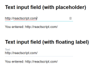
See the demo page. It has code examples for every component.
CSS
The CSS for this library resides in react-responsive-ui/style.css file and should be included on a page.
The stylesheet uses native CSS variables for easier styling. See variables.css for the list of all available variables. These variables have some sensible defaults which can be overridden:
:root { --rrui-unit : 12px; --rrui-white-color : white; --rrui-black-color : black; --rrui-accent-color : blue; --rrui-accent-color-light : cyan; --rrui-gray-color : gray; }Native CSS variables work in all modern browsers, but older ones like Internet Explorer wont't support them. For compatibility with such older browsers one can use a CSS transformer like PostCSS with a "CSS custom properties" plugin like postcss-custom-properties.
When using Webpack
// React Responsive UI. require('react-responsive-ui/style.css') // Custom variable values. require('./src/styles/react-responsive-ui-custom-variable-values.css')And set up a postcss-loader with a CSS autoprefixer for supporting old web browsers.
When not using Webpack
Get the style.css file from this package, process it with a CSS autoprefixer for supporting old web browsers, and then include it on a page.
<head> <!-- React Responsive UI --> <link rel="stylesheet" href="/css/react-responsive-ui/style.css"/> <!-- Custom variable values --> <link rel="stylesheet" href="/css/react-responsive-ui-custom-variable-values.css"/> </head>Small Screen
The small-screen directory contains "small screen" ("mobile devices") styles for some of the components. E.g. <Select/>s, <Autocomplete/>s, <ExpandableMenu/>s, <DatePicker/>s and <Modal/>s can open in fullscreen and <Snackbar/> are expanded in full screen (not neccessarily a good idea though).
Native CSS @import example:
/* Main style. */ @import url(~react-responsive-ui/style.css) /* Tweaks `<Modal/>`s for mobile devices a bit. */ @import url(~react-responsive-ui/small-screen/Modal.css) (max-width: 768px) /* Tweaks `<Snackbar/>`s for mobile devices a bit. */ @import url(~react-responsive-ui/small-screen/Snackbar.css) (max-width: 768px) /* Places a click-capturing overlay above `<DatePicker/>` input. */ @import url(~react-responsive-ui/small-screen/DatePicker.InputOverlay.css) (max-width: 768px)Validation
Each form component can be passed an error: String property. When passed, the component will be styled as "invalid" and the error will be displayed under the component.
Asterisk on required fields
To show asterisks (*) on required fields' labels:
/* (when the `value` is empty) */ /* Required input field labels will have asterisks. */ .rrui__input-label--required:after, .rrui__select__selected-label--required:after { content : '*'; margin-left : 0.2em; }Supported Browsers
IE 11, Edge, Firefox, Chrome, Safari (macOS, iOS) — have been tested.
Expandable components (Select, Autocomplete, ExpandableMenu) require Promise which is not present in IE 11 and requires a Promise polyfill to be included on a page.
Reducing footprint
Webpack 4 still can't "tree-shake" simple cases like
import { Modal, Button, TextInput } from 'react-responsive-ui'So if one's using only a small subset of this library it could be imported like so:
import Modal from 'react-responsive-ui/modules/Modal' import Button from 'react-responsive-ui/modules/Button' import TextInput from 'react-responsive-ui/modules/TextInput'or for CommonJS:
import Modal from 'react-responsive-ui/commonjs/Modal' import Button from 'react-responsive-ui/commonjs/Button' import TextInput from 'react-responsive-ui/commonjs/TextInput'Which results in a much smaller bundle size.
Theoretically the same thing can be done for CSS: instead of importing the whole react-responsive-ui/style.css bundle one could import only the necessary styles from react-responsive-ui/styles/ like react-responsive-ui/styles/Button.css, but there's a catch: various components are usually dependent on different styles; for example, a <Button/> actually requires three different stylesheets to be imported:
react-responsive-ui/styles/Button.cssreact-responsive-ui/styles/ButtonReset.cssreact-responsive-ui/styles/Input.css
Outline
By default all buttons and inputs have rrui__outline CSS class attached to them which hides the default browser outline for focused components.
.rrui__outline:not(.rrui__outline--default) { outline: none; }Instead of using the default browser outline which doesn't look pretty by any standards and which nobody uses (not "Google", not "Apple", not anyone else) the default react-responsive-ui styles define some custom :focus styling for most cases (though not for all of them). Still, these out-of-the-box :focus styles are quite subtle and if a developer is implementing a WAI-ARIA-compliant website then they should make sure that those :focus styles are more pronounced in each case.
Alternatively, those looking for a very-quick-and-dirty solution can use the same default browser outline, but prettier.
.rrui__outline:focus { box-shadow: 0 0 0 0.15rem #00aaff; }If a developer still prefers the default browser outline then they still can manually add rrui__outline--default CSS class to buttons and inputs to prevent outline: none CSS rule from being applied.
There's also an exported component called <KeyboardNavigationListener/> which listens to keydown events on document.body, and when it detects a Tab key being pressed it adds rrui__tabbing CSS class to document.body. Any further mouse or touch events reset the rrui__tabbing CSS class. This way rrui__outline can only be shown when the user is actually tabbing. It's still not considered a 100%-formally-correct solution because "screen readers" still emit all kinds of mouse events, or maybe some "screen readers" hypothetically don't emit a "keydown" event for the Tab key — who knows. It's more of an experimental feature. There're some other possible ideas like ./source/Interaction.js.
Inspecting Expandables
Expandables are implemented in such a way that they collapse when losing focus. This may present difficulties when trying to inspect expandable content via DevTools because switching to DevTools captures focus causing expandables to collapse. For such cases there's a global debug flag window.rruiCollapseOnFocusOut which can be set to false to prevent expandables from collapsing when losing focus. This flag affects: <Select/>, <Autocomplete/>, <ExpandableMenu/>, <SlideOutMenu/>, <DatePicker/>, <Snackbar/>, <Tooltip/>.
Known Issues
An overflown <Modal/> scroll is janky on iOS because it tries to scroll <body/> instead of the <Modal/> contents. That's how it is on iOS.
Contributing
After cloning this repo, ensure dependencies are installed by running:
npm installThis module is written in ES6 and uses Babel for ES5 transpilation. Widely consumable JavaScript can be produced by running:
npm run buildOnce npm run build has run, you may import or require() directly from node.
After developing, the full test suite can be evaluated by running:
npm testWhen you're ready to test your new functionality on a real project, you can run
npm packIt will build, test and then create a .tgz archive which you can then install in your project folder
npm install [module name with version].tar.gz


