
bootstrap-star-rating


A simple yet powerful JQuery star rating plugin for Bootstrap which supports advanced features like fractional star fill and RTL input support. Developed with a focus on utlizing pure CSS-3 styling to render the control. The plugin uses Bootstrap markup and styling by default, but it can be overridden with any other CSS markup. View the documentation or a complete demo at Krajee JQuery plugins.
NOTE: Release v4.0 is a modified rewrite with various new enhancements and BC breaking features. It allows rendering richer markup for star symbols and offers theming support.

Features
- Convert any HTML input to a star rating control.
- The plugin automatically converts an input to a star rating control if you set its
class = rating. All options to the input can be passed as HTML5dataattributes. - You can use the HTML 5 number input for polyfill and the plugin will automatically use the number attributes like
min,max, andstep. However, number inputs have a problem with decimal values on the Chrome Browser. Read the Browser Support section in the documentation. - Involves pure CSS3 styling of the stars. Say goodbye to image sprites or playing with image backgrounds. Offers clean scalable vector icons for consistent display across devices. Optionally one can use the Unicode character set to override symbols.
- Use any of your favorite font icon frameworks to render your star symbols (for example you can easily use the icons from the FontAwesome library).
- Render and display fractional star ratings. Configure number of stars, min, max, step, and theoretically support any fractional rating.
- Uses Bootstrap 3.x styles & glyphs by default. But this can be overridden with plugin parameters and your own CSS styles.
- Support for RIGHT TO LEFT (RTL) input. Automatically changes star styling for RTL.
- Ability to clear values and options for the stars. Control where the clear button element can be shown.
- Reset star rating to the initial value when the form is reset.
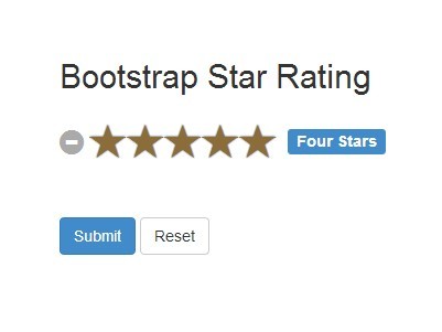
- Ability to control and display caption of the selected stars. Each rated star can have its own caption. Control where the caption element can be shown.
- Ability to size the rating control including the stars, caption, and clear button. Five prebuilt size templates are available
xl,lg,md,sm, andxs. - Triggers JQuery events for advanced development. Events currently available are
rating.change,rating.clear,rating.reset,rating.refresh,rating.hover, andrating.hoverleave. - Disabled and readonly input star rating support.
- Change stars and caption on mouse hover (new feature since v3.0.0).
- Change stars and caption on slide and drag for mobile/touch devices (new feature since v3.1.0).
- Support for translations and locales.
New features/changes since release v4.0
- BC Breaking Change: The
symbol,glyphicon,ratingClassproperties have been removed. The functionality is replaced with thethemeproperty (and can also be complemented or implemented separately using thecontainerClassproperty). - New property
themewill assign a CSS class with therating-<theme-name>to the rating container.- Themes included
- The default (blank) theme (for displaying bootstrap glyphicons)
krajee-svg(for displaying svg icons)krajee-uni(for displaying unicode symbols as stars)krajee-fa(for displaying font awesome icons)
- Add ability to override and add one's own themes
- Themes included
- Stars now have a better padding and spacing that can be configured via CSS and themes
- New property
filledStar- will allow one to set the markup forfilledStar- will default to<i class="glyphicon glyphicon-star"></i>
- New property
emptyStar- will allow one to set the markup foremptyStar- will default to<i class="glyphicon glyphicon-star-empty"></i>
- Exclusive support for SVG (and a prebuilt
krajee-svgtheme that contains two different ready to use SVG icons). - Ability to easily set the widget as a "display only" rating via
displayOnlyproperty. - New property
animateto control animation of highlighted stars on hover or click.
NOTE: Refer change log for details on plugin enhancements, fixes, and changes.
Documentation and Demo
View the plugin documentation and plugin demos at Krajee JQuery plugins.
Pre-requisites
- Bootstrap 3.x
- Latest JQuery
- Most browsers supporting CSS3 & JQuery.
Installation
Using Bower
You can use the bower package manager to install. Run:
bower install bootstrap-star-rating Using Composer
You can use the composer package manager to install. Either run:
$ php composer.phar require kartik-v/bootstrap-star-rating "@dev" or add:
"kartik-v/bootstrap-star-rating": "@dev" to your composer.json file
NOTE: You can use the sass branch for installation using
bootstrap-sassdependency. The master branch can be used for installation using plainbootstrapdependency.
Manual Install
You can also manually install the plugin easily to your project. Just download the source ZIP or TAR ball and extract the plugin assets (css and js folders) into your project.
Usage
Step 1: Load the following assets in your header.
<!-- default styles --> <link href="https://maxcdn.bootstrapcdn.com/bootstrap/4.3.1/js/bootstrap.min.js" rel="stylesheet"> <link href="https://cdnjs.cloudflare.com/ajax/libs/bootstrap-star-rating/4.0.6/css/star-rating.min.css" media="all" rel="stylesheet" type="text/css" /> <!-- optionally if you need to use a theme, then include the theme CSS file as mentioned below --> <link href="https://cdnjs.cloudflare.com/ajax/libs/bootstrap-star-rating/4.0.6/themes/krajee-svg/theme.css" media="all" rel="stylesheet" type="text/css" /> <!-- important mandatory libraries --> <script src="https://code.jquery.com/jquery-3.3.1.min.js"></script> <script src="https://cdnjs.cloudflare.com/ajax/libs/bootstrap-star-rating/4.0.6/js/star-rating.min.js" type="text/javascript"></script> <!-- optionally if you need to use a theme, then include the theme JS file as mentioned below --> <script src="https://cdnjs.cloudflare.com/ajax/libs/bootstrap-star-rating/4.0.6/themes/krajee-svg/theme.js"></script> <!-- optionally if you need translation for your language then include locale file as mentioned below --> <script src="https://cdnjs.cloudflare.com/ajax/libs/bootstrap-star-rating/4.0.6/js/locales/<lang>.js"></script>If you noticed, you need to load the jquery.min.js and bootstrap.min.css in addition to the star-rating.min.css and star-rating.min.js for the plugin to work with default settings.
Step 2: Setup your input markup to automatically initialize the rating
<input id="input-id" type="text" class="rating" data-size="lg" >Step 3: Initialize the plugin on your page for other input types. For example,
// initialize with defaults $("#input-id").rating(); // with plugin options (do not attach the CSS class "rating" to your input if using this approach) $("#input-id").rating({'size':'lg'});The #input-id is the identifier for the input on your page (that you used to initialize the rating), and this input is hidden automatically by the plugin (by adding the bootstrap CSS class hide).
Alternatively, you can directly call the plugin options by setting data attributes to your input field.
License
bootstrap-star-rating is released under the BSD-3-Clause License. See the bundled LICENSE.md for details.


