react-dragtastic

A simple drag and drop library for React which uses the more stable mouseDown/mouseUp pattern instead of the problematic HTML5 drag and drop API.
Drag and drop interfaces are complicated and difficult to properly program, this package attempts to alleviate some of the common hangups with drag and drop libraries. It should be noted that there are more mature solutions available such as the excellent react-dnd package, however for many simple drag and drop applications, the implementation of such packages can quickly become arduous.
- Warning, version 2 represents a significant rewrite of version 1 of
react-dragtastic. The API is completely different, but with the changes come several stability improvements, primitive mobile support, and significantly increased render flexibility. Be sure you're ready to rewrite your drag-and-drop implementation before upgrading from version 1.
Example
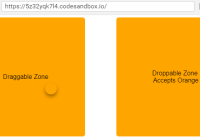
Demo Site More examples coming soon
Installation
npm install --save react-dragtastic or yarn add react-dragtasticUsage
For ES6 and up
import { Draggable, Droppable, DragComponent, DragState } from "react-dragtastic"For ES5
var dnd = require("react-dragtastic") var Draggable = dnd.Draggable var Droppable = dnd.Droppable var DragComponent = dnd.DragComponentOverview
react-dragtastic makes use of three different components, a <Draggable/> component which defines a zone on a page which can then trigger drag events, a <Droppable/> component, which defines zones which trigger drop events, and a <DragComponent/> component which defines the component that follows the user's pointer around the page while dragging.
react-dragtastic uses the "function-as-child" component pattern to give you full control over the rendering details of each component.
Draggable
This defines a draggable zone. At a minimum, spread the events over the element that should be draggable (usually the root element).
id: An id which will be used in the draggable zone's target<DragComponent/>type: A string, or array of strings, used to limit which droppable zones will accept<DragComponent/>'s attached to this draggable.data: Data of any type which will be passed to theonDropfunction of any<Droppable/>which accepts this<Draggable/>'s type.onDragStart: A function which will be called when the<Draggable/>zone is activated (The user started dragging).onDragEnd: A function which will be called when the<Draggable/>zone is deactivated (The user stopped dragging).onDrag: A function which will be called every time the user's cursor moves while dragging.delay: An optional int representing the distance in pixels the user's pointer must travel to activate the draggable. Defaults to8subscribeTo: An optional array of strings. For performance reasons you can limit which keys in the dragState your component subscribes to. For example, you may pass ['type', 'data'] to only rerender if these keys change.
Properties available from dragState:
- All the properties listed in the dragState section.
isActive: A boolean representing if the draggable is currently active.
class DraggableZone extends React.Component { render() { return ( <Draggable id="unique-id" type="apple"> {dragState => <div {...dragState.events}>I'm a draggable zone</div>} </Draggable> ) } }Droppable
This defines a droppable zone. At a minimum, spread the events over the element that should be droppable (usually the root element).
accepts: A string type corresponding to thetypeproperty of the<Draggable/>zone for which this<Droppable/>should accept drop events.onDrop: A function which will be called when a user drops a<DragComponent/>on this<Droppable/>with an accepted type.onDragEnter: A function which will be called when the user's cursor enters the<Droppable/>while dragging. This function will be called regardless of whether the droppable accepts the draggable currently being dragged.onDragLeave: A function which will be called when the user's cursor leaves the<Droppable/>while dragging. This function will be called regardless of whether the droppable accepts the draggable currently being dragged.subscribeTo: An optional array of strings. For performance reasons you can limit which keys in the dragState your component subscribes to. For example, you may pass ['type', 'data'] to only rerender if these keys change.
Properties available from dragState:
- All the properties listed in the dragState section.
isOver: A boolean representing if the user is currently hovering the<Droppable/>.willAccept: A boolean representing if this droppable will accept the currently dragging<DragComponent/>.
class DroppableZone extends React.Component { render() { return ( <Droppable accepts="apple"> {dragState => <div {...dragState.events}>I'm a droppable zone</div>} </Droppable> ) } }DragComponent
By default, children passed to this component will only render if the user is currently dragging, but this can be overridden.
for: A string corresponding to theidproperty of the<Draggable/>zone that should trigger this component to start rendering.onDrag: A function which will be called every time a user drags.alwaysRender: A boolean determining whether or not the DragComponent should always render. Defaults tofalse.subscribeTo: An optional array of strings. For performance reasons you can limit which keys in the dragState your component subscribes to. For example, you may pass ['type', 'data'] to only rerender if these keys change.
Properties available from dragState:
- All the properties listed in the dragState section.
isOverAccepted: a boolean representing whether the user is currently hovering a<Droppable/>that accepts thetypeof the currently active<Draggable/>
class DragComponentWrapper extends React.Component { render() { return ( <DragComponent for="unique-id"> {dragState => ( <div style={{ position: "fixed", left: dragState.x, top: dragState.y, pointerEvents: "none" }} > I will render when my Draggable zone is activated </div> )} </DragComponent> ) } }DragState
All components imported from react-dragtastic have access the global dragState with the following properties:
x: The user's current horizontal position on the page.y: The user's current vertical position on the page.startingX: The user's initial horizontal position on the page when they started dragging.startingy: The user's initial vertical position on the page when they started dragging.isDragging: A boolean representing whether the user is currently dragging.currentlyDraggingId: The id of the currently dragging element.currentlyHoveredDroppableId: The id of the<Droppable/>currently being hovered.currentlyHoveredDroppableAccepts: Theacceptsproperty of the<Droppable/>currently being hovered.data: Data from thedataproperty of the<Draggable/>which is currently active.nullif not dragging.type: The type of the component being currently dragged.nullif not dragging.subscribeTo: An optional array of strings. For performance reasons you can limit which keys in the dragState your component subscribes to. For example, you may pass ['type', 'data'] to only rerender if these keys change.
Occasionally you may need to notify a component about changes in the dragState without making that component a draggable or droppable zone. For these cases there is a fourth component available called <DragState/>. This component is used just like a draggable or droppable, but does not accept or trigger any drag events.
class CompWithDragState extends React.Component { render() { return ( <DragState> {dragState => ( <div style={{ background: dragState.isDragging ? "red" : "blue" }}> I always render, and have access to the global dragState. </div> )} </DragState> ) } }Troubleshooting
My Droppables aren't working!
- You most likely need to set
pointer-events: nonein the css of yourDragComponent. This allows droppables to receive drop events when the user's pointer is directly on top of the DragComponent as it is being dragged. This property is well supported.
My app is slow when I have a lot of Draggables or Droppables
- In this case the easiest fix is to use the
subscribeToprop to pass an array of dragState keys you want to subscribe to.
Coming Soon
- A project website with live examples.
- Screencast showing basic implementation examples.
- Improved mobile support.
- Additional event hooks
Contributing
Contributions of any kind are welcome. Please feel free to file issues, submit pull-requests, or drop us a line with feature requests.


