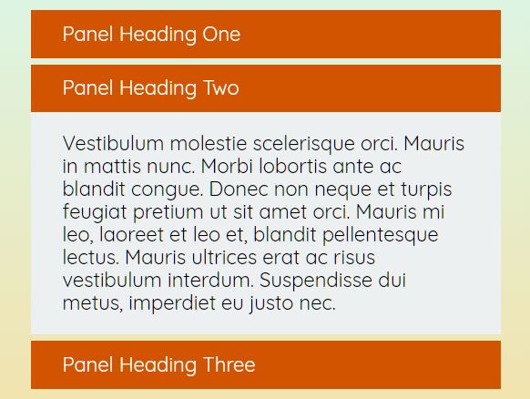
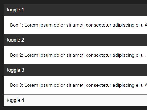
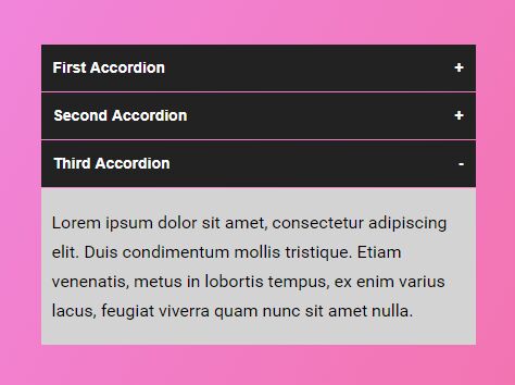
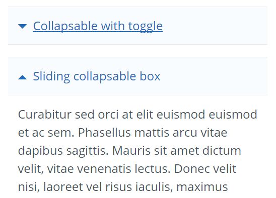
Collapsible
We have created our plugin for many reasons :
- We find Bootstrap Collapse too complex
- Flexibility with custom HTML tags (some others plugins force to use some specific HTML tags for build the plugin, we disagree, that's why we use only classes).
Get started
Add scripts
<script src="jquery.js"></script> <script src="collapsible.js"></script> <!-- Initialize Collapsible --> <script type="text/javascript"> $(document).ready(function() { $('.collapsible').collapsible(); }); </script> Minimal HTML
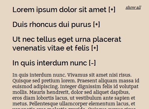
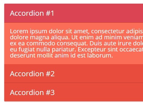
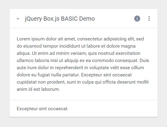
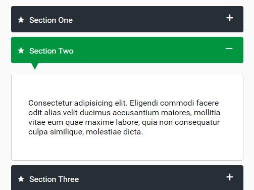
<div class="collapsible"> <!-- One... --> <div class="collapse-container"> <div class="collapse-head"> ... </div> <div class="collapse-content"> ... </div> </div> <!-- Two... --> <div class="collapse-container"> <div class="collapse-head"> ... </div> <div class="collapse-content"> ... </div> </div> ... </div> Extras
Options
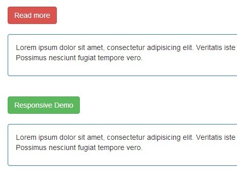
$(document).ready(function() { $('.collapsible').collapsible({ classContainer: "collapse-container", classHead : "collapse-head", classContent : "collapse-content", classOpen : "collapse-open", classClose : "collapse-close", speed : 200 }); }); CSS for beginners
.collapse-close is also availabled when the collapse is closed.
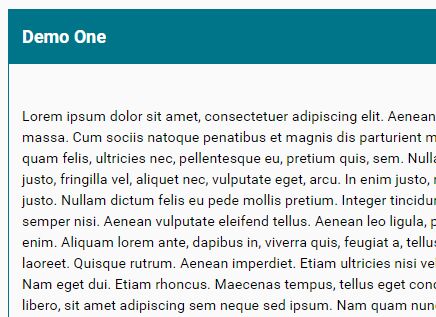
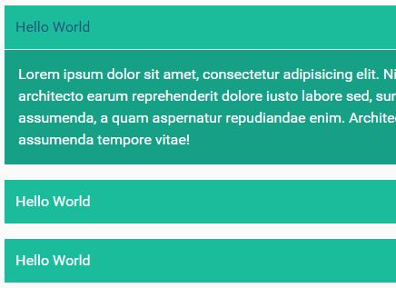
.collapse-container { margin: 15px 0; border: 1px solid #ddd; } .collapse-head { background-color: #ddd; cursor: pointer; padding: 15px; } .collapse-head h2 { font-size: 125%; padding: 0; margin: 0; } .collapse-content { padding: 15px; } .collapse-container.collapse-open { border: 1px solid #007489; } .collapse-container.collapse-open .collapse-head { background-color: #007489; color: #fff; } CSS for Bootstrap 3
.collapsible { @extend .panel-group; } .collapse-container { @extend .panel, .panel-default; } .collapse-head { @extend .panel-heading, .panel-title; cursor: pointer; } .collapse-content { @extend .panel-collapse, .collapse, .panel-body; border-top: 1px solid #ddd; } .collapse-open { @extend .collapse.in; } TODO
For this moment, we have developed the functionalities for our usages, but we're open for improvements :
- Collapse(s) opened on start
- Toggle mode
- More flexibility for options: give the possibility to define HTML tags with classes instead of only classes
- Use cookies for remember collapses items
- Others ?
License
The MIT License (MIT)
Copyright (c) 2016 ITENEO
Permission is hereby granted, free of charge, to any person obtaining a copy of this software and associated documentation files (the "Software"), to deal in the Software without restriction, including without limitation the rights to use, copy, modify, merge, publish, distribute, sublicense, and/or sell copies of the Software, and to permit persons to whom the Software is furnished to do so, subject to the following conditions:
The above copyright notice and this permission notice shall be included in all copies or substantial portions of the Software.
THE SOFTWARE IS PROVIDED "AS IS", WITHOUT WARRANTY OF ANY KIND, EXPRESS OR IMPLIED, INCLUDING BUT NOT LIMITED TO THE WARRANTIES OF MERCHANTABILITY, FITNESS FOR A PARTICULAR PURPOSE AND NONINFRINGEMENT. IN NO EVENT SHALL THE AUTHORS OR COPYRIGHT HOLDERS BE LIABLE FOR ANY CLAIM, DAMAGES OR OTHER LIABILITY, WHETHER IN AN ACTION OF CONTRACT, TORT OR OTHERWISE, ARISING FROM, OUT OF OR IN CONNECTION WITH THE SOFTWARE OR THE USE OR OTHER DEALINGS IN THE SOFTWARE.

