declarativeToggle
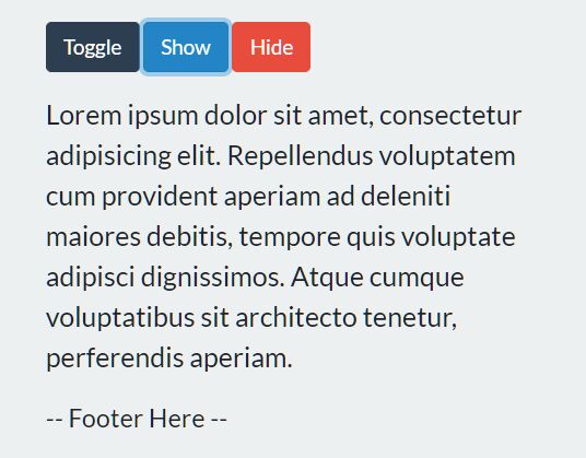
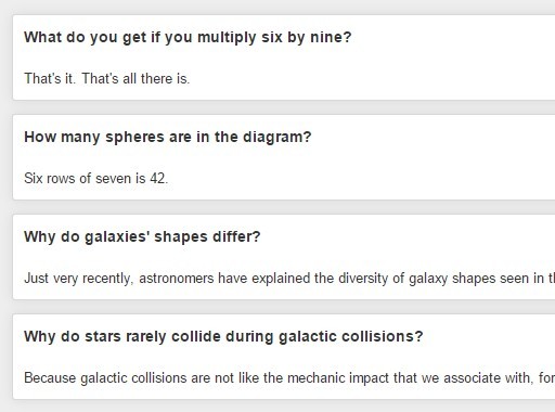
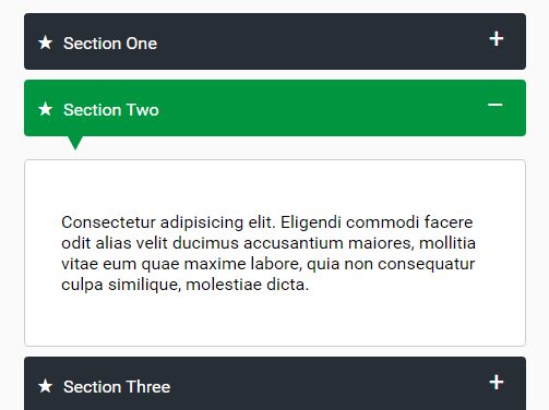
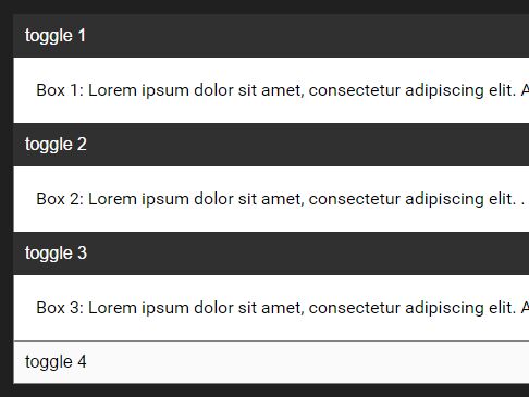
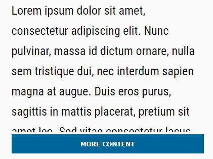
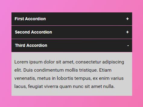
declarativeToggle is a jQuery snippet which makes it simple to reveal sections of content on a click/tap event (think mobile navigation menus on responsive sites). Add show/hide functionality without writing a single line of JavaScript by using the data-attributes outlined below.
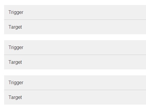
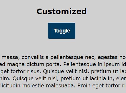
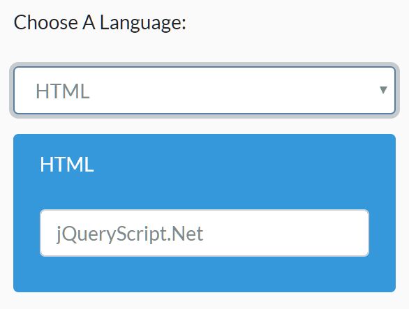
Turn any element into a toggle trigger by adding a data-toggle-target attrirubte and providing a CSS-esque selector as the value.
Example
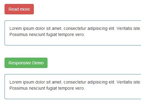
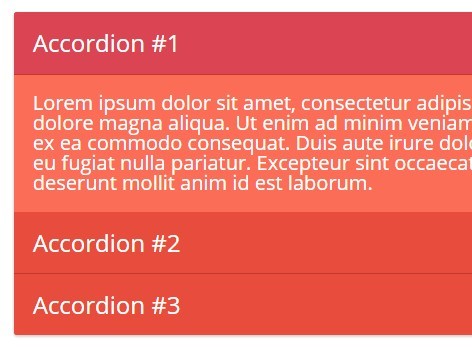
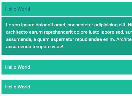
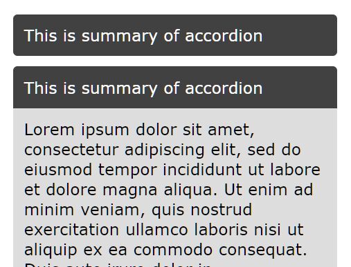
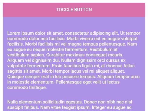
<span class="toggle-btn" data-toggle-target="#box3">Show box 3</span> <div id="box3"><p>This content is hidden by default because it is the target of a toggle button. Clicking on the above span will reveal this content.</p></div>CSS
declarativeToggle relies on CSS for hiding and displaying content; the script simply adds and removes classes at the right moment to the right element.
This is the boilerplate CSS you can copy and paste into your stylesheet:
.toggle-btn {display: none;} .toggle-btn-visible {display: block;} .toggle-target-hidden {display: none;} .toggle-target-expanded {display: block;}Responsive
Make things responsive by wrapping the final three rules in a media query.
.toggle-btn {display: none;} @media screen and (max-width: 767px) { .toggle-btn-visible {display: block;} .toggle-target-hidden {display: none;} .toggle-target-expanded {display: block;} }Many Toggles and Many Breakpoints
In the above CSS example the toggles will only display for smaller devices. What if you had a toggle in your main column that you wanted to display even for larger devices? Simply add an ancestor selector to our boilerplate selectors:
.toggle-btn {display: none;} @media screen and (max-width: 767px) { .toggle-btn-visible {display: block;} .toggle-target-hidden {display: none;} .toggle-target-expanded {display: block;} } .main-area .toggle-btn-visible {display: block;} .main-area .toggle-target-hidden {display: none;} .main-area .toggle-target-expanded {display: block;}Toggling the Button Text
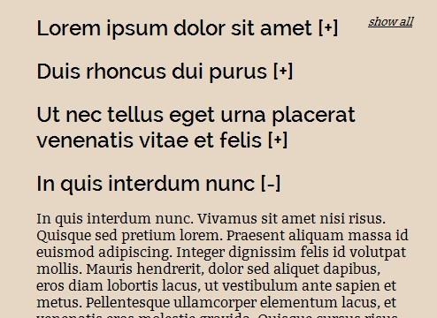
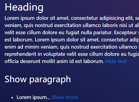
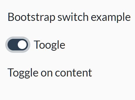
Add a data-toggle-text attribute to the button element to switch the button text during show/hide states. Example:
<span class="toggle-btn" data-toggle-target="#box3" data-toggle-text="Hide box 3">Show box 3</span> <div id="box3"><p>This content is hidden by default because it is the target of a toggle button. Clicking on the above span will reveal this content.</div>Accessibility
Do not worry about manually hiding content initially. declarativeToggle automatically adds a class of toggle-target-hidden to the content you want to reveal on click. This way, if JavaScript is disabled or a file fails to load users will still see all content (and the toggle buttons will not display).
