jquery.toggle-visibility
A jQuery plugin to declaratively toggle the visibility of elements based on form input selections.
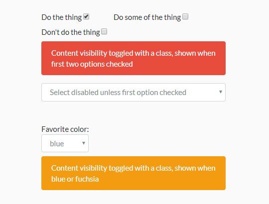
The general philosophy here is that declarative is better than imperative. Using this plugin, I was able to remove a bunch of Javascript that performed simple show/hide operations based on form selections.
Using nesting, you can make some pretty complex interactions possible without writing any code at all – you just need to add the proper data-* selectors. However, this is really meant for simple interactions – anything too complex, and you might want to consider a real framework, such as Vue or React.
Installation
npm
npm install jquery.toggle-visibility --save
yarn
yarn add jquery.toggle-visibility
Note: In the cases of npm and yarn, the source file will be in node_modules/jquery.toggle-visibility/src/jquery.toggle-visibility.js. The project doesn't include a build step, as everyone has their own way of setting that up at the project level these days, minifying and whatnot.
manual
Just download the source file here, and place a referece to it in your document's head. Make sure to include jQuery first.
Usage
This plugin uses declarative data-* attributes to determine what is to be shown or hidden, depending on the selection the user has made.
To activate the plugin, call it on all the relevant inputs as a jQuery plugin once the DOM is ready. For example:
$(function() { $('input[data-toggle-element], select[data-toggle-element]').toggleVisibility(); });Currently, the plugin hides elements by simply adding the "hidden" class to them, so you should have something like the following in your CSS:
.hidden { display: none; }If you are using Bootstrap, this utility class should already be present.
Checkbox
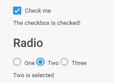
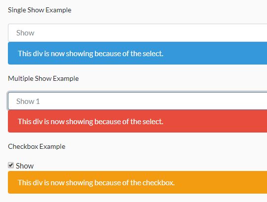
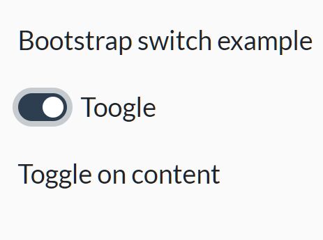
Simply give a checkbox input a data-toggle-element of the selector you wish to hide/show as that checkbox is checked/unchecked.
<form> <label> <input type='checkbox' data-toggle-element='.checkbox-is-checked'> Check me </label> <div class='checkbox-is-checked'>The checkbox is checked!</div> </form>You can also invert the checkbox behaviour (hide on checked) by setting the data-toggle-element-invert to true, like so:
<form> <label> <input type='checkbox' data-toggle-element='.checkbox-is-unchecked'> Check me </label> <div class='checkbox-is-checked' data-toggle-element-invert='true'> The checkbox is not checked! </div> </form>Radio
Give all related radio button inputs a data-toggle-element of the selector that selects all the possible elements you wish to show/hide based on the value of the radio button. There should be one element per possible value of the radio button.
Give each of the elements that you wish to show/hide a data-toggle-element-value that corresponds to a possible value of the aforementioned radio button group.
<form> <label> <input type='radio' name='radio-buttons' value='one' data-toggle-element='.radio-button-selections'> One </label> <label> <input type='radio' name='radio-buttons' value='two' data-toggle-element='.radio-button-selections'> Two </label> <label> <input type='radio' name='radio-buttons' value='three' data-toggle-element='.radio-button-selections'> Three </label> <div class='radio-button-selections' data-toggle-element-value='one'>Selection: One</div> <div class='radio-button-selections' data-toggle-element-value='two'>Selection: Two</div> <div class='radio-button-selections' data-toggle-element-value='three'>Selection: Three</div> </form>You can also invert the hide/show behaviour (hide on checked) by setting the data-toggle-element-invert to true, like so:
<form> <label> <input type='radio' name='radio-buttons' value='one' data-toggle-element='.radio-button-selections'> One </label> <label> <input type='radio' name='radio-buttons' value='two' data-toggle-element='.radio-button-selections'> Two </label> <label> <input type='radio' name='radio-buttons' value='three' data-toggle-element='.radio-button-selections'> Three </label> <div class='radio-button-selections' data-toggle-element-value='one' data-toggle-element-invert='true'> Not selected: One </div> <div class='radio-button-selections' data-toggle-element-value='two' data-toggle-element-invert='true'> Not selected: Two </div> <div class='radio-button-selections' data-toggle-element-value='three' data-toggle-element-invert='true'> Not selected: Three </div> </form>Select
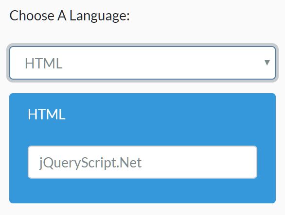
Give a select tag a data-toggle-element of the selector that selects all the possible elements you wish to hide/show based on the value of the select. There should be one element per possible value of the select.
Give each of the elements that you wish to hide/show a data-toggle-element-value that corresponds to a possible value of the aforementioned select.
Add a data-toggle-element-value-none for an element to be shown when no selection is made.
Add a data-toggle-element-value-any for an element to be shown when any selection is made.
<form> <select data-toggle-element='.select-selections'> <option></option> <option value='one'>One</option> <option value='two'>Two</option> <option value='three'>Three</option> </select> <div class='select-selections' data-toggle-element-value-none='true'>No selection</div> <div class='select-selections' data-toggle-element-value-any='true'>Selection made</div> <div class='select-selections' data-toggle-element-value='one'>Selection: One</div> <div class='select-selections' data-toggle-element-value='two'>Selection: Two</div> <div class='select-selections' data-toggle-element-value='three'>Selection: Three</div> </form>