input-toggle
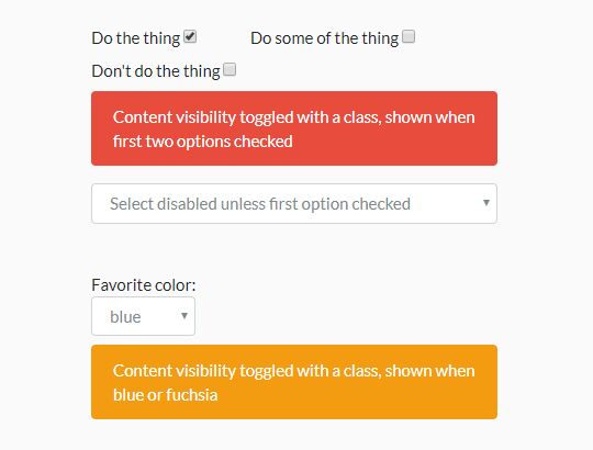
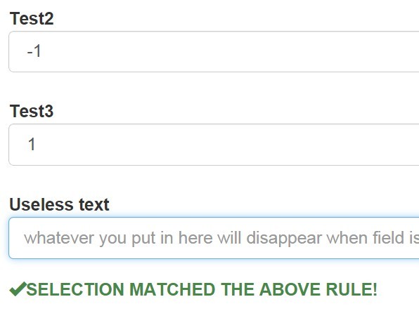
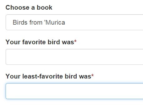
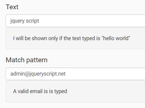
jQuery component to toggle classes or attributes on elements based on the value(s) of a form input, or of a set of inputs that share a name (i.e. checkboxes, radio buttons), being equal or not equal to a value or among or not among a set of possible values.
If there are any features you would like to see, or things you don't believe to be working correctly, don't hesitate to open an issue on the GitHub project page.
- Repository: https://github.com/tompenzer/input-toggle
- NPM Package: https://www.npmjs.com/package/input-toggle
Requirements
- jQuery 1.4 or above
Usage
To use InputToggle, include input-toggle in your package.json if you use npm or Yarn to build your app, or type npm install input-toggle in your project directory to install using npm, or download the package from github and include <script type="text/javascript" src="path/to/input-toggle.js"></script> at the bottom of your page, after including jQuery, and then run InputToggle.init(); upon document.ready(); to initialize the library. Note that configuration is done entirely with attributes in the DOM.
The interface to this library is to add several data attributes to element(s) whose class(es) and/or attribute you would like toggled by the state of a form input, and call InputToggle.init() to bind change event listeners to the input(s) and set the initial state of the toggled element(s). You can optionally provide a scope to InputToggle.init() in the form of a DOM reference or jQuery selector, to limit the initialization scope.
The names of those required attributes can be modified by passing them to InputToggle.init() as options, but we'll document using the default values. If you use custom attribute names without data- prefixes for the active values and inactive values, you lose the ability to specify a JSON array list of values for active or inactive input values.
This component is structured so that several elements can be toggled based on the value of the same input with a single change listener, and can even be toggled based on the value(s) of a set of inputs (i.e. checkboxes, radio buttons), or of a multi-select, and can be toggled based on the presence or absence of one or a set of possible values. This is facilitated by the fact that we get all the input values with the target input name within the initialization scope, meaning that you will want to limit that scope if you have multiple inputs on a page with the same name, and you don't want all of them to activate a particular toggle.
Given a checkbox input with the name checkbox_name and a value of 1, and an element whose class and/or attribute you would like toggled (referred to henceforth as 'toggled'), take the following steps to configure the toggle:
- Give the attribute
data-input-toggle="checkbox_name"to the element to be toggled based on the value(s) of the input(s) with the namecheckbox_name. - Give either of the attributes
data-input-toggle-active-valueORdata-input-toggle-inactive-valueto the toggled element, set to the value(s) of the input you would like to have trigger the active or inactive classes or attributes, respectively. For a single active or inactive value, simply set the attribute to that value. For multiple active or inactive values, set to a JSON array string, such asdata-input-toggle-active-value='["1","2"]'. Note that you must use strings for the values in this array, since the input values to which they're compared are always interpreted as strings. Special characters should be htmlentities-encoded, and they will be decoded for comparison with the input value(s). - Give any combination of the following attributes to the toggled element as desired:
data-input-toggle-active-class: set to a single or space- separated set of class names added when the input is set to the active value and removed otherwise in the case of thedata-input-toggle-active-valueattribute use, or inversely the class added to the toggled element when the input isn't set to the inactive value, and removed from it when it is when usingdata-input-toggle-inactive-value.data-input-toggle-inactive-class: set to a single or space- separated set of class names removed when the input is set to the active value and added otherwise in the case of thedata-input-toggle-active-valueattribute use, or inversely the class added to the toggled element when the input is set to the inactive value, and removed from it otherwise when usingdata-input-toggle-inactive-value.data-input-toggle-active-attribute: set to the desired name and value (optionally, separated by=), of an attribute to be added when the input is set to the active value and removed otherwise in the case of thedata-input-toggle-active-valueattribute use, or inversely the attribute removed from the toggled element when the input is set to the inactive value, and added to it otherwise when usingdata-input-toggle-inactive-value. An example usage would bedata-input-toggle-active-attribute="checked=checked", yielding the attributechecked="checked"upon the target input having an active value/state.data-input-toggle-inactive-attribute: set to the desired name and value (optionally, separated by=), of an attribute to be removed when the input is set to the active value and added otherwise in the case of thedata-input-toggle-active-valueattribute use, or inversely the attribute added to the toggled element when the input matches the inactive value, and removed from it otherwise when usingdata-input-toggle-inactive-value.
Example
A demo of this library is available here:
