###Changelog: v0.2.0:
- CSS overrides to allow unresponsive top navbar menu items with the 'navbar-static' class (refer index.html)
- Renamed 'sidebar-show-{{size}}' to 'sidebar-{{size}}-show' for consistency with column classes
v0.1.0:
- Right sidebar now fully tested. make sure your right sidebar is after your 'main' content in your HTML if you want to make it a permanent sidebar at any screen size.
- Clicking anywhere outside of the sidebar hides the sidebar (if it is not set to permanent) see index.html
- Sidebars are now hidden by default, and you can make it display permanently by adding a sidebar-{{size}}-show class (replace size with xs, sm, md, lg as per Bootstrap's convention) see index.html. Make sure your 'main' content area are classed properly with 'col-{{size}}-#' and 'col-{{size}}-offset-#' so that the main content is displayed properly when the sidebar is permanently open.
bootstrap-sidebar
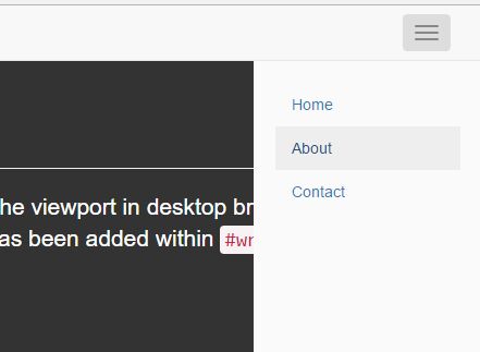
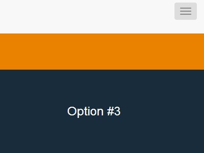
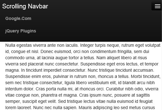
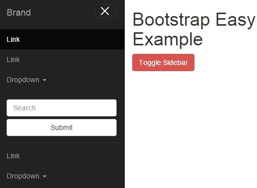
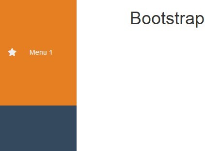
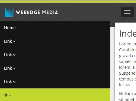
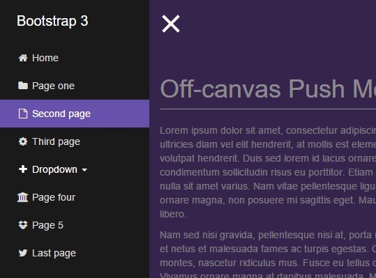
A responsive sidebar plugin for bootstrap 3. if your menus are too big to fit into a horizontal menubar, or you need to have a responsive sidebar that is compatible with bootstrap, then this is the plugin for you. (NOTE: Contributions are welcome! please issue a Pull Request)
###Features:
- Hardware accelerated slide-in animation
- You can set the sidebar to be permanently open for any screen size
- You can set the sidebar size for each screen size using standard bootstrap grid classes
- Clicking outside of the sidebars closes it automatically (if the sidebar is not open permanently)
- Right and Left sidebars now work.
- CSS overrides for top navbar to allow menu items to stay visible and not responsive when in smaller screens
###Current Limitations:
- This sidebar assumes you have a fixed top menubar
- This sidebar assumes you are using the 'container-fluid' class. use the affix plugin or a normal vertical menu for a fixed-width setup.
you will have to write some custom css to enable fixed horizontal menu items (ask me if you need help)This plugin is only tested for the left sidebar only. support for setting up a right sidebar exists but has never been tested yet.Clicking outside the sidebar does not close the sidebar in smaller screens.On larger screens the sidebar is open(visible) by default and there is no way to change this at the moment.
###Demo:
view plunker demo here: http://run.plnkr.co/plunks/sA6H7U/
#####OR
open index.html on your browser to checkout the features
###Installation:
Install using bower:
bower install bootstrap-sidebar or download a zip copy of this repo
###Usage:
Usage is almost the same as the horizontal menubar collapse method: define a button on your top menubar that toggles the sidebar on and off like this:
<button type="button" class="navbar-toggle" data-toggle="sidebar" data-target=".sidebar"> <span class="sr-only">Toggle navigation</span> <span class="icon-bar"></span> <span class="icon-bar"></span> <span class="icon-bar"></span> </button>Note the data-toggle and data-target attriubutes - these are the attributes necessary to make this button work with sidebar
then define your sidebar column as:
<div class="col-xs-7 col-sm-3 col-md-2 sidebar sidebar-left sidebar-animate"> <!-- content --> </div>#####Note the important classes:
- "sidebar" - main css class
- "sidebar-left" - to define the position of your sidebar and slide-in slide-out animations. Options are: sidebar-left, sidebar-right
- "sidebar-animation" - (Optional) to tell sidebar to animate sliding in and out.
- "col-xs-7", "col-sm-3", "col-md-2" - you can freely set the sidebar column sizes across different screen sizes according to Bootstrap's Grid guidelines
###Defining permanent sidebars:
To define a sidebar that displays permanently for a certain screen size (in this example, for sizes md and above):
<div class="col-xs-7 col-sm-3 col-md-3 sidebar sidebar-left sidebar-animate sidebar-md-show"> <!-- Sidebar content here! --> </div>make sure your main content area is defined as follows:
<div class="col-md-9 col-md-offset-3"> <!-- Main Content here! --> </div>#####Note the important classes:
- In the sidebar div:
- "sidebar-md-show" - tells the sidebar to be permanently open. 'md' refers to the screen size you want the sidebar to be permanently open at (options are: xs, sm, md, lg as per bootstrap 3 conventions). make sure you set your column sizes accordingly to accomodate a permanent sidebar.
- In the main content div:
- "col-md-9" - sets the column size of the main content. this column size must take into consideration the column size of the sidebar at the corresponding screen size (they must total 12)
- "col-md-offset-3" - offsets the main content according to the column size of the sidebar. otherwise your content will be hidden by the sidebar. the value here must equal the column value of the sidebar
