flexible-bootstrap-carousel
Flexible Bootstrap Carousel plugin
Introducing
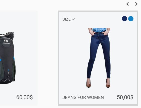
This plugin makes possible showing different numbers of entities in each item of your Bootstrap carousel depending on the browser's window width. The content of each entity might be either simple (an image, for example) or complicated (as a product description with several images, selectors of sizes, colors etc... in an internet-store). Actually, the plugin creates several columns in each item of a Bootstrap carousel. Then it is watching if the width of a browser window is changing and is adjusting number of columns in each item respectively to window's size (by default - from 1 through 3 columns, but you can set up number of entities in each item on your own). To see the plugin in action visit this showcase
Dependencies
<link rel="stylesheet" type="text/css" href="css/bootstrap.css" /> <script src="https://ajax.googleapis.com/ajax/libs/jquery/2.2.4/jquery.min.js"></script> <script type="text/javascript" src="js/bootstrap.js"></script>Installing
You can download flexible-bootstrap-carousel.js and flexible-bootstrap-carousel.css manually to you project or you can install with npm:
npm install flexible-bootstrap-carousel or bower:
bower install flexible-bootstrap-carousel Usage
First of all, you'll want to link the flexible-bootstrap-carousel.js and flexible-bootstrap-carousel.css files to your web-page:
<link rel="stylesheet" type="text/css" href="css/flexible-bootstrap-carousel.css" /> <script type="text/javascript" src="js/flexible-bootstrap-carousel.js"></script>To initiate the plugin you might add some additional class name to those Bootstrap carousels which you want to turn into flexible ones. Suppose, it is a .flexible class name:
<div class="carousel flexible slide" data-ride="carousel" data-interval="5000" data-wrap="true"> //some stuff inside the carousel </div>Then you need to create inside of the carousel a container with class name of .items. You also should put the items, which you want to appear in the carousel, into this container (each of them should have class of .item).
<div class="carousel flexible custom slide" data-ride="carousel" data-interval="5000" data-wrap="true"> <div class="items"> <div class="flex-item"> <img class="img-responsive" src="images/item1.jpg"/> </div> <div class="flex-item"> <img class="img-responsive" src="images/item2.jpg"/> </div> <div class="flex-item"> <img class="img-responsive" src="images/item3.jpg"/> </div> <div class="flex-item"> <img class="img-responsive" src="images/item4.jpg"/> </div> <div class="flex-item"> <img class="img-responsive" src="images/item5.jpg"/> </div> <div class="flex-item"> <img class="img-responsive" src="images/item6.jpg"/> </div> </div> <div class="carousel-inner" role="listbox"> </div> <a class="left carousel-control" href="#simple-content-carousel" role="button" data-slide="prev"> <span class="fa fa-angle-left" aria-hidden="true"></span> <span class="sr-only">Previous</span> </a> <a class="right carousel-control" href="#simple-content-carousel" role="button" data-slide="next"> <span class="fa fa-angle-right" aria-hidden="true"></span> <span class="sr-only">Next</span> </a> </div>You can leave empty container with class name of .carousel-inner.
Finally, you just have to add next code to your JavaScript file:
$(".carousel.flexible.default").flexCarousel(); You've done it! Enjoy of your page with built in flexible Bootstrap carousel.
Extra customization
If you want to set up more than one carousel with different settings on the same page, you also need to add some another classes (or id) to each of the carousel to make it possible to differentiate them. For example, you can add a .default class name if you do not want to change default settings and a .custom class name if you want to set up your own number of columns for each screen size:
<div class="carousel flexible default slide" data-ride="carousel" data-interval="5000" data-wrap="true"> //some stuff inside the carousel </div> <div class="carousel flexible custom slide" data-ride="carousel" data-interval="5000" data-wrap="true"> //some stuff inside the carousel </div>If you want to set up number of entities inside of each item of a carousel on your own, you can do it by giving an object with your settings to .flexCarousel function. Inside the object you put properties (ranges of screen sizes) in quotes, and give a value (number of columns) to each of the properities. For example, if you want to appear 2 entities inside of each item of a carousel when screen size is between 320px and 768px, but 5 items when screen size is more than 768px, you should write the next code:
$(".carousel.flexible").flexCarousel({ "320-768": 2, "769-20000": 5 }); Pay attention to two things in the code above. First - you should not place whitespaces inside property names. Second - if you want, for example, 5 columns on screen size of 769px and above, you just write "769-20000": 5. The second number should be large enough (in this case it is 20000) to ensure that any of existing devices can't reach it.
Adjusting contents of the entities of the carousel
If the content of the entities of your carusel is complicated enough, you might want to adjust it each time when the carousel changes number of elements inside each item. To do so you can use the event aCarouselHasBeenAdjusted, that is triggered each time when the carousel has been adjusted:
$(".carousel.flexible").on("aCarouselHasBeenAdjusted", function() { // do something }); License
This project is licensed under the MIT License - see the LICENSE.md file for details


