React Sliding Pane
Pane that slides out of the window side. Like panes from Google Tag Manager.
Features:
- Animated open-close
- Outside click or left top arrow click to close
- Efficient: pane content is not rendered when pane is closed
- Based on react-modal
- Small — 1.8 Kb minified (+ react, react-modal)
See changelog.
Open demo
When to use (UX)
I've found sliding pane very helpful in situations when normal modal window (or just popup) is not enough: long list with pagination, multi-step form or nested popups.
How to use
Install module and peer dependencies:
npm i --save react react-dom react-sliding-pane
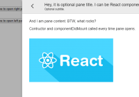
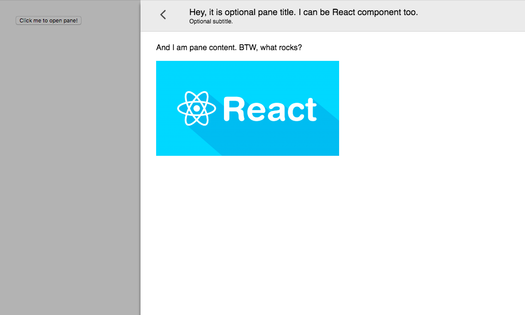
import React, { Component } from 'react'; import { render } from 'react-dom'; import Modal from 'react-modal'; import SlidingPane from 'react-sliding-pane'; import 'react-sliding-pane/dist/react-sliding-pane.css'; class App extends Component { constructor(props) { super(props); this.state = { isPaneOpen: false, isPaneOpenLeft: false }; } componentDidMount() { Modal.setAppElement(this.el); } render() { return <div ref={ref => this.el = ref}> <button onClick={() => this.setState({ isPaneOpen: true })}>Click me to open right pane!</button> <div style={{ marginTop: '32px' }}> <button onClick={ () => this.setState({ isPaneOpenLeft: true }) }> Click me to open left pane with 20% width! </button> </div> <SlidingPane className='some-custom-class' overlayClassName='some-custom-overlay-class' isOpen={ this.state.isPaneOpen } title='Hey, it is optional pane title. I can be React component too.' subtitle='Optional subtitle.' onRequestClose={ () => { // triggered on "<" on left top click or on outside click this.setState({ isPaneOpen: false }); } }> <div>And I am pane content. BTW, what rocks?</div> <br /> <img src='img.png' /> </SlidingPane> <SlidingPane closeIcon={<div>Some div containing custom close icon.</div>} isOpen={ this.state.isPaneOpenLeft } title='Hey, it is optional pane title. I can be React component too.' from='left' width='200px' onRequestClose={ () => this.setState({ isPaneOpenLeft: false }) }> <div>And I am pane content on left.</div> </SlidingPane> </div>; } } render(<App />, document.getElementById('app')); How to develop
npm run docs open docs/example.html 


