
Install
$ npm install react-simple-popoverUsage
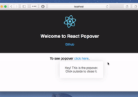
import Popover from 'react-simple-popover'; import React, { Component } from 'react'; class PopoverDemo extends Component { constructor(props) { super(props); this.state = { open: false }; } handleClick = (e) => { this.setState({open: !this.state.open}); } handleClose = (e) => { this.setState({open: false}); } render() { return ( <div> <a href="#" className="button" ref={(node) => { this.target = node }} onClick={this.handleClick}>Popover</a> <Popover placement='left' container={this} target={this.target} show={this.state.open} onHide={this.handleClose} > <p>This is popover</p> </Popover> </div> ); } }Options
placement
One of left, right, bottom or top.
show
Boolean, true if popover is shown; false otherwise.
onHide
Hide callback function.
target
Target ref to align popover around target element.
container
Reference to the component that represents the context
hideWithOutsideClick
Boolean, true if popover should hide when clicked outside; false otherwise.
containerStyle
Style for outermost container
style
Style for the content's container
Author
Ismail Demirbilek - @dbtek
MIT Licensed


