React responsive tabs
Your feedback is highly appreciated!
Please, file an issue if something went wrong or let me know via Twitter @maslianok
Responsive
- Hide tabs under the 'Show more' option when they don't fit into the screen
- Transform tabs into the accordion when the wrapper width reaches the
transformWidthvalue

Accessible
The component outputs HTML code that follows accessibility principles (aka WAI-ARIA) and uses ARIA attributes such as role, aria-selected, aria-controls, aria-labeledby etc.

Fast
We are using react-resize-detector. No timers. Just pure event-based element resize detection.
Installation
npm install react-responsive-tabs
Demo
Live demo
Local demo
// 1. clone the repository git clone https://github.com/maslianok/react-responsive-tabs.git // 2. Install react-responsive-tabs dependencies. You must do it because we use raw library code in the example cd react-responsive-tabs npm install // 3. Install dependencies to run the example cd examples npm install // 4. Finally run the example npm start Example
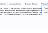
import React, { Component } from 'react'; import { render } from 'react-dom'; import Tabs from 'react-responsive-tabs'; // IMPORTANT you need to include the default styles import 'react-responsive-tabs/styles.css'; const presidents = [{ name: 'George Washington', biography: '...' }, { name: 'Theodore Roosevelt', biography: '...' }]; function getTabs() { return presidents.map((president, index) => ({ title: president.name, getContent: () => president.biography, /* Optional parameters */ key: index, tabClassName: 'tab', panelClassName: 'panel', })); } const App = () => <Tabs items={getTabs()} />; render(<App />, document.getElementById('root'));API
| Prop | Type | Description | Default |
|---|---|---|---|
| items | Array | Tabs data | [] |
| onChange | Function | onChange callback | undefined |
| selectedTabKey | Number/String | Selected tab | undefined |
| showMore | Bool | Whether to show Show more or not | true |
| showMoreLabel | String/Node | Show more tab name | ... |
| transform | Bool | Transform to accordion when the wrapper width is less than transformWidth. | true |
| transformWidth | Number | Transform width. | 800 |
| tabsWrapperClass | String | Wrapper class | undefined |
| tabClassName | String | Tab class | undefined |
| panelClassName | String | Tab panel class | undefined |
| allowRemove | Bool | Allows tabs removal. | false |
| removeActiveOnly | Bool | Only active tab has removal option | false |
| showInkBar | Bool | Add MaterialUI InkBar effect | false |
License
MIT


