react-portal-popover


A popover library for React, using react-portal for better positioning.
Installation
npm install react-portal-popover Usage
There's two steps: import the OverlayTrigger that decorates your toggle element, then pass in an overlay={} prop with your ToolTip that you'd like to display.
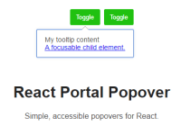
import React from 'react'; import ToolTip, { OverlayTrigger } from 'react-portal-popover'; const MyComponent = () => { const options = { size: 7, color: '#999', foregroundColor: '#fff', className: 'my-special-tooltip', useForeground: true, }; const toolTip = ( <ToolTip position="bottom" options={options}> <p>My tooltip content</p> </ToolTip> ); return ( <div> <OverlayTrigger overlay={toolTip} label="Excerpt" showLabel="Show" hideLabel="Hide"> <button>Toggle</button> </OverlayTrigger> </div> ); };Configuration options
There are some options you can pass to the ToolTip component to customise how it is displayed. This allows you to define multiple styles of tooltip in the same application, and saves writing lots of the CSS boilerplate required for drawing arrows.
const options = { classBase: 'tooltip', // eg .${classBase}--bottom, className: '', // extra classnames to add to the tooltip element size: 7, // the size of the arrow offset: 2, // how many pixels to offset the arrow by color: '#999', // border colour of your tooltip foregroundColor: '#fff', // foreground colour of your tooltip useForeground: true, // render two arrows, a border and a background. borderWidth: 1, // pixel width of your border }; <ToolTip position="bottom|top|left|right" options={options} />OverlayTrigger options
closeOnScroll determines whether the tooltip closes when you scroll the window.
<OverlayTrigger closeOnScroll={true|false} /> Developing
nvm install npm installRunning tests
npm test npm run test:watch npm run lint


