React-Picker
Picker Component offers a popup options list with responsive layouts.
Changelogs
v1.2.13
- removed webpack-dev-server dependency
v1.2.11
- Update react-tapper to 0.1.15; update dependencies
v1.2.10
- Update demo link in readme
v1.2.9
- Upgrade babel-loader & update readme
v1.2.8
- Added .npmignore
v1.2.7
- Update for react v15.5.x
Installation
yarn add react-picker or
npm install react-picker --save Snapshots


Demo
Demo file in repository: ./examples/demo.html
Example
./examples/demo.jsx
Import component into your react project
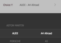
import Picker from 'react-picker' <ul> <li> <label>Choice X</label> <div className="edit"> <Picker ref="fruitSelection" value={fruit} options={['Mango', 'Orange', 'Avocado', 'Pineapple', 'Jack Fruit', 'Durian', 'Apricot', 'Carambola', 'Dateplum Persimmon', 'Megranate']} onChange={this._handleFruitChange} > <OptionBox value={fruit} onClick={this._handleClickFruit} /> </Picker> </div> </li> <li> <label>Choice Y</label> <div className="edit"> <Picker ref="carSelection" value={[brand, serial]} options={[this.state.brands, this.state.series]} onChange={this._handleCarChange} width="600px" > <OptionBox value={this.getCarText(brand, serial)} onClick={this._handleClickCar} /> </Picker> </div> </li> </ul> OptionBox is a customized component defined for the demo.
Using CSS/SCSS
CSS: import css/picker.css
SCSS: 1) import bourbon library (http://bourbon.io/), 2) import scss/picker.scss
Properites
@value: Default selected option value
@options: Options of the picker
@onChange: callback on changing selected option
@onShow: callback on calling show method
@onDismiss: callback on calling dismiss method
@onClickAway: callback on clicking area outside the picker panel
@width: width of the picker panel
@theme: theme setting of month-picker; 2 options (light/dark); default theme is light


