📐 react-native-size-matters


A React-Native utility belt for scaling the size your apps UI across different sized devices.

Installation
npm install --save react-native-size-matters //or: yarn add react-native-size-mattersMotivation
When developing with react-native, you need to manually adjust your app to look great on variety of different screen sizes. That's a tedious job.
react-native-size-matters provides some simple tooling to make your scaling a whole lot easier.
The idea is to develop once on a standard ~5" screen mobile device and then simply apply the provided utils.
Api
Scaling Functions
import { scale, verticalScale, moderateScale } from 'react-native-size-matters'; const Component = props => <View style={{ width: scale(30), height: verticalScale(50), padding: moderateScale(5) }}/>;-
scale(size: number)
Will return linear scaled result of the provided size, based on your device's screen width. -
verticalScale(size: number)
Will return linear scaled result of the provided size, based on your device's screen height. -
moderateScale(size: number, factor?: number)
Sometimes you don't want to scale everything in a linear manner, that's where moderate scale comes in.
The cool thing about it is that you can control the resize factor (default is 0.5).
If normal scale will increase your size by +2X, moderateScale will only increase it by +X, for example:
➡️ scale(10) = 20
➡️ moderateScale(10) = 15
➡️ moderateScale(10, 0.1) = 11
ScaledSheet
import { ScaledSheet } from 'react-native-size-matters'; const styles = ScaledSheet.create(stylesObject)ScaleSheet will take the same stylesObject a regular StyleSheet will take, plus a special (optional) annotation that will automatically apply the scale functions for you:
<size>@s- will applyscalefunction onsize.<size>@vs- will applyverticalScalefunction onsize.<size>@ms- will applymoderateScalefunction with resize factor of 0.5 onsize.<size>@ms<factor>- will applymoderateScalefunction with resize factor offactoron size.
Example:
import { ScaledSheet } from 'react-native-size-matters'; const styles = ScaledSheet.create({ container: { width: '100@s', // = scale(100) height: '200@vs', // = verticalScale(200) margin: 5 }, row: { padding: '[email protected]', // = moderateScale(10, 0.3) height: '50@ms' // = moderateScale(50) } });Changing the Default Guideline Sizes
In the ever changing mobile devices world screen sizes change a lot.
This lib uses 350dp x 680dp as guideline sizes, but if you (or your designer) prefer using different sizes it's possible.
To do so, first you'd need to setup react-native-dotenv.
After setting it up and creating .env file, add the following env params to it:
SIZE_MATTERS_BASE_WIDTH=<custom-width> SIZE_MATTERS_BASE_HEIGHT=<custom-height> Next and final step, you should change all your imports to react-native-size-matters/extend, for instance:
import { ScaledSheet, moderateScale } from 'react-native-size-matters/extend';Examples
You can clone the expo-example-app from this repo, run npm install and npm start and scan the presented QR code in the Expo app on your preferred device.
The app has a on/off switch for using react-native-size-matters, so you can test yourself how the app will look with and without scaling.
It is expected to look good on every device you want - iOS or Android, phone or tablet, basically anything (please let me know if not).
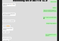
There are also some attached screenshots in the repo if you don't feel like cloning.


