react-native-tabbed-view-pager-android

Getting started
$ npm install react-native-tabbed-view-pager-android --save
Mostly automatic installation
$ react-native link react-native-tabbed-view-pager-android
Manual installation
iOS
Not Supported.
Android
- Open up
android/app/src/main/java/[...]/MainActivity.java
- Add
import is.uncommon.rn.widgets.TabbedViewPagerAndroidPackage;to the imports at the top of the file - Add
new TabbedViewPagerAndroidPackage()to the list returned by thegetPackages()method
- Append the following lines to
android/settings.gradle:include ':react-native-tabbed-view-pager-android' project(':react-native-tabbed-view-pager-android').projectDir = new File(rootProject.projectDir, '../node_modules/react-native-tabbed-view-pager-android/android') - Insert the following lines inside the dependencies block in
android/app/build.gradle:compile project(':react-native-tabbed-view-pager-android')
Windows
Not Supported.
Usage
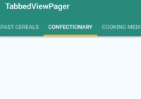
import TabbedViewPager from 'react-native-tabbed-view-pager-android'; <TabbedViewPager tabMode={"scrollable"} tabGravity={"center"} tabBackground={"#008B7D"} tabIndicatorColor={"#FFB90B"} tabIndicatorHeight={4} tabTextColor={"#ffffffa0"} tabSelectedTextColor={"#ffffff"} tabElevation={4} tabNames={this.state.tabNames} style={styles.viewPager} initialPage={0} onPageSelected={(event) => this.onPageSelected(event.nativeEvent.position)} onPageScrollStateChanged={(state) => this.onPageScrollStateChanged(state)} onPageScroll={(event) => this.onPageScroll(event.nativeEvent)}> { this.state.tabNames.map((tabName) => { return( <View style={styles.pageStyle} key={tabName}> <Text>{tabName}</Text> </View> ) }) } </TabbedViewPager>All props of ViewPagerAndroid are supported. Following table shows tab props supported by this component.
| Prop | Type | Default | Optional | Explanation |
|---|---|---|---|---|
| tabMode | string | scrollable | Yes. | Either fixed or scrollable. |
| tabGravity | string | fill | Yes. | Either center or fill. |
| tabBackground | string | App theme | Yes. | Entire tab layout background color. Specify in CSS color format. |
| tabIndicatorColor | string | App theme | Yes. | Selected tab indicator color. Specify in CSS color format. |
| tabIndicatorHeight | number | App theme | Yes. | Selected tab indicator height. Specify in CSS color format. |
| tabTextColor | string | App theme | Yes. | Color of the text in the normal/unselected tab. Specify in CSS color format. |
| tabSelectedTextColor | string | App theme | Yes. | Color of the text in the selected tab. Specify in CSS color format. |
| tabElevation | number | 0 | Yes. | Elevation of the tab layout. Default value is 0. |
| tabNames | array | None | No. | A string array of tab names. Non optional prop. Should indicate names in the same order as views of view pager children. |
Look at Example included with this sample for further details.


