React Native Action View
react-native-action-view is an easy to use component that allows displaying swipeable buttons with a variety of transitions.
Using
Import the component:
import { SwipeActionView } from 'react-native-action-view';Use the component:
<SwipeActionView rightExpansionSettings={{buttonIndex: 0}} leftExpansionSettings={{buttonIndex: 0}} rightButtons={[{title: 'Red', color: 'rgb(255, 0, 0)', callback: () => {alert('Red button tapped.');}}, {title: 'Green', color: 'rgb(0, 255, 0)', callback: () => {alert('Green button tapped.');}}, {title: 'Blue', color: 'rgb(0, 0, 255)', callback: () => {alert('Blue button tapped.');}}]} leftButtons={[{title: 'Red', color: 'rgb(255, 0, 0)', callback: () => {alert('Red button tapped.');}}, {title: 'Green', color: 'rgb(0, 255, 0)', callback: () => {alert('Green button tapped.');}}, {title: 'Blue', color: 'rgb(0, 0, 255)', callback: () => {alert('Blue button tapped.');}}]} > <Text style={styles.welcome}> Welcome to React Native! </Text> <Text style={styles.instructions}> To get started, swipe this view. </Text> <Text style={styles.instructions}> Tap on a button or swipe fully. </Text> </SwipeActionView>Configuration
Possible props are:
leftButtons,rightButtonstitleorimage,color,callback
leftExpansionSettings,rightExpansionSettings- Control the button expansion settingsbuttonIndex- The button to expand (Number)fillOnTrigger- Whether to fill the button upon expansion (Boolean)threshold- The treshold, in points, before expansion begins (Number)
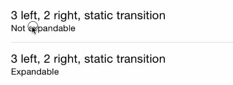
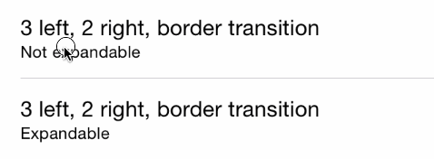
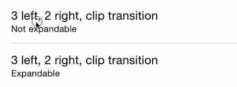
leftSwipeSettings,rightSwipeSettings- Control swipe settingstransition- The transition type (String)- Available types:
"static"(default),"border","drag","clipCenter","rotate3d","grow"
- Available types:
- enableSwipeBounces - Controls if the swipe motion bounces or not (Boolean)
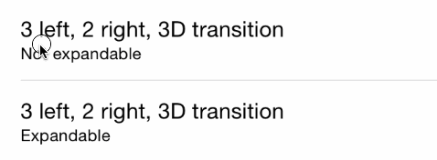
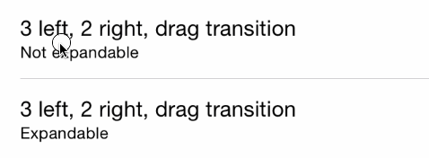
Transitions Types
Border
Clip
Rotate3D
Static
Drag


