react-native-segmented-control-tab(for Android/iOS) 🚀


A react native component with the same concept of react native's SegmantedControlIOS, Primarily built to support both IOS and Android.
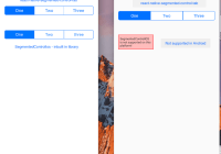
ScreenShots
Android

iOS

Install
npm install react-native-segmented-control-tab --saveUsage
IMPORTANT
This has been made into a controlled component from 3.0. Those who are familiar with 2.0, read below for the updated usage.
import SegmentedControlTab from "react-native-segmented-control-tab"; class ConsumerComponent extends Component { constructor() { super(); this.state = { selectedIndex: 0 }; } handleIndexChange = index => { this.setState({ ...this.state, selectedIndex: index }); }; render() { return ( <View> <SegmentedControlTab values={["First", "Second", "Third"]} selectedIndex={this.state.selectedIndex} onTabPress={this.handleIndexChange} /> </View> ); } }Props
| Name | Description | Default | Type |
|---|---|---|---|
| values | titles of tabs | ['One', 'Two', 'Three'] | array |
| selectedIndex | index of tab item to be selected initially | [0] | number |
| selectedIndices | Array of indices of tab items to be selected initially - when multiple prop is true else it will take selectedIndex | [0] | arrayOf(PropTypes.number) |
| enabled | Boolean to enable or disable the component | true | bool |
| multiple | Boolean which enables the multiple selection option | false | bool |
| borderRadius | borderRadius of whole tab | 5 | number |
| tabsContainerStyle | external styles can be passed to override the default styles of the segmentedControl wrapper | base styles added in SegmentedControlTab.js | object(styles) |
| tabsContainerDisableStyle | Custom style that can be passed when enable is set to false | default style opacity: 0.6 | object(styles) |
| tabStyle | external styles can be passed to override the default styles of the tabs | base styles added in SegmentedControlTab.js | object(styles) |
| firstTabStyle | external styles can be passed to override the default styles of the first tab | base styles added in SegmentedControlTab.js | object(styles) |
| lastTabStyle | external styles can be passed to override the default styles of the last tab | base styles added in SegmentedControlTab.js | object(styles) |
| tabTextStyle | external styles can be passed to override the default styles of the tab title | base styles added in SegmentedControlTab.js | object(styles) |
| activeTabStyle | external styles can be passed to override the default styles of the active tab | base styles added in SegmentedControlTab.js | object(styles) |
| activeTabTextStyle | external styles can be passed to override the default styles of the active tab text | base styles added in SegmentedControlTab.js | object(styles) |
| badges | badges values to display | [1, 2, 3] | array |
| tabBadgeContainerStyle | external style can be passed to override the default style of the badge container | base styles added in SegmentedControlTab.js | object(styles) |
| activeTabBadgeContainerStyle | external style can be passed to override the default style of the active badge container | base styles added in SegmentedControlTab.js | object(styles) |
| tabBadgeStyle | external style can be passed to override the default style of the badge text | base styles added in SegmentedControlTab.js | object(styles) |
| activeTabBadgeStyle | external style can be passed to override the default style of the active badge text | base styles added in SegmentedControlTab.js | object(styles) |
| onTabPress | call-back function when a tab is selected | () => {} | func |
| allowFontScaling | whether the segment & badge text should allow font scaling (default matches React Native default) | true | bool |
| accessible | enables accessibility for each tab | true | bool |
| accessibilityLabels | Reads out the given text on each tab press when voice over is enabled. If not set, uses the text passed in as values in props as a fallback | ['Label 1', 'Label 2', 'Label 3'] | array |
| activeTabOpacity | Opacity value to customize tab press | 1 | number |
Custom styling
<SegmentedControlTab tabsContainerStyle={styles.tabsContainerStyle} tabStyle={styles.tabStyle} firstTabStyle={styles.firstTabStyle} lastTabStyle={styles.lastTabStyle} tabTextStyle={styles.tabTextStyle} activeTabStyle={styles.activeTabStyle} activeTabTextStyle={styles.activeTabTextStyle} selectedIndex={1} allowFontScaling={false} values={["First", "Second", "Third"]} onPress={index => this.setState({ selected: index })} />; const styles = StyleSheet.create({ tabsContainerStyle: { //custom styles }, tabStyle: { //custom styles }, firstTabStyle: { //custom styles }, lastTabStyle: { //custom styles }, tabTextStyle: { //custom styles }, activeTabStyle: { //custom styles }, activeTabTextStyle: { //custom styles }, tabBadgeContainerStyle: { //custom styles }, activeTabBadgeContainerStyle: { //custom styles }, tabBadgeStyle: { //custom styles }, activeTabBadgeStyle: { //custom styles } });P.S.
License
MIT


